In home design, the smallest details often make the biggest impact. One of those key details that can elevate your home’s exterior is the choice of font used for house numbers, nameplates, and exterior signage. Modern fonts have surged in popularity in recent years for their clean, sleek, and versatile appearance. They fit effortlessly across various architectural styles, from ultra-contemporary to classic and everything in between.
Whether you live in a minimalist glass house or a charming craftsman-style home, the right modern font can boost curb appeal, improve readability, and add a subtle design statement that complements your overall aesthetic.
In this blog, we’ll explore what makes a font modern, why modern fonts work so well on homes, the benefits they bring, and practical tips for choosing and installing modern fonts that will enhance your home’s exterior for years to come.
What Defines a Modern Font?

Understanding the core characteristics of modern fonts helps explain their widespread appeal and adaptability. Modern fonts are distinct from traditional or ornate fonts because they emphasize clarity, simplicity, and clean lines.
Key Characteristics of Modern Fonts:
- Minimalist Design: Modern fonts avoid excessive flourishes, curls, or complex serifs that can clutter a design. The focus is on essential shapes and simplicity.
- Clean, Straight Lines: Modern fonts typically feature geometric and balanced shapes. Their letters often have uniform stroke widths, which create a neat and orderly appearance.
- Sans-Serif Style: Many modern fonts are sans-serif, meaning they do not have the small decorative “feet” or strokes (serifs) at the ends of letters. This omission gives them a sleek and contemporary look.
- Versatility: Because of their neutrality and balance, modern fonts pair well with many design styles and color schemes, making them incredibly adaptable.
- Legibility: One of the most important attributes is clear readability from various distances. Modern fonts excel in this regard, making them ideal for house numbers and exterior signage.
Fonts like Helvetica, Futura, Montserrat, and Avenir are some prime examples of modern typefaces widely used in design and architecture because they embody these traits.
How Modern Fonts Enhance Your Home’s Exterior

Choosing a font for your house numbers and signage isn’t just about aesthetics; it also impacts practical aspects like visibility and first impressions. Here’s why modern fonts are an excellent choice for any home exterior:
Improve Readability and Visibility
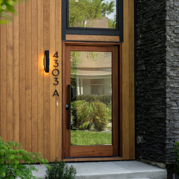
House numbers must be easily readable from the street to help guests, mail carriers, delivery drivers, and emergency responders find your home quickly. Modern fonts provide sharp, clear letterforms without distractions, making numbers legible even at a distance or in low light.
Add Contemporary, Stylish Appeal
Modern fonts provide an instant update to your home’s curb appeal. Their clean lines and minimalism complement current design trends focused on simplicity and elegance. This update can refresh your home’s look without costly renovations or repainting.
Complement Diverse Architectural Styles
One of the biggest strengths of modern fonts is their versatility. Whether your home is ultra-modern, mid-century, traditional, farmhouse, or eclectic, modern fonts blend harmoniously with the design language. They neither clash with classic details nor look out of place on futuristic facades.
Increase Property Value
While subtle, the right signage sends a powerful message about attention to detail and pride of ownership. Well-designed, easy-to-read house numbers contribute positively to your home’s curb appeal, which can increase perceived value and marketability.
Maintain Timelessness
Modern fonts are less likely to become outdated quickly compared to trendy or ornate fonts. Their minimalist roots help ensure your house numbers will look fresh and stylish for many years.
Popular Modern Fonts for House Numbers and Signage

If you’re considering updating your home’s numbers or signage with modern fonts, here are some popular options favored for their style and readability:
Helvetica
Helvetica is a classic sans-serif font known for neutrality and clarity. It’s widely used in signage because it is legible and visually balanced.
Futura
Futura features geometric shapes with circular letterforms and sharp angles. It’s bold and modern, ideal for contemporary home designs.
Montserrat
Montserrat is a friendly yet sleek font with clean lines and great readability. Its balanced proportions make it a popular choice for both numbers and letters.
Gotham
Gotham is strong and professional, often used in branding and public signage. It provides a bold presence without being overwhelming.
Avenir
Avenir offers an elegant and rounded take on modern fonts. Its soft edges make it a good fit for homes looking for a gentler modern feel.
Proxima Nova
Proxima Nova is well-balanced and versatile, fitting a range of styles. Its smooth curves and modern structure make it easy to read and aesthetically pleasing.
How to Choose the Perfect Modern Font for Your Home

Selecting the right font involves more than simply picking what looks good. The font should align with your home’s character, the environment, and your practical needs.
Match the Font to Your Architecture
- Sleek, minimalist homes: Opt for geometric fonts like Futura or Montserrat to emphasize clean lines.
- Traditional or transitional homes: Choose softer modern fonts like Avenir or Proxima Nova to balance classic features with modern flair.
- Mid-century modern homes: Fonts like Gotham or Helvetica complement the era’s clean and functional design ethos.
Consider Font Size and Placement
- Ensure your numbers are large enough to be seen from the street but proportional to your home’s size and style.
- Placement should be strategic: near entryways, mailboxes, or well-lit areas to maximize visibility.
Choose Materials That Enhance the Font
- These materials highlight the clean lines of the font and contribute to durability.
- Acrylic or wood are alternative materials that can soften the look while maintaining modern appeal.
- Precision cutting is key to preserving the modern style when using acrylic or wood.
Color and Contrast
- Light-colored numbers on dark backgrounds improve visibility.
- Dark-colored numbers on light backgrounds also enhance readability.
- High contrast ensures the address is visible from a distance and in various lighting conditions.
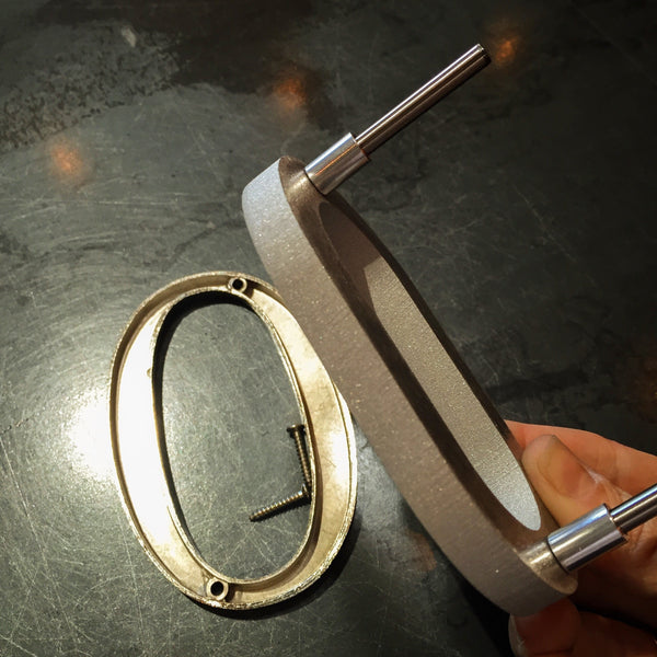
Installation Tips to Maximize the Impact of Modern Fonts

Proper installation plays a critical role in the overall effect of your modern font house numbers.
Lighting
- Install LED or solar-powered backlighting to illuminate numbers at night.
- Spotlighting or pathway lighting enhances visibility and adds a dramatic effect.
Mounting
- Flush mounting creates a sleek, seamless appearance where the numbers appear integrated with the surface.
- Raised mounting provides a shadow effect that adds depth and interest, especially effective for modern fonts.
Spacing
- Maintain adequate spacing between numbers and letters to prevent visual clutter and ensure legibility.
- Follow font designer guidelines on kerning and tracking when possible.
The Practical Advantages of Modern Fonts

While modern fonts are aesthetically appealing, they also offer several practical benefits for homeowners:
Durability and Maintenance
- Modern fonts often come in durable materials like metal or weather-resistant acrylic, meaning they withstand weather extremes.
- Their simple shapes make them easy to clean, with fewer crevices for dirt and grime.
Future-Proof Design
- Their timeless style ensures your house numbers won’t look dated even after years.
- This reduces the need for frequent updates or replacements, saving money long-term.
Enhanced Home Security
- Clear, visible numbers improve home security by making it easier for emergency services to locate your address quickly.
- This can be critical during emergencies like fires or medical situations.
Environmental Considerations
- Modern fonts are often used with eco-friendly materials such as recycled aluminum, aligning with green building practices. To achieve this look instantly, homeowners can learn how to quickly get numbers that arrive ready for installation. For those wanting a more personalized architectural statement, knowing how to get custom plaques allows you to combine these sustainable materials with custom text or logos, ensuring your home or business reflects a commitment to both modern design and environmental responsibility.
- Choosing long-lasting, low-maintenance fonts reduces waste over time.
Combining Modern Fonts with Other Exterior Design Elements

To maximize curb appeal, consider how your font choice interacts with other exterior features.
House Colors
Modern fonts look great against neutral palettes like white, gray, or black but can also contrast beautifully with vibrant colors.
Door Hardware and Fixtures
Coordinate your font style with your door handles, knockers, and lighting fixtures to create a cohesive look.
Landscaping
Simple, modern fonts pair well with clean landscaping lines, minimalist gardens, or structured hedges, enhancing the overall aesthetic.
Frequently Asked Questions
-
What defines a modern font for home use?
Modern fonts typically feature clean lines, minimalistic design, and balanced proportions. They often use sans-serif styles that are easy to read and visually appealing on house numbers, signage, and decor.
-
Why do modern fonts enhance curb appeal?
Their sleek, simple design creates a fresh and updated look that complements a wide range of architectural styles, from contemporary to traditional, making homes appear more inviting and stylish.
-
Are modern fonts easy to read from a distance?
Yes. Modern fonts prioritize clarity and legibility, ensuring that house numbers and signs are easily visible from the street, which is important for visitors, deliveries, and emergency services.
-
Can modern fonts be customized for different home styles?
Absolutely. Many modern fonts come in various weights and styles, allowing homeowners to choose versions that match their personal taste and the character of their home.
-
Do modern fonts work well with different materials?
Yes. Whether used on metal, wood, acrylic, or stone, modern fonts maintain their clean aesthetic and sharp lines, making them versatile for various signage and decorative applications around the home.
Elevate Your Home with Modern Fonts

Choosing modern fonts for your house numbers and exterior signage is more than a style decision; it’s an investment in your home’s curb appeal, functionality, and future value. The clean lines, minimalist design, and timeless appeal of modern fonts offer unmatched versatility and practicality. They improve readability, complement a wide range of architectural styles, and add a fresh, sophisticated touch to your exterior.
By selecting the right modern font, pairing it with durable materials, and installing it thoughtfully with proper lighting and placement, you can create an exterior detail that stands out and welcomes guests with style and clarity.
Explore the premium selection of modern fonts and house numbers available at Modern House Numbers. Discover eco-friendly options, customizable designs, and expert craftsmanship designed to enhance your home’s exterior for years to come.