Color theory helps us understand how colors work together and how they affect what we see and feel. In simple words, it’s about choosing color combinations that are pleasing to the eye, enhance visibility, and create harmony with surroundings. When applied to the outside of a home, especially to something small like house numbers, it plays a big role in safety, style, and how people perceive the property. Knowing the best colors for mailbox number decals helps.
Visibility matters more than many homeowners realize.. Zillow research suggests that homes with strong curb appeal are more likely to sell faster and may command higher prices than comparable homes without those visual upgrades. Colors and finishes that contrast well against the background (like white or brushed-metal numbers on dark siding) help visitors, delivery drivers, or emergency services find your address quickly.
In short, getting the color and finish for your house numbers right isn’t optional. It’s essential for safety, quick readability, and making your home stand out in the best way possible. Next, let’s explore how color theory works in practice and how you can apply it to your own home’s exterior design.
Why Color and Finish Matter for House Numbers
House numbers may be small in size, but their impact is much larger than most homeowners realize. They serve a dual purpose: ensuring safety through visibility and enhancing a home’s overall appearance. Functionally, the right color and finish can make numbers easy to spot from the street, day or night, which is critical for emergency responders, delivery drivers, and first-time visitors. Poor contrast or dim finishes often lead to address delays in emergencies.

On the aesthetic side, color and finish are equally powerful. Since curb appeal improvements are among the first things buyers notice, homeowners often invest several thousand dollars in exterior upgrades before listing a home for sale, suggesting that investment in outward appearance, such as choosing finishes that contrast and stand out, is one way to improve market impression. Choosing finishes like matte black, polished brass, or brushed aluminum can help communicate style, care, and character.
In short, choosing the right color and finish is about more than decoration; it's about balancing beauty with function. A thoughtful finish ensures your house numbers are noticed for the right reasons: they support safety, readability, and create a welcoming first impression.
Basics of Color Theory in Exterior Design
Color theory is the study of how colors interact and the emotions they create. When applied to exterior design, it helps homeowners make thoughtful choices that strike a balance between harmony, contrast, and mood. For house numbers and plaques, these choices go beyond decoration; they play a role in both visibility and style.
Contrast is one of the most essential principles. A dark number on a light background, or vice versa, ensures that the address is easy to spot from the street. This is especially important for guests, delivery drivers, or even emergency services who need to identify your home quickly. Harmony, on the other hand, ties the house numbers into the overall design. Matching finishes with door hardware, trim, or lighting fixtures creates a polished and intentional look.
Mood is equally influential, since colors carry meaning and shape impressions. Warm finishes like brass and bronze give off a welcoming, traditional feel, while cooler tones such as stainless steel or silver convey modernity and precision. Research supports just how powerful these decisions can be. Studies show that people form an impression of a product or environment within 90 seconds, and color plays a significant role in that initial judgment, with some research suggesting it accounts for 60-90% of snap judgments.
With such a strong link between color and perception, choosing the right finish for house numbers is a simple way to boost both curb appeal and personality.
The Role of Contrast in House Number Visibility
Contrast is one of the most critical factors in making house numbers effective. If the numbers blend into the siding, brick, or paint color behind them, they lose their purpose. A simple rule is that light-colored numbers should be placed on dark surfaces, and dark numbers should be used on light backgrounds. This difference in tone makes the address visible from the street, both during the day and at night.

Many local building and fire codes specifically require house numbers to be clearly visible. For example, the City of San Diego’s municipal code states that numbers must be at least four inches high, placed on a contrasting background, and positioned. Hence, they are legible from the street or nearest access road, as per the San Diego Municipal Code. Standards like these highlight the role contrast plays in safety.
Strong contrast not only improves compliance but also ensures that first responders, delivery drivers, and visitors can locate the property quickly. Without it, even large numbers can go unnoticed. Choosing finishes that stand out, like white against dark stone or matte black on a pale wall, offers both functionality and a sleek design element.
Popular Color Options for House Numbers and What They Mean
Choosing the color and finish of house numbers is about more than decoration. Each option carries subtle design cues that shape how visitors, neighbors, and even buyers perceive a home. From timeless black to warm brass or sleek stainless steel, the finish you choose communicates a certain mood and identity. Below are some of the most popular choices and what they typically represent.
Black Numbers for Timeless Elegance and Clarity

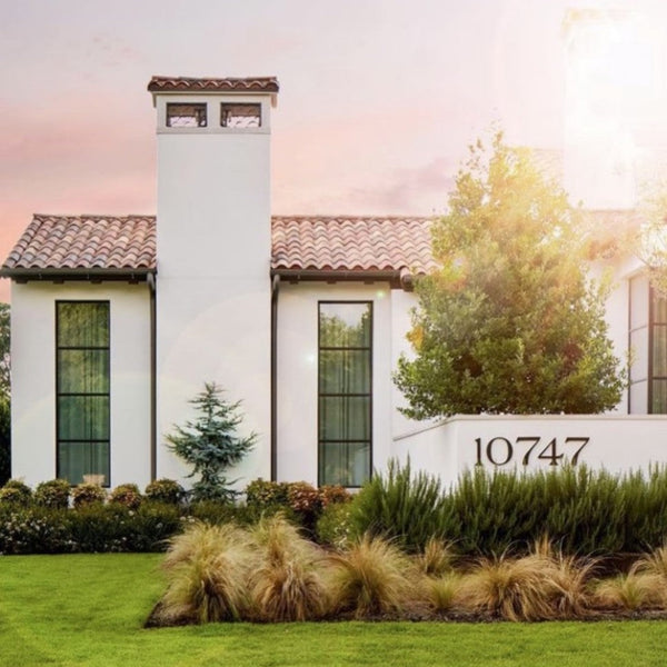
Black remains the most versatile and widely used finish for house numbers. It offers a strong contrast against light-colored backgrounds like white siding, brick, or stone, making it highly legible from a distance. Beyond function, black carries a sense of sophistication and works well with both traditional and modern homes. It is a safe yet stylish choice for homeowners who want clarity without overthinking color combinations.
White Numbers for Minimalist and Clean Design

White house numbers provide a crisp, modern look that works best against dark surfaces such as charcoal siding, brick, or stained wood. Their minimalist quality makes them popular with contemporary or Scandinavian-inspired homes. White conveys simplicity and cleanliness, projecting a neat and orderly impression. However, ensuring proper lighting is key, since white numbers can sometimes be harder to see at night without contrast or backlighting.
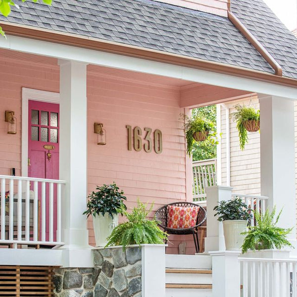
Brass and Gold Finishes for Warmth and Luxury

Brass and gold tones bring a warm, rich feel to a home’s exterior. They are often chosen for traditional or upscale properties, where they complement wood doors, lantern-style lighting, or stone entryways. Brass, in particular, develops a patina over time, adding character and charm. These finishes signal elegance, permanence, and a touch of luxury, making them ideal for homeowners who want to elevate your home’s curb appeal.
Brushed Aluminum and Stainless Steel for Modern Minimalism

Brushed aluminum and stainless steel finishes are sleek, durable, and unmistakably modern. They are often paired with contemporary architecture, minimalist landscapes, and industrial-style designs. The polished or brushed look communicates precision, simplicity, and modernity. Stainless steel also withstands outdoor elements exceptionally well, which means it maintains its aesthetic appeal over time while signaling strength and durability.
Bronze and Matte Finishes for Rustic and Subtle Charm

Bronze and other matte finishes have an earthy, grounded quality that suits rustic, farmhouse, or craftsman-style homes. These colors don’t demand attention the way metallic tones do, but instead blend naturally with stone, wood, and brick. Bronze numbers create a subtle, timeless look that feels warm and welcoming, while matte finishes offer a softer, less reflective option for homeowners who prefer understated charm over bold shine.
How Different Finishes Affect Durability and Maintenance
The finish you choose for house numbers impacts both style and longevity. Some options are designed to minimize upkeep, while others may appear luxurious but require more frequent care. Studies on exterior coatings and metals provide insight into how these finishes perform over time.
Matte Finishes and Their Low-Maintenance Benefits
Matte finishes are popular for their modern, glare-free appearance. Unlike polished metals, they don’t easily show fingerprints or water spots, which makes them easier to maintain. They also reduce glare under sunlight, improving visibility from the street. In the broader coatings industry, the exterior architectural coatings market is projected to grow at approximately 4-5% annually through 2034, highlighting rising demand for durable, decorative, and low-maintenance finishes in both homes and businesses.
Polished Finishes and Their High-End Appearance
Polished brass or stainless steel surfaces create an elegant, reflective look that signals luxury. However, this finish demands frequent upkeep to stay pristine. The International Stainless Steel Forum reports that over 70% of stainless steel used in architectural applications is polished or mirror-finished, showing its popularity despite higher maintenance needs. Homeowners choosing polished numbers should plan on regular cleaning to maintain their brilliance.
Brushed and Textured Finishes for Balanced Looks
Brushed and textured finishes, such as satin stainless steel, hide small scratches and smudges better than polished versions. This makes them highly practical for exterior applications. Research by ASM International shows that brushed and satin finishes reduce visible wear by nearly 30% compared to polished metals, making them one of the most balanced choices for style and durability. These finishes work well in both modern and traditional settings, offering a versatile option for long-term use.
Matching House Number Colors With Exterior Elements
House numbers are small details that can have a big impact on a home’s overall look. When chosen thoughtfully, they not only make your address more visible but also tie into the exterior design. Here are a few ways to match numbers with exterior features effectively.
Matching Numbers to Front Doors and Entryways
The front door is often the centerpiece of a home’s exterior, so aligning house numbers with its color or finish creates a cohesive look. For example, a brass knocker paired with brass numbers feels polished and intentional, while matte black numbers on a black or dark-stained door convey sleek minimalism.
Using numbers as an accent piece, such as silver numbers on a navy door, can also highlight the entryway and create a focal point that draws the eye.
Using Numbers to Contrast Exterior Walls
Contrast is a proven way to ensure house numbers remain visible from the street. Light-colored numbers on dark walls, such as white on charcoal siding, pop immediately and enhance readability. The reverse works equally well: black or bronze numbers stand out against white or pale walls.

For homeowners who want something bolder, high-contrast combinations like polished stainless steel on red brick can add both functionality and striking style.
Coordinating with Mailboxes, Plaques, and Signs

House numbers don’t exist in isolation; they often sit near mailboxes, plaques, or directional signs. Matching these elements creates a sense of unity across the property. A set of bronze numbers paired with a bronze mailbox or a matching plaque instantly elevates curb appeal.
Studies on home staging consistently show that unified exterior accents increase perceived value, with exterior projects offering some of the highest returns in resale value improvements. For homeowners planning to sell, aligning finishes across numbers, mailboxes, and plaques can make the exterior feel more intentional and appealing.
Color Psychology and Emotional Impressions
Colors do more than decorate your home exterior; they influence how people feel when they see it. Psychologists have long studied the link between color and human emotion, and research consistently shows that different shades shape perceptions of warmth, trust, and even safety. When it comes to house numbers, choosing the right color isn’t just about style; it's about the impression your home makes before anyone steps inside.
Here's how standard finishes and colors can affect perception:
-
Black – Authority & Timelessness: Black is associated with strength, sophistication, and clarity. Studies in color psychology suggest darker hues are often perceived as more formal and dependable, making black numbers a safe, elegant choice for visibility.
-
White – Simplicity & Cleanliness: White represents purity and openness. According to design psychology, people perceive white spaces as larger and cleaner, so white numbers on a dark background can create a fresh, minimalist vibe.
-
Brass & Gold – Luxury & Warmth: Gold tones trigger associations with wealth, tradition, and prestige. Metallic finishes increase the perceived value of objects, which is why brass and gold finishes often feel upscale and inviting.
-
Brushed Aluminum & Stainless Steel – Modernity & Precision: Cool metallic tones are tied to sleekness and efficiency. Typically, cooler colors like gray and silver are linked with professionalism and modernity, making stainless steel finishes ideal for contemporary homes.
-
Dark Bronze & Earthy Finishes – Stability & Comfort: Earth tones create a sense of grounding and reliability. Designers often use bronze to signal tradition and craftsmanship, giving homes a warm, welcoming presence.
By understanding these emotional cues, homeowners can choose house number finishes that not only look great but also communicate the right message to visitors, neighbors, and potential buyers.
Mistakes to Avoid When Choosing House Number Colors
Selecting the right house number color is about more than personal taste. A poor choice can affect safety, design balance, and even property value. Here are the most common mistakes to avoid:
-
Poor Contrast: Numbers should always stand out from their background. Dark-on-dark or light-on-light pairings reduce readability. Many municipalities recommend at least 4-inch high numbers with clear contrast for emergency responders.
-
Excessive Glare: Shiny finishes like polished stainless steel may look elegant, but can reflect sunlight in ways that obscure visibility. Brushed or matte alternatives often solve this issue.
-
Blending Into Wall Colors: Numbers that closely match the wall or trim color become invisible from the street. For example, white numbers on a pale stucco wall fade away in daylight.
-
Ignoring Finish Durability: Some paints and coatings fade quickly under outdoor conditions. Research indicates UV exposure accounts for approximately 40-60% of material fading outdoors. Choosing UV-resistant or powder-coated finishes avoids frequent replacements.
-
Choosing the Wrong Size: Even if the color is perfect, undersized numbers make homes hard to find. Many local codes and fire departments recommend at least 4 inches tall for residential addresses.
-
Overlooking Night Visibility: A stylish matte black number may work during the day, but vanish in low light. Adding reflective coatings, solar backlighting, or contrasting materials can fix this.
-
Not Considering Surroundings: Landscape elements, seasonal decorations, or overgrown plants can obstruct numbers. A bold color choice helps maintain visibility year-round.
-
Prioritizing Style Over Safety: While trendy tones like bronze or charcoal add sophistication, functionality must come first. Numbers should be instantly recognizable to delivery drivers, visitors, and emergency responders.
By keeping these pitfalls in mind, homeowners can strike the perfect balance between style, safety, and durability.
Tips to Choose the Right Color and Finish for Your Home
Choosing the right color and finish for your house numbers may seem like a small decision, but it has a big impact on style, safety, and how others perceive your home. Below is a step-by-step guide designed to help you make the smartest choice.

1. Start With Contrast for Visibility
Contrast ensures numbers are easily seen from the street. Black on white siding or white on dark brick are timeless pairings that guarantee legibility. The International Fire Code requires that address numbers have a clear contrast with their background so emergency responders can find homes quickly.
2. Consider Your Home’s Architecture
Different architectural styles pair naturally with specific finishes. A colonial or craftsman house often looks best with brass or bronze, while modern and minimalist designs shine with stainless steel or matte black. Aligning design choices with architecture creates visual balance and strengthens curb identity.
3. Balance Daytime and Nighttime Readability
What works at noon may vanish after sunset. Reflective finishes or solar backlighting keep numbers visible at all times, which is especially important on dimly lit streets.
4. Factor in Durability and Maintenance
Not all finishes handle the elements equally well. Polished metals require frequent upkeep, while matte and brushed textures resist fingerprints and water spots. UV rays are particularly damaging; sunlight accounts for a significant share of outdoor material degradation, making protective coatings essential. Durable finishes save homeowners time and replacement costs in the long run.
5. Coordinate With Entryway Features
Numbers look most intentional when they connect with nearby elements. Matching finishes with door handles, mailboxes, or outdoor lighting ties the whole entryway together. This kind of design consistency adds polish and helps a property feel well-maintained. The National Association of Realtors found that outdoor upgrades strongly influence first impressions, with many agents ranking them as a top factor for appeal.

6. Keep Resale Value in Mind
Neutral, classic finishes appeal to the broadest audience, making them a safe long-term investment. Black, bronze, and stainless steel are versatile options that suit many styles without alienating potential buyers. Even minor updates, such as refreshed numbers, contribute to that effect.
7. Avoid Overly Trendy Choices
Bold, unconventional colors may feel exciting now, but often age poorly, leaving your exterior looking outdated. Instead, focus on timeless finishes and use font styles or layouts to add personality. Design psychology research supports this approach, noting that timeless details lead to longer-lasting homeowner satisfaction.
Small Detail, Big Impact: Choose the Right Finish Today
Choosing the right color and finish for house numbers is more than just a design detail; it is a balance of visibility, safety, and personal style. Throughout this guide, we explored how color theory, contrast, and finish durability all play a vital role in making sure your home’s address is easy to read while also complementing your exterior design.
From timeless black and white combinations to modern brushed metals, the right choice not only improves day-to-day functionality but also boosts curb appeal, which can positively influence home value.
If you are looking to update your exterior with fresh, stylish, and durable numbers, consider exploring the wide range of options at Modern House Numbers. Our curated collection of finishes and styles allows homeowners to find the perfect match for their entryway, ensuring both elegance and long-lasting performance.
Whether you are renovating, selling, or simply refreshing your home’s look, investing in quality house numbers and plaques is a small change with a big impact.
Frequently Asked Questions
What is the trend in exterior paint in 2026?
In 2026, exterior paint trends focus on natural, timeless shades. Homeowners are choosing earthy neutrals like taupe, greige, and warm whites, along with muted greens such as sage and olive. Darker accents, including deep blues and charcoals, are also popular for creating bold contrast.
How do I pick a trim color for my house exterior?
Start by considering your home’s style. Traditional houses often look best with crisp white or cream trim, while modern homes can pull off darker or monochrome trims. Decide whether you want a high-contrast look (like black trim on white siding) or a subtle effect with a color a few shades lighter or darker than your siding.
What is the best finish for exterior trim?
Semi-gloss or gloss finishes are recommended for exterior trim because they highlight details and provide extra durability against weather conditions. These finishes also make it easier to clean surfaces compared to flat paints.
What color house numbers are easiest to see?
High-contrast combinations (for example, black on white or white on dark siding) are the easiest to read from the street. Increasing contrast and using retroreflective materials measurably improve nighttime detection and recognition distances for signage; the same principles apply to address numbers.
Should house numbers match the front door color?
Matching the finish of your house numbers to door hardware (handles, hinges, light fixtures) usually produces a more cohesive entryway than matching the painted door color itself. Design guides and trend studies recommend coordinating finishes (metal-to-metal) while maintaining distinct enough numbers for legibility.
Are matte or polished finishes better for outdoors?
Matte finishes are lower-maintenance (hide fingerprints and small scratches) while polished finishes offer a high-gloss, premium look but need more regular cleaning. The exterior architectural coatings market (which includes matte and other finish types) is growing, supporting the trend toward durable, low-maintenance exterior coatings.
Do dark house numbers work on dark walls?
No, dark-on-dark reduces visibility. Building and fire codes require address characters to contrast with their background and be legible from the street. If your siding is dark, choose a light or metallic finish instead.
What is the most popular finish for house numbers today?
Rather than a single dominant finish, current trend reporting points to matte black and brushed stainless (or mixed warm metals) as top choices for exterior hardware and accents. Matte black and brushed metals have been among the most-saved and most-requested exterior finishes in recent years.