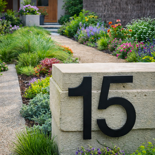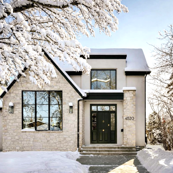
Your mailbox numbers serve a critical purpose: ensuring your address is clearly visible to postal workers, delivery drivers, emergency responders, and guests. But beyond function, the color of your numbers plays a major role in both visibility and design. Selecting the right color involves understanding contrast, background materials, lighting conditions, and overall curb appeal. For example, dark numbers on dark mailboxes can become unreadable, while high-gloss finishes might reflect too much light and reduce clarity.
Here's how to pick the best one for your space.
Why Color Matters in Mailbox Decals

The color of your decals affects not just style but also function. Your house numbers need to be visible from the street, easy to read day or night, and complementary to the mailbox and surrounding elements.
When choosing a color, consider:
-
Mailbox color and material
-
Home exterior and trim colors
-
Lighting conditions (sun exposure, shade, etc.)
-
Personal design style or neighborhood guidelines
Let’s explore the best options from our color palette and where they shine.
Best Colors for Mailbox Number Decals
Given below is the list of the popular and best colors for number decals:
1. Black – Timeless, Bold, and High-Contrast

Black decals are the most popular for a reason—they work with almost anything. Black offers maximum contrast on light surfaces, making it ideal for white, silver, or brushed aluminum mailboxes.
-
Great for : White, light gray, or silver mailboxes
-
Style : Clean, bold, classic
-
Visibility : Excellent during both day and night
Use black if: You want strong readability and a modern, minimal look that stands out clearly from the street.
2. White – Clean, Crisp, and Modern

White decals offer a bright, clean look that pairs perfectly with dark surfaces. White stands out beautifully on black, dark bronze, or navy mailboxes, making it a favorite for homes with a modern or industrial exterior.
-
Great for: Black, dark bronze, or deep green mailboxes
-
Style : Modern, clean, minimal
-
Visibility : Excellent, especially in shaded areas
Use white if: Your mailbox is dark and you want a high-contrast, eye-catching design.
3. Silver – Sleek, Subtle, and Sophisticated

Silver decals offer a polished, elegant appearance. On darker surfaces, they provide soft contrast with a sleek metallic finish. Silver is a popular choice for homes with contemporary or industrial aesthetics.
-
Great for : Black, navy, or matte green mailboxes
-
Style : Refined, understated, modern
-
Visibility : Moderate during the day, reflective in sunlight
Use silver if: You prefer a neutral tone that adds a metallic edge without overpowering the design.
4. Green – Natural, Calm, and Unique

Green decals offer a more organic, nature-inspired vibe and are ideal for homes with earthy tones, garden surroundings, or rustic architecture. They pair well with wood textures, matte finishes, or natural colors.
-
Great for : Beige, stone, wood, or copper mailboxes
-
Style : Natural, earthy, vintage
-
Visibility : Moderate depending on contrast
Use green if: You want a softer, less traditional look that blends with natural elements.
5. Blue – Cool, Bold, and Contemporary

Blue decals bring a cool, modern tone to your mailbox. They offer a bold yet balanced presence and work well in modern home exteriors. Depending on the shade of your mailbox, blue can act as either a contrast or accent color.
-
Great for : White, silver, light gray, or brushed aluminum mailboxes
-
Style : Fresh, trendy, cool-toned
-
Visibility : Good contrast on light backgrounds
Use blue if: You're looking for a modern accent color that feels bold but not overpowering.
6. Orange – Bright, Bold, and Eye-Catching

Orange decals offer the highest visual energy of any color in the palette. They create a vibrant, standout look that grabs attention from the street. Perfect for homes that embrace bold design or need a pop of color.
-
Great for : Black, dark gray, or navy mailboxes
-
Style : Modern, energetic, playful
-
Visibility : High visibility, especially in daylight
Use orange if: You want a bright, fun, and unmistakable presence on your mailbox.
7. Copper – Warm, Textured, and Distinctive

Copper decals bring warmth and elegance with a subtle metallic sheen. They're ideal for classic, rustic, or transitional homes and pair well with natural finishes like stone or wood.
-
Great for : Dark bronze, matte black, or woodgrain mailboxes
-
Style : Warm, rich, classic
-
Visibility : Moderate, with a warm metallic glow
Use copper if: You want a refined, rustic look that feels both modern and timeless.
8. Brass – Luxe, Refined, and Classic

Brass decals add a high-end finish with their soft golden hue. They're popular in upscale or traditional homes and bring a touch of heritage-inspired charm to your exterior.
-
Great for : Black, white, or deep green mailboxes
-
Style : Elegant, traditional, luxurious
-
Visibility : Good contrast with dark surfaces
Use brass if: You want a touch of vintage elegance that still feels current and upscale.
9. Dark Bronze – Rich, Subtle, and Versatile

Dark bronze decals are a favorite for blending subtle richness with strong readability. This finish works beautifully on light mailboxes or those with warm tones. It offers a softer alternative to black with just as much durability.
-
Great for : White, light tan, beige, or aluminum mailboxes
-
Style : Earthy, transitional, warm-modern
-
Visibility : Strong contrast with light surfaces
Use dark bronze if: You want something warmer than black but just as sophisticated and long-lasting.
How to Pick the Right Color for Your Mailbox Decals
Choosing the right color involves balancing contrast, style, and surrounding design elements. Here are some quick tips:
-
For high visibility : Choose black or white based on your mailbox background.
-
For warmth and depth : Go with copper, brass, or dark bronze.
-
For modern appeal : Choose silver, blue, or matte black.
-
For personality and boldness : Try orange or green.
Always consider your home’s exterior color, your mailbox material, and lighting conditions throughout the day.
Frequently Asked Questions (FAQs)
Which decal color is the most visible from the street?
Black and white offer the highest contrast depending on your mailbox color. Use black decals on light mailboxes and white decals on dark ones for maximum visibility.
Will bright colors like orange or blue fade in the sun?
No. Our decals are made with UV-resistant, weatherproof vinyl, so even vibrant colors like orange, blue, or green will resist fading and maintain their color over time.
Can I match the decal color with my home's exterior or trim?
Yes. We offer a wide range of finishes such as brass, copper, dark bronze, silver, and more—so you can match or complement your home's style and color palette seamlessly.
What color works best on a stainless steel or silver mailbox?
For silver or brushed aluminum mailboxes, black, blue, or dark bronze decals offer excellent contrast and readability from the curb.
Are metallic colors like brass and copper reflective?
Metallic colors have a subtle sheen, not a high-gloss finish. They provide a rich, elegant look without glare, making them both stylish and easy to read.
Upgrade with Colorful Mailbox Decals from Modern House Numbers

At Modern House Numbers, our decals are more than just functional. They’re a design element built to last. With a wide selection of premium finishes, modern fonts, and size options, you can create a custom mailbox look that reflects your personality and improves curb appeal.
Ready to refresh your mailbox with the perfect color? Explore our customizable mailbox decals today and find the finish that makes your numbers stand out beautifully.


