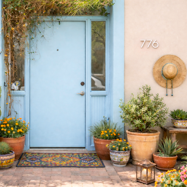
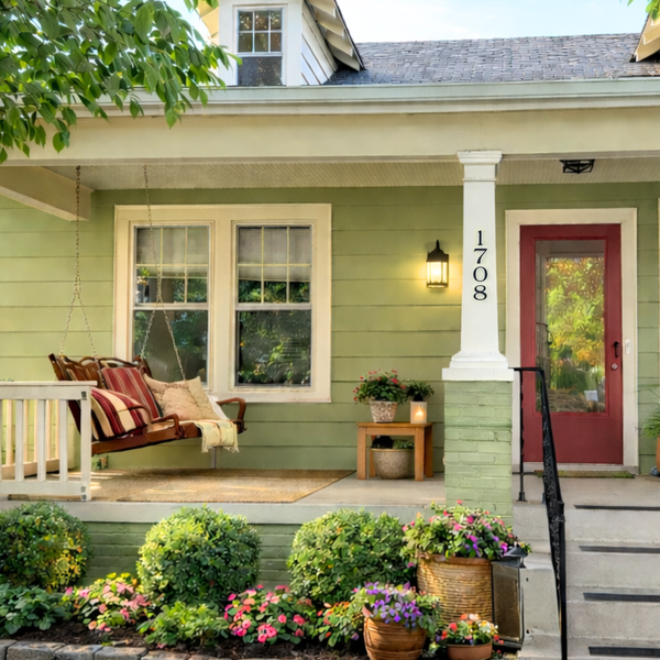
From the Modern House Number Mailbag: "Which of your modern fonts is the most popular?" A great question! Our font options have been carefully chosen to look great anywhere you choose to install them. Among the seven options, our most popular font style has midcentury modern roots and timeless appeal.

|
 |
6" Palm Springs Numbers | 5in circle plaques, Palm Springs font
From numbers and letters to plaques our most popular font style is 'Palm Springs'! This font, found on every architectural style imaginable, is extremely popular for a variety of reasons.
Inspired by the architecture and signage of Architect Richard Neutra, our 'Palm Springs' style is iconic and timeless.
'Palm Springs' has clean lines that create better legibility. It's also very open and approachable. In our 'Palm Springs' style, the zero is perfectly round, and not an oval like other modern fonts. This defining element is also found in the numbers "6", 8", and "9", makes for lots of "breathing room" and is a large part of why it is so iconic.

Palm Springs font, Brushed Aluminum
'Palm Springs' is pleasing to the eye, easy to read and, is a san serif font, which makes it instantly modern. The inspiration for this font style comes from the work of renown midcentury architect Richard Neutra whose approach to design was functional and holistic, including the signage.

The numbers, letters and symbols in this font style are stylish and timeless. This font will compliment any home or business, from traditional to contemporary. For these reasons, 'Palm Springs' remains a popular and appealing option for projects around the world.
If you're curious, our second most popular style is 'SoCal'. This font is modern, with art deco roots. Preview your numbers and letters in each of our stylish font options before you purchase. It's fun, and it a great tool to help visualize how your combination will look.
...
"Although better known for his residential buildings, Richard Neutra’s commercial projects nevertheless resonate the same holistic ecology—unity with the surrounding landscape and uncompromising functionalism. His attention to detail even extended to the selection of signage for his buildings. It is no wonder that Neutra specified lettering that was open and unobtrusive, the same characteristics which typified his progressive architecture." - House Fonts foundry


