The font you choose for a plaque is more than just a design detail, it defines how your message is seen, understood, and remembered. Whether you're designing house numbers, a nameplate, or a commemorative sign, the right typeface can elevate your plaque from ordinary to exceptional.
A well-chosen font improves readability, matches the setting, and enhances curb appeal or emotional impact. But picking the best one can be overwhelming with so many styles available. This guide’ll break down practical tips to help you choose the perfect font that balances form, function, and personal style.
Understand the Purpose of the Plaque

Choosing the right font starts with understanding what your plaque is meant to communicate. Each plaque serves a unique purpose, some are functional, others are symbolic or decorative. By identifying the primary goal, you can narrow down your font choices to those that align with the message and setting.
Consider these purposes when selecting a font:
-
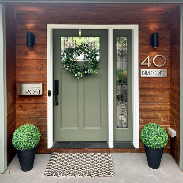
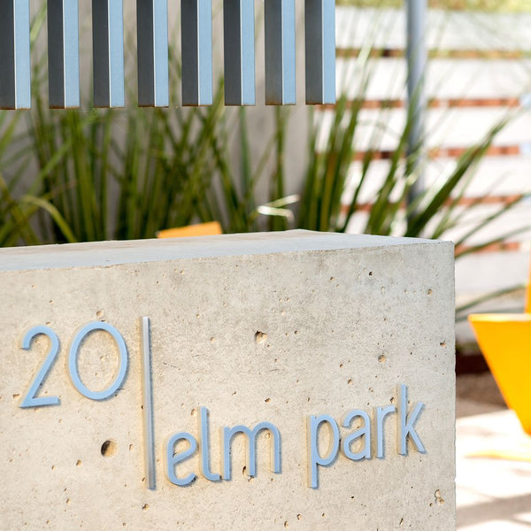
House Numbers: Go for clean, modern fonts that offer high readability from a distance.
-
Memorial or Dedication Plaques: Choose serif or script fonts that convey formality and respect.
-
Decorative or Thematic Plaques: Opt for bold or unique fonts that reflect your home’s style.
-
Business or Commercial Plaques: Use professional, legible fonts that support brand identity.
Your font should feel appropriate to the plaque's use, something that communicates meaning as clearly as the words themselves. Starting with purpose ensures the design remains both functional and meaningful.
Clarity First: Ensuring Your Plaque Is Legible

No matter how stylish a font looks, it must be easy to read. Readability ensures that your plaque serves its purpose, whether it’s helping guests find your house or commemorating an important message. Always assess visibility from a distance and in different lighting conditions.
Key tips to improve readability:
-
Use Clear Typeface Styles: Stick with clean fonts like Arial, Helvetica, or Futura.
-
Avoid Overly Scripted or Complex Fonts: These can be hard to read, especially at small sizes.
-
Consider Bold or Medium Weights: Thin fonts may disappear in outdoor light or shadow.
-
Test Visibility at a Distance: Check if the font is still legible from the sidewalk or street.
A well-chosen font combines beauty with function. Prioritizing readability ensures your plaque is not just decorative but also effective and accessible.
Pair the Right Font with the Right Material

The material of your plaque plays a big role in how the font looks and lasts. Some fonts work better with certain surfaces, helping maintain readability and style over time. Matching the right font to your material ensures a balanced, professional finish.
Here are some smart pairings:
-
Metal Plaques: Stick to bold, clean fonts. Fine lines can get lost during engraving, so choose a typeface that stands out and stays sharp.
-
Wooden Plaques: Serif or script fonts add a timeless touch. Just make sure they’re not too detailed, as wood grain can reduce clarity.
-
Glass or Acrylic Plaques: Opt for sleek, minimalist fonts. Their clean lines enhance the smooth, modern look of clear or frosted materials.
If possible, test your font choice on a sample piece of the material to check clarity and style before final production.
Consider Font Size and Viewing Distance

Where your plaque will be displayed, and how far away it will be viewed, should guide your font size and weight. A beautifully designed font means little if it’s too small to read or too large for its space.
Key tips to keep in mind:
-
Long-Distance Viewing: Choose large, bold fonts for plaques mounted on walls, fences, or exterior entrances. These are easier to read from across the street or driveway.
-
Close-Up Plaques: For plaques installed at eye level, like commemorative or desk-mounted pieces, you can explore smaller or more intricate fonts.
-
Balanced Proportions: Always ensure the font size complements the plaque’s overall dimensions; too small looks underwhelming, while too large may appear cramped.
Print a paper version at actual size and view it from your intended distance to check for readability before finalizing your design.
Align Your Font with the Surrounding Aesthetic

Your plaque’s font should feel like a natural extension of the space it occupies. Choosing a font that complements the surrounding environment ensures visual harmony and a stronger design impact.
Here’s how to match font styles with different settings:
-
Modern Spaces: Opt for sleek, sans-serif fonts like Futura, Century Gothic, or Helvetica Neue. These clean lines suit minimalist and contemporary architecture.
-
Traditional Environments: Fonts with classic elegance, such as Times New Roman, Garamond, or Georgia, convey formality and timelessness, ideal for historic buildings or memorials.
-
Rustic or Vintage Settings: Handwritten or script fonts like Great Vibes, Pacifico, or Lora provide warmth and personality, enhancing the handcrafted charm of wood, brick, or reclaimed spaces.
Consider nearby signage, architectural details, and your plaque’s mounting surface to ensure cohesive visual flow.
Limit the Number of Fonts Used

Using multiple fonts on a single plaque can quickly clutter the design and reduce readability. To maintain a clean, cohesive look, it’s best to stick to one font style or, at most, pair two complementary fonts.
Here are a few key tips:
-
Stick with simplicity: One well-chosen font is usually enough to convey your message clearly and stylishly.
-
Pair wisely: If using two fonts, combine a serif with a sans-serif to create contrast without conflict.
-
Avoid visual noise: Too many font styles can make even the most thoughtful plaque appear unprofessional or confusing.
Keeping font choices minimal ensures that your message stands out, and your plaque looks refined, not chaotic.
Test Before Finalizing

Before finalizing your plaque design, it’s essential to test your chosen font. A mock-up helps you visualize how the text will appear in real-world conditions, ensuring it’s both attractive and readable.
Key steps to follow:
-
Create a full-scale preview of your plaque with the selected font.
-
Check readability from the intended viewing distance and under different lighting conditions.
-
Adjust spacing and alignment to improve balance and visual appeal.
-
Solicit feedback from others to gain perspective on clarity and aesthetics.
Taking time to test prevents costly errors and ensures your plaque delivers its message with style and precision.
Seek Professional Advice
When in doubt, consulting with design experts or plaque manufacturers can make all the difference. Their experience allows them to recommend fonts and styles that best suit your plaque’s purpose and material.
Benefits of seeking professional advice include:

-
Access to expert knowledge on font suitability and engraving techniques.
-
Samples and templates to visualize how fonts appear on different materials.
-
Guidance on compliance and durability, ensuring your plaque stands the test of time.
-
Insight into current design trends to keep your plaque modern and relevant.
-
Customized solutions tailored to your specific project needs and environment.
Partnering with professionals ensures your final product is both visually appealing and functional, reducing guesswork and enhancing satisfaction.
Frequently Asked Questions
1. Why is font legibility important for plaques?
Legibility ensures your plaque can be easily read from a distance, which is crucial for identification and aesthetic appeal. Simple, clean fonts like Palm Springs or Times New Roman Bold provide clarity without sacrificing style.
2. How does the plaque material affect font choice?
Different materials suit different fonts. For example, natural slate pairs well with thin, elegant scripts like Pouty Script, while limestone looks best with bold fonts like Berling Bold due to its deeper engraving capabilities.
3. Should I choose a serif or sans-serif font for my plaque?
Both can work depending on style and readability. Serif fonts like Times New Roman offer a classic, formal look, while sans-serif fonts such as Futura or Helvetica provide a modern, clean appearance that suits many home styles.
4. How does font spacing impact the plaque’s appearance?
Fonts with good spacing between letters and numbers improve readability and prevent a crowded look. For example, Helvetica is praised for balanced spacing, making plaques look neat and easy to read.
5. Can decorative or script fonts be used on plaques?
Yes, but with caution. Decorative or script fonts add elegance but require appropriate plaque size and material to maintain legibility. Thin scripts work well on smooth materials like slate, but may be hard to read if letters are too close or the surface is rough.
Selecting the Perfect Plaque Font

Choosing the right font for your plaque combines creativity with practical considerations. By focusing on the plaque’s purpose, material, size, placement, and the surrounding environment, you can find a font that truly enhances both its message and visual appeal. Always prioritize readability, create mock-ups to test your choices, and consult professionals when in doubt.
For premium, customizable plaque fonts and quality materials that bring your vision to life, explore Modern House Numbers. Their expert craftsmanship and wide selection of plaques ensuring your design looks perfect and lasts for years.