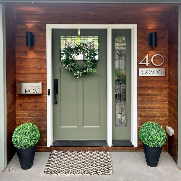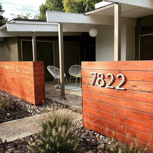
When you think about your home’s curb appeal, your house number sign might not be the first detail that comes to mind. Yet that little plaque or set of characters plays a big role. Getting the layout right often means combining numbers, letters, and symbols in a clear and attractive way.
If you’re looking for a guide to match symbols with your house numbers and letters properly, this is the only guide you need.
Continue reading to explore how you can make your house numbers and symbols both stylish and unmistakably clear.
Why Proper Symbols Enhance Your Home’s Curb Appeal

When you invest in a stylish address marker, you send a message about your home’s character. A sign with clear, well‑chosen symbols not only looks polished but also:
-
Enhances visibility. Clean symbols paired with bold numbers guide visitors and emergency services straight to your door.
-
Reflect your style. Sleek modern glyphs or classic block letters can complement any architectural theme.
-
Increases resale value. Thoughtful exterior details show buyers you cared about every design choice.
Symbols act as visual cues. A subtle slash for a fractional unit or a crisp hyphen in a hyphenated number keeps the sign from looking cluttered. And when you combine metal letters and numbers with your chosen symbol style, you reinforce a unified look that feels both intentional and elegant.
How to Choose the Right Symbol for Your Address
Not every symbol is created equal, and picking the right character type can streamline production and guarantee that your sign meets postal guidelines.
Use Dashes for Hyphenated Numbers

Dashes are perfect when your official address incorporates a letter or unit designation directly after the primary number. For instance, 150‑A calls out a distinct unit without adding clutter. Keep these tips in mind:
-
Use a single dash. Avoid fancy ornamental dashes that may not cut cleanly in metal or acrylic.
-
Always match the size. Your dash should align with the height of your numbers and letters.
-
Position the dash precisely and center it between the number and letter to preserve balance.
Use Slashes for Fractions

If your address includes a fraction like 123 1/2 Main Street, a slash is the only way to represent that extra half‑unit.
Here’s what you should do to avoid confusion:
-
Use a clear forward slash. Backslashes or diagonal bars can look unintended.
-
Eliminate extra spacing. “1/2” should read as one unit, not “1 / 2.”
-
Consider scale. In smaller sign kits, a tiny fraction can become illegible, so pick a size that stays crisp.
Use Letters and Alphanumeric Ranges

Buildings with multiple units sometimes need lettered ranges, such as 100–198 (e). When you work with alphanumeric sequences, you should:
-
Keep the range format consistent. Both ends of a range must share the same format. For example, 10A–20A.
-
Limit letter changes to the final position. Sequences like 10AB–10AD look clean; avoid 010AA–010BA, as it breaks visual flow.
-
Match symbol style. If you use a hyphen for ranges, mirror that look in both numbers and letters.
What Formatting Rules Should I Follow?
Beyond choosing symbols, how you combine them with your numbers and letters affects readability and compliance.
Follow these guidelines below:
-
Numeric digits only
Stick to plain Arabic numerals for the core address. -
Single punctuation use
Limit punctuation to one symbol: a hyphen for hyphenated numbers, a slash for fractions, or a simple en dash for ranges. -
No filler characters
Avoid parentheses, quotation marks, ampersands, and other decorations. These can interfere with automated mail sorting and confuse visitors. -
Standard unit designators
Spell out secondary units such as APT, STE, and FL using USPS‑approved abbreviations. Only use the pound sign if no official designation exists in your ZIP+4 database. -
Uniform font and size
Choose a single font family for numbers, letters, and symbols. Size every character consistently for clean sight lines.
Some Styling Tips for Modern Elegance
Your choice of material, finish, and mounting style can elevate a simple house number into a work of art. Here’s how you can make the most of design options.
Choose Your Material Wisely

Your choice of the material used matters a lot, as custom house numbers and symbols are a long-lasting investment.
-
Aluminum. Being lightweight and rust‑proof, aluminum cuts clean shapes and resists weathering.
-
Stainless steel. For a high‑end finish, go for stainless steel, as it offers a subtle sheen and durable performance.
Acrylic. Available in a spectrum of colors, acrylic works well for bold and flat designs.
Each material pairs differently with symbols. A brushed finish softens hard edges, while polished surfaces create reflection and depth.
Finish and Color Choices

Selecting the right finish can have a huge impact on your home’s facade:
-
Matte black. Provides a strong contrast on light backgrounds.
-
Brushed aluminum. Blends seamlessly with modern hardware.
-
Dark bronze. Complements traditional and craftsman styles.
Coordinating the color of the symbol with the house numbers guarantees that the entire composition is read as a single, cohesive element.
Placement and Mounting Considerations

-
Vertical versus horizontal. Horizontal layouts suit long facades; vertical stacks work well near door frames.
-
Spacing. A good rule of thumb is to keep your house numbers at least half an inch apart. That said, spacing can vary based on the font style and number size you select.
-
Hidden hardware. Use standoffs or flush‑mount clips so screws stay out of sight.
These styling choices help your address sign feel integrated rather than an afterthought. Once the sign is in place, maintaining its appearance is key to lasting appeal.
How to Keep Your Symbols in Top Condition
A beautiful sign deserves long‑term care. With routine checks and simple cleaning, you can preserve its original luster.
-
Dust and debris removal. Wipe symbols and characters with a soft cloth every few weeks.
-
Gentle cleaners only. Mild soap and water work for most surfaces. Harsh chemicals can etch metal and dull finishes.
-
Inspect for loosening. Over time, wind and temperature changes can nudge mounting screws. Tighten them to keep everything flush.
By scheduling quick maintenance sessions twice a year, you’ll protect your investment and keep your home looking fresh.
Common Mistakes and How to Avoid Them
Even small oversights can throw off the look and function of your address sign.

Watch out for these problems:
-
Overcrowding characters. Tight letter spacing hampers readability from the street.
-
Ignoring scale. Tiny fractions or symbols disappear at a distance. Always test legibility from the sidewalk.
-
Unapproved abbreviations. Random shortcuts like “#Apt” may confuse mail carriers. Stick to recognized codes.
-
Neglecting contrast. Pale characters on light siding disappear in daylight. Aim for high contrast to ensure visibility day or night.
Frequently Asked Questions
Where to put house number signs?
Mount your numbers where they’re easy to see from the street and driveway. A good spot is next to your front door or on the wall by your mailbox. Aim for about five to six feet above the ground so delivery drivers and visitors don’t have to bend or strain to read them.
If you have a mailbox near the curb, adding a smaller set of numbers there can help drivers find you more quickly.
Can a house number have letters?
Yes. Letters are often used to designate apartments, units, or building sections—think “12B” or “150‑A.” Just keep the letter right next to the number with no space in between. Use uppercase letters that match your main house‑number font so everything looks uniform and stays easy to read.
What is the best font for house numbers?
Choose a simple sans‑serif font with clear, open shapes. Fonts like Helvetica, Futura, or DIN are great because their straight lines and even proportions make numbers stand out at a glance. Avoid overly decorative or script‑style fonts. They may look nice up close but can be hard to read from the street.
What is the best color for house numbers?
Go for high contrast. If your home’s exterior is light, choose dark numbers—black or dark bronze work well. On a dark facade, white or brushed aluminum pops. Reflective or backlit finishes can add extra visibility at night. Pick a color that complements your home’s palette but still jumps out against the background.
Do house numbers need to be lit?
You don’t have to light your house numbers, but illumination makes them easier to spot after dark. A small spotlight, backlit numbers, or reflective finishes can boost visibility for delivery drivers and emergency crews. If your street is dim, adding light helps ensure people find you without delay.
Revitalize Your Home with Thoughtful Symbols

Your address sign may seem like a small detail, but it’s often the first thing people notice. Choosing clear symbols, sticking to proven formatting rules, and keeping your sign well‑maintained make it easy for visitors to find you and give your home a welcoming look.
Ready to upgrade your curb appeal? Browse the wide selection of high‑quality numbers, letters, and symbols at Modern House Numbers. From sleek metal arrows and fractions to other specialty characters, you’ll find everything you need to craft an address sign that speaks to your style and stands the test of time.


