 Numbers + Letters
 QuickShip
 Plaques
 Decals
 Custom
 Trade



Modern wayfinding signage is the system of signs, maps, and visual cues, built from strategic typography, color, and materials, that guides people through physical spaces while reinforcing brand identity. In 2026, this discipline sits at the intersection of design psychology, accessibility law, and rapidly advancing display technology, with the signage market growing steadily as digital and interactive solutions expand.
This guide covers the design principles and aesthetic trends shaping modern signage, the materials and technology transforming how signs function, the sustainability and compliance standards now governing installations, and the practical ways branding, planning, and property type shape real-world wayfinding decisions.
Design and aesthetics form the foundation: clarity, legibility, and color hierarchy determine whether a sign works, while minimalist, monochrome, and architecturally integrated styles define the current visual language. Bigger, bolder typography paired with neutral finishes now dominates, replacing decorative clutter with confident, purposeful forms.
Materials and technology are converging around durability and responsiveness. Recycled aluminum and weather-resistant finishes deliver longevity outdoors, while digital kiosks, QR codes, and NFC tags connect static signs to real-time data, letting property managers choose between static and digital solutions based on traffic and update frequency.
Sustainability and ADA compliance increasingly shape material and placement decisions from the outset rather than as afterthoughts. Braille spacing, tactile character requirements, and recycled-content standards now function as design constraints that skilled specifiers build around, not obstacles that limit creativity.
Branding, planning, and property-specific strategy tie these elements together. Whether reinforcing a hotel's identity, auditing an existing building's signage, or selecting the right approach for a single-family home versus a mixed-use development, cohesive numbers, letters, and plaques create the visual consistency that separates functional signage from a true wayfinding system.
What Is Modern Wayfinding Signage and Why Does It Matter?

Modern wayfinding signage is the system of signs, maps, and visual cues that guide people through a physical environment using strategic design, color, and typography. Its role in 2026 spans user experience, brand identity, and accessibility, covered in the sections below.
How Do We Define Wayfinding Signage in Contemporary Built Environments?
Wayfinding signage is the combination of signage design, map design, symbols, color, and typography used to navigate people through a space, with particularly important applications in built environments. Wayfinding is not simply about directions; it represents a brand-guided journey that delivers a cohesive and visually engaging experience. Color plays a defining role in this system: red signals energy and boldness, blue conveys trust and professionalism, and green represents growth and freshness. This matters because minimal-effort wayfinding reduces cognitive load and emotional stress in unfamiliar environments; research from the MDPI International Journal of Geo-Information found that visitors frequently fixate on non-informative structural features while overlooking existing wayfinding cues. For small properties such as private offices, single-building clinics, or boutique retail spaces, signage systems typically cost between $2,000 and $5,000. This demonstrates that even modest wayfinding investments carry real financial stakes tied to design accuracy.
Why Is Wayfinding Signage More Critical Than Ever for User Experience?
Wayfinding signage is more critical than ever because navigation failures carry measurable financial and emotional costs while digital expectations continue rising. An early study at Emory University Hospital estimated that poor wayfinding wastes more than $400,000 annually (in 2021 dollars), primarily through lost staff time and missed appointments, according to SEGD. This cost pressure coincides with rapid market expansion: the global signage market reached USD 37.8 billion in 2025 and is projected to hit USD 39.4 billion by the end of 2026, growing at a 4.3% CAGR, per Future Market Insights. The dynamic wayfinding signage segment is growing even faster, expected to expand from USD 2.42 billion in 2024 to USD 7.93 billion by 2033 at a 13.7% CAGR, according to DataIntelo.
Several forces are converging to raise the stakes for 2026:
- Design confidence: Minimalist signage is becoming bigger, bolder, and more confident, featuring clean typography and strong proportions.
- Texture and tactility: Sketched elements, bold typography, and tactile finishes are emerging trends.
- Brand consistency: High readability paired with consistent branding is now essential to interior signage as a brand experience.
A wayfinding audit, a structured, evidence-based assessment of navigation effectiveness across architectural layout and signage condition, should be conducted post-construction, during organizational changes, or every three to five years as periodic review, according to Plotstuff. Digital signage costs 10 to 15 times more upfront than static signage, yet long-term brand value and cost savings often justify the investment. In practice, this means businesses that treat wayfinding as decoration rather than infrastructure are the ones absorbing avoidable costs. Multifamily properties increasingly hire wayfinding specialists to simplify navigation and improve resident experience, while hospitality environments rely on signage, from entrance markers to interior wayfinding, to shape unforgettable guest experiences. SEGD, the Society for Experiential Graphic Design, has guided this discipline for over fifty years. A well-executed wayfinding plan builds trust and comfort by reducing confusion, pre-framing the visitor's entire experience as positive.
How Do Wayfinding, Branding, and Accessibility Intersect Today?

Wayfinding, branding, and accessibility intersect through environmental graphic design (EGD), a discipline that is transforming from traditional signage into a dynamic, multi-sensory practice. Modern systems no longer treat navigation, brand storytelling, and inclusive design as separate concerns; they are engineered together from the outset. For homeowners and property professionals, this means even entry-level signage, such as address numbers and plaques, should be selected with the same attention to legibility and brand cohesion applied to large-scale commercial systems. Getting this intersection right early prevents costly retrofits later.
With definitions, market context, and this branding-accessibility overlap established, the next section examines the specific design principles that make wayfinding signage effective in practice.
What Are the Most Important Design Principles for Effective Wayfinding Signage?
The most important design principles for effective wayfinding signage are clarity, legibility, typographic contrast, color hierarchy, and thoughtful scale and placement. This section covers:
- Clarity, legibility, and readability
- Typography, contrast, and color hierarchy
- Scale, placement, and sightlines
How Do Clarity, Legibility, and Readability Shape Modern Wayfinding?
Clarity, legibility, and readability shape modern wayfinding by determining how quickly people orient themselves, make navigational decisions, and move confidently toward a destination. According to research published in the MDPI International Journal of Geo-Information, successful wayfinding depends on environmental legibility, meaning intuitive spatial hierarchies, clearly identifiable landmarks, and consistent visual cues throughout a building or site. The same research identifies affordance, coherence, and legibility as the three foundational design principles guiding effective wayfinding. Signage that fails on any of these fronts forces visitors to pause, backtrack, or ask for directions, undermining the system's purpose. Legibility issues are often the most common failure point: text sized for a brochure frequently becomes unreadable at hallway or parking-lot distances.
What Role Do Typography, Contrast, and Color Hierarchy Play in Wayfinding Design?
Typography, contrast, and color hierarchy play a foundational role in wayfinding design by making signage communicate before it decorates. Effective systems pair legible sans-serif fonts with standard color associations, such as green for exits, red for emergency notices, and blue for information, plus universal symbols that cross language barriers. According to the U.S. Access Board, tactile signs must carry raised characters repeated in Grade 2 braille alongside non-glare finishes and strong color contrast for visual accessibility. Color psychology reinforces this hierarchy: warm tones signal energy and urgency, while cool tones signal calm and trust, helping designers assign meaning at a glance. Oversized decorative type without contrast remains a common, costly mistake that defeats a sign's entire purpose.
How Should Scale, Placement, and Sightlines Influence Signage Layouts?
Scale, placement, and sightlines should influence signage layouts by determining whether a sign is seen and acted on before a visitor changes direction. Type size must scale to viewing distance and walking speed, growing bolder from afar and finer up close. Placement works best at true decision points, such as intersections, entrances, and elevator lobbies, rather than mid-corridor. Sightlines dictate mounting height and angle, keeping signs visible above crowds, furniture, or landscaping. The most common layout mistake is designing each sign as a standalone graphic instead of part of a connected system that reinforces every decision point along the route. These layout principles set the stage for the material and finish choices covered next.
Which Aesthetic Trends Are Defining Modern Wayfinding Signage?

Modern wayfinding aesthetics center on minimalism, monochrome palettes, and architectural integration. These three trends work together to make signage feel less like an add-on and more like a natural extension of a building's design language.
How Is Minimalist, Modern Design Influencing Wayfinding Systems?
Minimalist design is influencing wayfinding systems by stripping signage down to essential typography, clean geometry, and purposeful negative space. This aesthetic did not emerge overnight.
Airports were early adopters of this simplified approach. Airport Technology notes that during the 1960s through the mid-1970s, airport signing systems relied on permanent, static installations, such as directional arrows mounted on stands or fastened to walls. That same restraint defines wayfinding, but with sharper proportions and more confident finishes.
In the residential and small-commercial space, this translates to fewer decorative flourishes and more emphasis on clean, legible number and letter forms that read clearly from the street or hallway. Minimalism works because it removes visual noise, letting the essential navigational information do the work.
Why Are Monochrome and Neutral Palettes So Popular in Wayfinding?
Monochrome and neutral palettes are popular in wayfinding because they prioritize legibility and blend seamlessly with varied architectural styles rather than competing with them. Black, white, matte bronze, and brushed metal tones dominate exterior and interior signage alike, allowing typography and form to carry the visual weight instead of color.
This shift reflects a broader design philosophy: wayfinding should communicate first and decorate second. Neutral finishes also age well, avoiding the dated look that trend-driven color choices can create within a few years. A charcoal or matte black number set, for instance, reads as timeless against brick, stucco, or glass facades in a way that bright accent colors rarely do.
From a practical standpoint, neutral palettes reduce design risk for homeowners and property managers who want signage that complements future renovations rather than clashing with them.
How Are Architectural House Numbers and Letters Being Integrated Into Wayfinding Aesthetics?
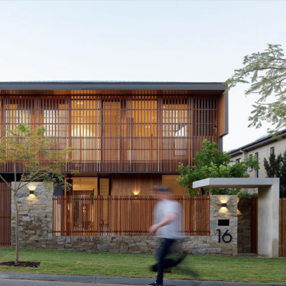
Architectural house numbers and letters are being integrated into wayfinding aesthetics by treating them as design elements rather than purely functional labels. Instead of generic stamped numerals, homeowners and design professionals are choosing solid, dimensional numbers and letters that echo a building's material palette, whether that means matching brushed aluminum against a modern facade or contrasting bronze tones against warm stucco.
Modern House Numbers approaches this integration directly, offering architect-designed numbers, letters, and plaques crafted from solid, recycled aluminum in finishes and fonts selected to complement contemporary and mid-century architecture alike. Each piece is made to order, which allows the numeral style, size, and finish to align with a property's specific sightlines and material story rather than defaulting to a one-size-fits-all option.
This kind of intentional detail signals that address signage is no longer an afterthought. It has become a legitimate extension of a home's architectural identity, small in scale but significant in visual impact.
How Are Materials and Finishes for Wayfinding Signage Changing?
Materials and finishes for wayfinding signage are shifting toward durable metals, sustainable compositions, and tactile finishes that balance longevity with environmental responsibility. This section covers weather-resistant exterior materials, recycled metal choices, and trending textures shaping both indoor and outdoor signage systems.
Which Durable and Weather-Resistant Materials Are Best for Exterior Wayfinding?

The most durable and weather-resistant materials for exterior wayfinding are aluminum and PVC. Solid aluminum sheet resists rust and weathering over the long term, making it ideal for regulatory signage, street and parking signs, and directional markers, according to Vanderbilt Printing Services. PVC signage withstands strong winds, intense sunlight, and heavy rain without warping, giving it lasting durability outdoors. LEED-certified buildings encourage projects to use materials free of PVC plastics and formaldehyde glues, since these release toxins when burned. Beyond material choice, many exterior systems pair signs with QR codes or NFC tags: QR suits broad, cost-sensitive campaigns, while NFC delivers premium, secure, data-rich experiences. For homeowners, aluminum offers the best long-term value for addressing signage exposed to the elements.
How Are Recycled Metals and Sustainable Materials Shaping Signage Choices?
Recycled metals and sustainable materials are shaping signage choices by offering durability without sacrificing environmental responsibility. Aluminum ranks among the most recycled materials on the planet, and its rust-proof, durable properties make it a popular signage choice, according to Square Signs. Recycled aluminum specifically resists corrosion, keeping signage strong even in high-traffic or harsh weather environments. Demand for eco-friendly signage has increased industry-wide, driving adoption of recyclable materials, sustainable printing substrates, and low-impact inks. Manufacturers are also focused on minimizing energy consumption, water usage, and waste generation during production. Tactile braille signage, meanwhile, relies on materials such as photopolymer, acrylic, stainless steel, aluminum, and brass. Recycled aluminum is quickly becoming the material of choice for architects seeking sustainability without compromising longevity.
What Finishes and Textures Are Trending for Modern Indoor and Outdoor Wayfinding?
The finishes and textures trending for modern indoor and outdoor wayfinding are matte and brushed metal surfaces, powder-coated finishes, and raised dimensional lettering that adds tactile depth. These finishes reduce glare while creating a more sculptural, architectural presence than flat printed signs. Brushed aluminum and bronze-toned coatings pair well with contemporary facades, while matte black remains a favorite for minimalist commercial interiors. This emphasis on texture is not new. For homeowners, a dimensional, textured finish signals quality that flat printed signs cannot match. These material and finish choices set the stage for the technology reshaping wayfinding signage next.
How Is Technology Transforming Wayfinding Signage?
Technology is transforming wayfinding signage through digital displays, interactive kiosks, and integrated mobile tools that connect physical signs to real-time data. This section covers interactive displays, QR code and NFC integration, and how to choose between static and digital solutions for different environments.
In What Ways Are Digital and Interactive Displays Enhancing Wayfinding?
Digital and interactive displays enhance wayfinding by replacing static maps with touch-enabled kiosks that update in real time. Interactive kiosks now integrate touch interfaces, real-time data feeds, and mobile app connections, giving visitors turn-by-turn guidance on-screen. Smart building sensors add another layer, feeding kiosks live data on crowd levels, elevator availability, and space occupancy so directions adjust automatically. For large campuses, hospitals, and mixed-use developments, this real-time responsiveness reduces wasted movement and keeps navigation accurate even as conditions change.
How Are QR Codes, NFC, and Mobile Wayfinding Apps Being Integrated With Physical Signs?
QR codes, NFC, and mobile wayfinding apps are being integrated with physical signs through embedded codes and tags that link static signage to digital content. According to 3D Wayfinder, integrating QR codes into wayfinder software enhances the user experience by seamlessly connecting the physical environment with digital information. A visitor scans a code on a directory sign or door plaque, and a mobile app opens turn-by-turn directions, building information, or accessibility details instantly. NFC tags work similarly but require only a tap, making them useful for premium or high-traffic locations such as multifamily lobbies and hospital corridors, where signs must do more than point; they must connect residents and patients to real-time digital guidance without replacing the physical sign itself.
When Should You Choose Static Versus Digital Wayfinding Solutions?
You should choose static versus digital wayfinding solutions based on the space's need for frequent updates, budget, and traffic complexity. Static signs suit simple, single-purpose spaces such as small offices or single-family homes, where directions rarely change and low upfront cost matters most. Digital signage fits larger, fast-changing environments, such as hospitals, campuses, and mixed-use developments, where wayfinding needs adjustments in real time. According to Market.us, the digital wayfinding solutions market is projected to grow from $1.17 billion in 2024 to $2.9 billion by 2034, a 9.50% CAGR. For homeowners and small properties, static, well-designed signage remains the smarter investment. Sustainability and compliance standards further shape which wayfinding materials perform best.
How Do Sustainability and Compliance Impact Wayfinding Signage?
Sustainability and compliance now shape wayfinding signage decisions as much as aesthetics, since certifications, ADA mandates, and material choices affect design outcomes. This section covers sustainability certifications, ADA accessibility requirements, and balancing eco-friendly materials with durability.
What Sustainability Standards and Certifications Apply to Wayfinding Signage?
Sustainability standards and certifications that apply to wayfinding signage include LEED building certification credits, low-VOC material guidelines, and recycled-content standards for aluminum and other metals. Many commercial and institutional projects now require signage vendors to document material sourcing and manufacturing processes to qualify for green building points. Certifications typically evaluate factors such as material recyclability, use of non-toxic adhesives and coatings, and reduced waste during production. For property owners and designers, these standards increasingly function as procurement checkpoints rather than optional add-ons. Choosing signage that meets recognized certification criteria can support broader building sustainability goals without compromising design quality.
How Do ADA and Accessibility Requirements Shape Signage Design and Placement?
ADA and accessibility requirements shape signage design and placement by dictating tactile character specifications, braille spacing, and mounting locations. According to Nova Polymers, braille must be separated by at least 3/8 inch from any other tactile characters, raised borders, or decorative elements to ensure readability. These precise spacing rules prevent tactile confusion for visually impaired users navigating unfamiliar buildings. Beyond compliance mechanics, wayfinding and signage improve how spaces function and feel, supporting accessibility, reducing confusion, and reinforcing the identity of a place. Designers who treat ADA requirements as design constraints, rather than afterthoughts, typically produce signage systems that serve every user more effectively. This makes ADA compliance a design asset, not a barrier, for skilled specifiers.
How Can You Balance Eco-Friendly Materials With Long-Term Durability?
Eco-friendly materials can be balanced with long-term durability by choosing recycled aluminum, which combines environmental responsibility with proven weather resistance. According to SF Bay Signs, aluminum signs last 7 to 15-plus years and are the gold standard for permanent outdoor signage, offering strength, weather resistance, and cost-effectiveness. This durability reduces replacement frequency, lowering the material waste tied to frequent sign production. Sustainable signage decisions should prioritize lifecycle performance over upfront material cost alone. A sign lasting fifteen years on recycled aluminum outperforms cheaper alternatives requiring frequent replacement, both financially and environmentally. Experienced specifiers increasingly treat durability itself as a sustainability metric, not a separate consideration. With sustainable, compliant materials selected, attention turns to how signage reinforces brand and architecture.
What Role Do Branding and Architecture Play in Wayfinding Signage Systems?
Branding and architecture shape wayfinding signage by turning functional direction-giving into a cohesive brand experience that respects a building's structural design. Together, they influence material choice, color systems, and placement. The sections below cover brand reinforcement, architectural alignment, and how custom numbers and letters unify these families.
How Can Wayfinding Signage Extend and Reinforce a Brand Identity?

Wayfinding signage extends brand identity by pairing functional guidance, such as directions to exits, restrooms, and specific destinations, with consistent visual branding elements. According to National Branding, wayfinding signage helps people navigate through a building or space while identifying key locations along the way. Beyond function, signage carries brand personality: hotels increasingly integrate ambient visuals and storytelling into their wayfinding systems, per Identity Group, transforming a simple direction into a branded moment. Miller EG Design notes that properly designed signage makes navigation intuitive, reduces confusion, and reinforces a hotel's brand identity simultaneously. Civic Brand describes this broader effect as turning infrastructure into identity, aligning design, policy, and activation into one experience. In practice, brands that treat signage as a storytelling touchpoint, not just a directional tool, see stronger recall and guest satisfaction.
How Should Signage Align With Architectural Lines, Materials, and Sightlines?
Signage should align with architectural lines, materials, and sightlines by matching a building's structural style rather than competing with it. According to Monigle, signage is integrated with each building's design, using materials and lighting that complement the surrounding architecture. This means a sign's finish, mounting angle, and scale should echo existing sightlines, columns, and facades instead of standing apart from them. When designers treat signage as an architectural extension rather than an add-on, buildings read as more intentional and polished. This alignment also reduces visual clutter, letting sightlines guide movement naturally through a space.
How Can Custom Numbers, Letters, and Plaques Create Cohesive Wayfinding Families?
Custom numbers, letters, and plaques create cohesive wayfinding families by repeating consistent fonts, finishes, and materials across every touchpoint in a property. When address numbers, unit letters, and directional plaques share the same design language, visitors instantly recognize the brand's visual system, whether at a shopping center pylon or a building entrance. This consistency matters most in multi-level environments such as malls and parking garages, where pylons, hanging signs, and side flags must work together for orientation. Matching materials and typography across these elements strengthens both brand recognition and navigational clarity throughout the property.
How Should Wayfinding Signage Be Planned and Implemented in New and Existing Spaces?
Planning wayfinding signage requires a structured process: assess the space, define signage needs by zone, select materials and technology, then implement and audit results. This applies whether the project is new construction or an existing site with outdated signage. The following steps cover planning, auditing, and common mistakes to avoid.
What Are the Key Steps in Planning a Comprehensive Wayfinding System?
The key steps in planning a comprehensive wayfinding system are site assessment, stakeholder consultation, signage hierarchy mapping, design and material selection, and phased installation with post-occupancy review.
- Assess the site's circulation patterns, decision points, and existing landmarks.
- Consult stakeholders, such as facility managers, architects, and end users, to identify pain points.
- Map a signage hierarchy that prioritizes primary, secondary, and tertiary wayfinding cues.
- Select materials and finishes that match the environment's durability and branding needs.
- Install signage in phases, testing key decision points before full rollout.
For new construction, wayfinding planning should begin during early architectural design rather than after construction, since retrofitting signage into a finished space costs more and often compromises sightlines.
How Do You Audit and Improve Existing Wayfinding Signage?
You audit and improve existing wayfinding signage by conducting a structured, evidence-based review of how the space supports navigation. According to Plotstuff, this audit should examine every element that contributes to wayfinding, from architectural layout to the condition, accuracy, and legibility of individual signs.
Audits should be scheduled at specific triggers, such as:
- Before investing in new signage during a pre-refurbishment phase.
- Within three to six months of post-construction occupancy.
- When user complaints signal systemic navigation problems.
- During major organizational or layout changes.
- As part of a periodic review every three to five years.
Improvements typically follow the audit findings: outdated signs get replaced, missing decision-point signage gets added, and inconsistent branding gets unified across the system.
What Common Wayfinding Mistakes Should Designers and Owners Avoid?
The common wayfinding mistakes designers and owners should avoid include inconsistent terminology, sign overcrowding, poor decision-point placement, and neglected maintenance. Specific pitfalls include:
- Mixing terms inconsistently, such as switching between "restroom" and "washroom" across signs.
- Overcrowding signs with excessive text or icons that force users to search for information.
- Placing signs where sightlines are blocked or where they arrive after the decision point.
- Skipping post-installation audits, leaving outdated or damaged signage unaddressed for years.
Maintenance rarely makes the original budget, yet a sign that ages poorly quietly erodes the trust it was meant to build. With planning and audits complete, matching signage ideas to each property type comes next.
How Do Modern Wayfinding Signage Ideas Differ for Homes, Multifamily, and Commercial Projects?
Wayfinding signage needs vary by property type, ranging from simple address identification for single-family homes to layered directory systems for multifamily buildings and dynamic, brand-driven signage for commercial spaces. The following sections cover: 1. Single-family homes and small properties, 2. Multifamily, condos, and mixed-use developments, 3. Offices, retail, hospitality, and public spaces.
What Wayfinding Signage Works Best for Single-Family Homes and Small Properties?
Single-family homes benefit most from clear, well-placed address numbers, entrance markers, and simple directional cues rather than complex sign systems. A visible house number remains the primary wayfinding tool, guiding visitors, delivery drivers, and emergency responders to the correct location. Small properties, such as duplexes or standalone offices, often add a secondary plaque near the entry to confirm the address once a visitor is close.
Material choice matters here: durable metals like aluminum resist weather while keeping a clean, architectural look that complements the home's exterior. Because scale is small, legibility depends on contrast, size, and mounting height more than on elaborate signage hierarchies. For most homeowners, prioritizing a single strong focal point, such as an oversized number or a distinct plaque, outperforms scattering multiple small signs across the property.
How Should Wayfinding Be Approached in Multifamily, Condos, and Mixed-Use Developments?
Wayfinding in multifamily, condos, and mixed-use developments requires a layered system that guides residents and visitors through shared entrances, unit clusters, parking areas, and amenity spaces. Unlike single-family homes, these properties need consistent numbering across buildings, floors, and units to prevent confusion in larger footprints.
Mixed-use developments add another layer, since retail tenants, residential entries, and shared lobbies often coexist on the same site. Effective systems typically include:
- Building and unit identification signs at entrances and hallway junctions
- Directory signage at main lobbies or parking structures
- Consistent visual branding that ties residential and commercial zones together
- Directional signs at decision points such as elevators, stairwells, and courtyards
Consistency across these touchpoints reduces visitor frustration and supports smoother day-to-day navigation for residents.
What Are Smart Wayfinding Strategies for Offices, Retail, Hospitality, and Public Spaces?
Smart wayfinding strategies for offices, retail, hospitality, and public spaces combine thoughtful design, clear communication, and consistent visual cues to guide people efficiently through larger, more complex environments. According to BRL Contracting, effective retail wayfinding depends on this combination to keep customers moving confidently through a space rather than searching for direction.
Each setting has distinct priorities:
- Offices rely on directory boards, room numbering, and clear circulation paths for staff and visitors.
- Retail spaces use directional signage, department markers, and entrance cues to shape the customer journey.
- Hospitality environments blend wayfinding with brand storytelling at lobbies, elevators, and guest room corridors.
- Public spaces depend on high-visibility signage and universal symbols to serve diverse, often first-time visitors.
Because these environments serve large volumes of unfamiliar users, prioritizing clarity over decoration typically produces the strongest navigation outcomes. With these commercial strategies established, creative sign formats offer further ways to personalize wayfinding systems.
What Creative Modern Wayfinding Signage Ideas Can You Use?
Creative wayfinding ideas combine oversized numbers, sculptural plaques and blades, and flexible decals to guide visitors while reinforcing style. Each format solves a different challenge, from bold visibility to budget-conscious flexibility. The following sections break down how to use each creatively.
How Can Oversized Address Numbers and Letters Enhance Visibility and Style?
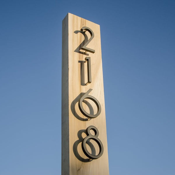
Oversized address numbers and letters enhance visibility by increasing legibility distance while making a strong architectural statement. Larger characters read faster from cars and sidewalks, which reduces hesitation at entrances and driveways. Beyond function, scale becomes a design choice: floating numbers mounted with standoffs cast shadows that add dimension against stucco, brick, or siding, echoing the bold, confident typography trend defined for signage.
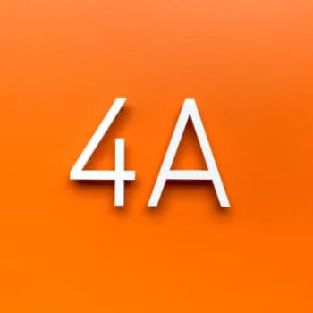
Sans-serif fonts remain the safest choice for oversized characters because their clean strokes stay crisp at a distance and in varied lighting. Pairing large numbers with a matching letter set, such as a unit designation or street name, creates a cohesive family that feels intentional rather than accidental. For homeowners and builders alike, this is one of the simplest upgrades that pairs curb appeal with genuine navigational clarity.
What Are Innovative Ways to Use Plaques, Panels, and Blades in Wayfinding?
Innovative ways to use plaques, panels, and blades in wayfinding include mounting them perpendicular to a path for two-sided visibility, layering materials for depth, and grouping them into directional clusters at decision points. Blade signs, in particular, project outward from walls or posts, allowing approaching visitors to read them well before reaching a doorway.
Panels work well as combination pieces, pairing a street number with a nameplate or unit marker on a single backing for a unified look. Designers increasingly treat these elements as small architectural features rather than afterthoughts, choosing finishes and mounting hardware that echo a building's existing materials.
- Blade signs projecting from walls or posts for two-directional readability
- Layered panels combining numbers, names, and unit markers
- Clustered plaques at pathway intersections to reduce hesitation
- Concealed hardware for a seamless, high-end finish
How Can Decals and Vinyl Graphics Support Flexible, Budget-Friendly Wayfinding?
Decals and vinyl graphics support flexible, budget-friendly wayfinding by offering low-cost, quickly updated identification for curbs, mailboxes, doors, and windows. Unlike cast plaques, vinyl applications can be swapped or repositioned as addressing needs, tenant names, or branding change, making them practical for rentals, multifamily units, and temporary spaces.
Curb stencils and mailbox decals serve as an accessible entry point into a wayfinding system, letting property owners maintain consistent numbering across a site without the cost of custom fabrication for every marker. This flexibility matters industry-wide: SEGD's Wayfinding + Experiential Graphics Professional Practice Group is launching 2025 initiatives focused specifically on icons, budgeting, and collaboration, signaling that cost-conscious, scalable solutions remain a priority across the profession.
In practice, decals work best as a complement to more permanent signage rather than a full replacement, since durability and finish quality still matter for long-term curb appeal. Matching a home or property's number style across both permanent numbers and vinyl decals keeps the wayfinding system visually consistent even when budgets are limited.
How Should You Approach Modern Wayfinding Signage With Architect-Designed Numbers, Letters, Plaques, and Decals?
Approaching modern wayfinding signage means pairing architect-designed elements with materials and finishes built to last. The sections below cover how made-to-order pieces elevate a wayfinding system and summarize the year's key trends.
How Can Modern House Numbers' Made-to-Order Numbers, Letters, Plaques, and Decals Elevate Your Wayfinding System?

Modern House Numbers elevates a wayfinding system by pairing architect-designed numbers, letters, plaques, and decals with handcrafted, made-to-order production. Each piece is precision-crafted from solid, recycled 3/8" thick aluminum, a material chosen for durability and sustainability rather than mass production.
This approach matters because wayfinding, at its core, is a brand-guided journey, not just a set of directions. Modern House Numbers extends that journey to the home or property's entrance by offering seven font options, custom plaques starting at $64.50, and numbers and letters starting at $24.50, all manufactured in Tucson, Arizona.
Every order includes free personalized drilling templates and step-by-step installation instructions, removing the guesswork that often derails DIY wayfinding projects. Concealed hardware keeps the finished look clean and architectural.
In our experience, the first impression a property makes often comes down to how confidently its address is displayed, and that single design decision sets the tone for everything that follows.
What Are the Key Takeaways About Modern Wayfinding Signage Trends and Ideas?
The key takeaways about modern wayfinding signage trends are that minimalism, tactility, and sustainable materials now define the category. According to Signwrite Studios (2026), minimalist signage has become bigger, bolder, and more confident, built on clean typography and strong proportions.
The most important shifts to carry forward are:
- Bolder minimalism: Clean typography and strong proportions now replace cluttered, decorative signage.
- Tactile, textured finishes: Sketched elements, bold typography, and nostalgic imagery are gaining prominence, per FASTSIGNS (2026).
- Simplicity with consistent branding: High readability paired with brand consistency is now essential to interior signage, per Sign Age (2026).
For homeowners and professionals alike, the lesson is clear: durable materials and architect-led design choices outperform trend-chasing every time. Choosing an architect-designed, handcrafted system now, such as those from Modern House Numbers, means wayfinding that stays relevant well beyond 2026.