Modern door number fonts are typeface styles applied to exterior address numerals that shape how a home reads from the street, balancing legibility, code compliance, and architectural character. The right font choice signals design intention from the moment a visitor or potential buyer approaches.
This guide covers font selection and curb appeal impact, popular typeface styles and trends, personalization and sizing principles, materials and finishes, installation best practices, sustainability considerations, and what Modern House Numbers offers for custom address signage.
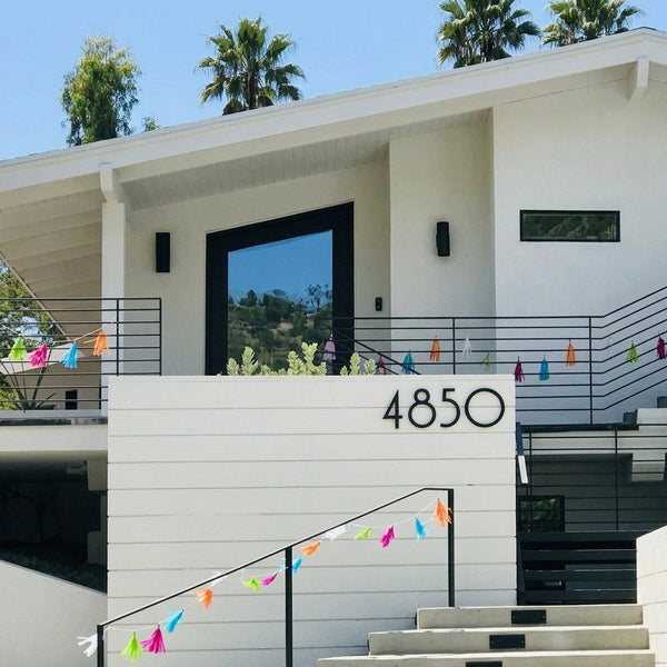
Font style and curb appeal are directly connected. Sans-serif typefaces like Palm Springs, Austin, and SoHo consistently outperform decorative or serif alternatives for street-level legibility, and homes with strong curb appeal sell for measurably more than those with neglected exteriors.
Trending modern fonts range from oversized bold geometric numerals to minimalist block styles, with 2025 and 2026 design directions emphasizing matte finishes, mixed-metal combinations, and floating stand-off mounting that adds dimension to any facade.
Personalization extends beyond typeface alone. Size, letter spacing, finish, and layout all affect how numbers read from a distance, and matching these details to a home's architectural style ensures the address feels designed rather than incidental.
Material and finish selection determine both appearance and longevity. Aluminum and stainless steel resist UV degradation and moisture damage far longer than polymer alternatives, and recycled aluminum delivers the same crisp surface quality as virgin metal with significantly fewer emissions.
Modern House Numbers produces handcrafted, made-to-order address signs in Tucson, Arizona, using architect-curated fonts and solid recycled aluminum, with every order including a personalized drilling template and concealed hardware for a clean, professional result.
Why Do Modern Door Number Fonts Matter for Curb Appeal?
Modern door number fonts matter for curb appeal because font style, size, and finish signal your home's design quality before a visitor reaches the front door. The sections below cover how font styles shape your address's visual identity and what practical factors to weigh when choosing them.
How Do Font Styles Influence the Look of Your Address?
Font styles influence the look of your address by setting the visual tone of your entire facade. A clean sans-serif typeface reads as contemporary and architectural, while a script or ornate font reads as traditional or informal. According to SF Bay Signs, sans-serif fonts maintain legibility at a distance better than decorative alternatives, making them a reliable choice for outdoor address signage.
The font you choose does more than label your home; it communicates design intention. Paired with the right finish and mounting method, even a single-digit number becomes a deliberate architectural detail.
]

What Should You Consider When Selecting Fonts for Door Numbers?
The key factors to consider when selecting fonts for door numbers are legibility, visibility from the street, and architectural compatibility. Numbers mounted at eye level along clean sightlines read most clearly, and illuminated options such as LED backlit numbers extend that visibility after dark. According to site design guidelines for family housing, dwelling numbers should be clearly seen by visitors approaching by car.
Beyond visibility, consider how the font's weight and proportion scale against your door or facade surface. A bold, wide typeface commands attention on a large entryway; a narrower font suits tighter mounting surfaces. Matching font personality to your home's architectural style ensures the numbers feel designed rather than added as an afterthought.
Which Modern Fonts Are Most Popular for Address Numbers?
The most popular modern fonts for address numbers are clean sans-serif typefaces, with Palm Springs, Austin, and SoHo recognized for their legible, uncluttered profiles. The sections below compare sans-serif and serif options and highlight today's top trending styles.
How Do Sans Serif Fonts Compare to Serif Fonts for Door Numbers?
Sans serif fonts outperform serif fonts for door numbers in outdoor readability. According to SF Bay Signs, sans-serif typefaces read better at a distance than serif or decorative fonts for outdoor signage. Serif fonts carry fine strokes and ornamental details that blur at range, especially in low light or from a moving vehicle. For homeowners prioritizing both style and street-level legibility, sans serif is the functionally superior choice, and it also happens to align with the clean, minimalist aesthetic that contemporary architecture demands.
What Are Examples of Trending Modern House Number Fonts?
Trending modern house number fonts include oversized bold numerals, minimalist block styles, and mixed-media letter-based displays. According to Dropcap Studio, emerging trends for 2026 include oversized bold statements, the use of letters alongside numbers, and floating or stand-off mounting that adds dimension. Beyond typeface alone, exterior home upgrades like updated house numbers carry an estimated 75 to 90% return on investment. Choosing a font that balances visual impact with legibility, such as a bold geometric sans-serif, positions your address as both a design statement and a high-value curb appeal upgrade.

How Can You Personalize Modern Door Number Fonts to Fit Your Home's Style?
You can personalize modern door number fonts by adjusting typeface, size, finish, layout, and mounting style to complement your home's architectural character. The sections below cover customization options that enhance uniqueness and the sizing and layout principles that maximize visibility.
What Font Customization Options Enhance Address Uniqueness?
Font customization options that enhance address uniqueness include typeface selection, finish, letter spacing, and mounting style. Pairing a clean sans-serif typeface with a matte black or brushed aluminum finish creates a look distinctly different from standard stamped numerals. For homes with warmer tones, a dark bronze or matte brass finish on a geometric font adds architectural personality. Mixed-metal combinations and stand-off mounting, both noted as rising trends for 2025 and 2026, add dimension and shadow that further distinguish a home's address from its neighbors. Choosing a made-to-order approach, rather than off-the-shelf hardware, ensures that every design detail reflects the home's specific style.
How Can Font Size and Layout Affect Door Number Visibility?
Font size and layout affect door number visibility by determining legibility from the street under both daylight and low-light conditions. According to SF Bay Signs, sans-serif fonts read better at a distance than serif or decorative alternatives for outdoor signage. Larger numeral heights, bold weights, and high contrast between the number and its background all improve identification speed. Horizontal layouts with consistent letter spacing read more easily than stacked or angled arrangements. Matte finishes popular in 2025 trends reduce glare without sacrificing clarity, making oversized bold numbers a practical choice as much as a stylistic one.

What Materials and Finishes Complement Modern Door Number Fonts?

Materials and finishes directly shape how a modern font reads on your home's exterior. The sections below cover how finish choices affect both appearance and longevity, and which materials best support contemporary numeral designs.
How Do Different Finishes Impact Font Appearance and Longevity?
Finishes impact font appearance and longevity by affecting both visual contrast and weather resistance over time. Matte finishes reduce glare, allowing crisp font edges to read cleanly in direct sunlight, while polished or brushed surfaces add depth and a reflective quality that highlights a numeral's geometry. According to Modern House Numbers, aluminum resists UV degradation and moisture damage longer than polymer-based options, making them the most reliable choices for exterior applications. Stainless steel performs particularly well in high-moisture environments where corrosion is a concern. Matte finishes combined with mixed metal combinations are among the top design trends for 2025, reinforcing that finish selection is both a durability and aesthetic decision.

Which Materials Work Best for Contemporary Font Designs?
The materials that work best for contemporary font designs are solid metals, particularly aluminum and stainless steel, because their clean edges and structural integrity preserve the precise geometry that modern typefaces require. Aluminum is especially well-suited: it is lightweight, corrosion-resistant, and holds tight manufacturing tolerances that keep letterforms sharp over years of outdoor exposure. For homeowners who need flexibility, NYC building codes confirm that numbers may also be composed of glass, plastic, or wood, though metals consistently outlast these alternatives in exterior conditions. Choosing the right material is as important as choosing the right font.
What Installation Tips Ensure Modern Door Number Fonts Look Their Best?
Installation tips that ensure modern door number fonts look their best cover two key areas: placement and spacing for readability, and the tools and templates that make precise installation achievable.
How Do Placement and Spacing Improve Readability and Design?
Placement and spacing improve readability and design by positioning numbers where they are most visible and proportionally balanced. According to site design guidelines for family housing, dwelling numbers should be clearly seen from the street by visitors approaching by car. Mounting at eye level along clean sightlines maximizes legibility, while LED backlit options extend visibility into nighttime hours. Consistent letter spacing prevents crowding, which is especially critical with bold or oversized modern fonts. Poor spacing can undermine even the cleanest typeface, making the address harder to read and less visually cohesive with the facade.
What Tools and Templates Simplify the Installation Process?
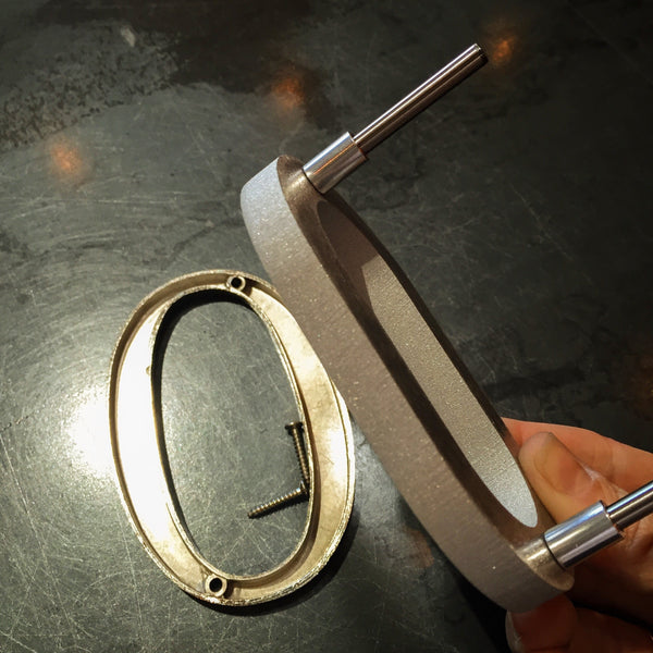
The tools and templates that simplify the installation process include personalized drilling templates, step-by-step written instructions, and concealed hardware. Modern House Numbers includes a free personalized drilling template with every purchase, eliminating the guesswork of hole placement and ensuring numbers align precisely. Step-by-step installation instructions guide homeowners through each stage, while concealed hardware produces a clean, professional finish without exposed fasteners. This approach makes accurate installation achievable without specialized skills, turning a potentially intimidating task into a straightforward upgrade with polished, architectural-quality results.
How Can You Incorporate Sustainable and Durable Address Numbers with Modern Fonts?
You can incorporate sustainable and durable address numbers by selecting materials that minimize environmental impact without sacrificing modern aesthetics. The following sections cover how material choice drives sustainability and how recycled materials align with contemporary design.
What Role Does Material Choice Play in Sustainability?
Material choice plays a central role in sustainability by determining a product's lifespan, resource consumption, and end-of-life recyclability. Metals such as aluminum and stainless steel resist UV degradation and moisture damage far longer than polymer-based alternatives, reducing replacement frequency and landfill contribution. Longer-lasting materials mean fewer resources consumed over time, which is the foundation of genuinely sustainable design. For address numbers, choosing a material that performs outdoors for decades is the single most impactful environmental decision a homeowner can make.
How Do Recycled Materials Align with Modern Design Aesthetics?
Recycled materials align seamlessly with modern design aesthetics because clean lines and minimalist forms depend on material quality, not material origin. According to Okon Recycling, beverage cans made from recycled aluminum produce up to 95% fewer emissions than those made from virgin materials, making recycled aluminum one of the most environmentally responsible choices available. Fortunately, recycled aluminum retains the same precision finish, smooth surface, and structural integrity as virgin aluminum, so it supports sharp, contemporary typography without visual compromise. Acrylic signage materials, while less sustainable, can be maintained with a soft cloth and non-abrasive cleaners to extend their service life. Recycled metal is a practical, beautiful, and low-impact material that makes sustainable design the obvious choice for modern address numbers.
What Custom Address Sign Services Does Modern House Numbers Offer for Stylish Fonts?
Modern House Numbers offers handcrafted, made-to-order custom address signs featuring architect-designed fonts, premium recycled aluminum construction, and full personalization. The sections below cover how made-to-order signage expands font selection and what key takeaways apply to choosing modern door number fonts.
How Does Handcrafted, Made-to-Order Address Signage Enhance Modern Font Selection?
Handcrafted, made-to-order address signage enhances modern font selection by giving homeowners access to architect-curated typefaces, including Palm Springs, SoCal, Austin, SoHo, Backbay, South Beach, and Santa Barbara, each precision-crafted to order rather than mass-produced. Modern House Numbers produces every sign from solid, recycled 3/8-inch aluminum in Tucson, Arizona, allowing individual customization of font, size, finish, and layout. Eco-friendly composite materials used across the signage industry, including blends of recycled wood fibers and resins, offer high moisture resistance and structural strength, reflecting the same material-first philosophy Modern House Numbers applies to aluminum. Every purchase includes a personalized drilling template and concealed hardware, making professional-quality installation accessible to any homeowner without specialist tools.
What Are the Key Takeaways About Modern Door Number Fonts and Stylish Address Ideas?
The key takeaways about modern door number fonts and stylish address ideas center on visibility, design integrity, and regulatory compliance. Fire codes typically require address numbers to be a minimum of 4 inches tall, contrast clearly with their background, and remain visible from the street. Sans-serif fonts consistently outperform decorative alternatives for outdoor legibility, while material choice, finish, and mounting style all influence long-term appearance. Modern House Numbers brings these principles together through architect-designed fonts, sustainable recycled aluminum construction, and made-to-order customization, making it straightforward to select a sign that is both code-compliant and genuinely distinctive for any home exterior.