 Numbers + Letters
 QuickShip
 Plaques
 Decals
 Custom
 Trade



Hotel wayfinding signage is the coordinated system of directional, room identification, and regulatory signs that orients guests within a property and guides them from arrival to their final destination. It works by anticipating decisions at key points, such as lobbies, corridors, and elevator banks, so guests move confidently without confusion or unnecessary staff intervention.
This guide covers the guest experience impact of wayfinding, core design principles, sign typology and materials, ADA compliance requirements, placement and technology integration, and project planning through to custom branded signage.
Well-executed wayfinding shapes first impressions and reduces guest stress by preventing the fear of getting lost, while cutting down on staff time spent giving directions. Color psychology and thoughtful environmental graphic design reinforce this effect, and the financial stakes are real: signage represents a meaningful but efficient slice of renovation budgets.
Intuitive design rests on mapping guest journeys, reducing cognitive load at decision points, and maintaining consistency property-wide. From there, hotels need specific sign types, including lobby directories, corridor directionals, room plaques, and ADA-mandated tactile and Braille signs, each suited to a distinct moment in the guest path.
Material choice and fabrication quality determine how long signage lasts and how premium it feels, with options ranging from acrylic and aluminum to sustainable substrates like recycled aluminum and HDU. Layered onto these choices, ADA specifications for tactile characters, mounting heights, and contrast ratios govern compliance without sacrificing high-end design.
Placement strategy, digital integration through QR codes and mobile apps, and disciplined budgeting round out a successful signage project. Finally, custom typography, plaques, and premium detailing, including options like those offered by Modern House Numbers, turn functional wayfinding into a lasting brand impression from lobby to room.
Why Is Effective Hotel Wayfinding Signage So Critical for Guest Experience?
Effective hotel wayfinding signage is critical for guest experience because it eliminates confusion, reduces stress, and shapes first impressions from the moment guests step into the lobby. This section covers core wayfinding principles, color psychology, and the financial stakes behind getting signage right.
Wayfinding in hospitality is defined as the process of orienting oneself within a physical space and navigating toward a desired destination. Under its strictest definition, wayfinding signage accomplishes two goals: telling guests where they are and showing them the best route to where they need to go. This discipline falls under Environmental Graphic Design (EGD), which builds a strong sense of place while enhancing the guest experience through carefully considered details.
Color choices reinforce this sense of place at an emotional level. According to HOTELSIGNS.com's 2025 analysis of color psychology in hotel signage, warm colors such as reds, oranges, and yellows evoke comfort and energy, making them well-suited to dining areas where stimulating appetite matters. Cool colors, including blues and greens, promote calmness and trust, which explains their frequent use in guest rooms and spas. Neutral tones like beige, gray, and white add balance and sophistication throughout shared spaces. In practice, hotels that align color palettes with the emotional tone of each zone tend to see smoother guest flow, since color acts as a subconscious cue before text or icons are even read.
The business case for strong wayfinding extends beyond aesthetics into measurable financial territory. The digital signage market, valued at $31.1 billion in 2025, is projected to reach $58.4 billion by 2033, reflecting how heavily the hospitality and retail sectors are investing in navigational technology. Digital signage also carries an 83% recall rate, underscoring its power to keep directional information top-of-mind for guests moving through unfamiliar spaces.
Signage investment should be weighed against the broader cost of hotel renovations. Total hotel renovation costs in 2026 average $4,000 to $6,000 per room nationally, with luxury properties exceeding $46,000 per room. Signage represents only a fraction of that total spend, yet it delivers outsized ROI by reducing operational disruptions, cutting staff-guest friction at the front desk, and elevating the overall visitor experience. For owners weighing renovation priorities, wayfinding signage consistently ranks among the highest-return line items precisely because it touches every guest, every day, from arrival to departure.
What Are the Core Principles of Intuitive Hotel Wayfinding Design?

The core principles of intuitive hotel wayfinding design are guest journey mapping, cognitive load reduction, and property-wide consistency. Together, these principles guide guests confidently from lobby to guestroom while reducing staff intervention and guest frustration.
- Understanding guest journeys from arrival to guestroom
- Reducing cognitive load and decision points
- Maintaining consistency across the entire property
How Do You Understand Guest Journeys from Arrival to Guestroom?
You understand guest journeys from arrival to guestroom by mapping each touchpoint a guest encounters, such as entrance, front desk, elevator lobby, corridor, and room door. This flow analysis reveals where guests hesitate, backtrack, or ask for directions, exposing gaps in the existing signage system. Hoteliers who study these pinch points can position signage precisely where decisions occur, rather than scattering signs throughout the property. In practice, walking the guest path during both peak and off-peak hours often uncovers blind corners, unclear elevator banks, and confusing branch points that data alone can miss.
How Can You Reduce Cognitive Load and Decision Points for Hotel Guests?
You can reduce cognitive load and decision points for hotel guests by placing clear, intuitive signage at every key decision point, such as lobby junctions, elevator banks, and corridor intersections. Comprehensive flow analysis anticipates guest needs before confusion sets in, so signage answers questions before guests have to ask them. According to L&H Signs, well-designed wayfinding signage reduces cognitive load by anticipating decisions before guests make them, preventing confusion and reducing the need for staff intervention. This anticipatory approach lets front desk and concierge teams focus on higher-value service rather than repeating directions, which is often the biggest hidden cost of poor signage.
Why Should Wayfinding Signage Be Consistent Across the Entire Property?
Wayfinding signage should be consistent across the entire property because inconsistent cues force guests to relearn navigation logic at every turn, increasing frustration and staff workload. This kind of consistency builds guest trust, and properties that get it right see guests return more often. With these principles established, sign typology determines which specific signs guests need.
What Types of Hotel Wayfinding Signs Do You Need from Lobby to Room?

Hotel wayfinding signage from lobby to room spans four core categories, each addressing a distinct point in the guest journey:
- Public area and lobby signs
- Directional and corridor signs
- Room identification signs and plaques
- Regulatory, ADA, and safety signs
What Public Area and Lobby Signs Help Guests Orient Themselves?
Public area and lobby signs that help guests orient themselves include directory boards, "you are here" maps, reception signage, and elevator bank indicators visible from the entrance. These signs answer a guest's first two questions upon arrival: where they are and where they need to go next. Because the lobby is the highest-traffic decision point in the building, materials here must balance visual appeal with everyday wear.
Acrylic is a common choice for this application. With a lifespan of 5 to 10 years and high indoor durability, acrylic works well for lobby signs, illuminated letters, and room numbers. It only needs occasional cleaning, though prolonged UV exposure should be avoided if used near sunlit entrances.
Which Directional and Corridor Signs Guide Guests to Elevators and Rooms?
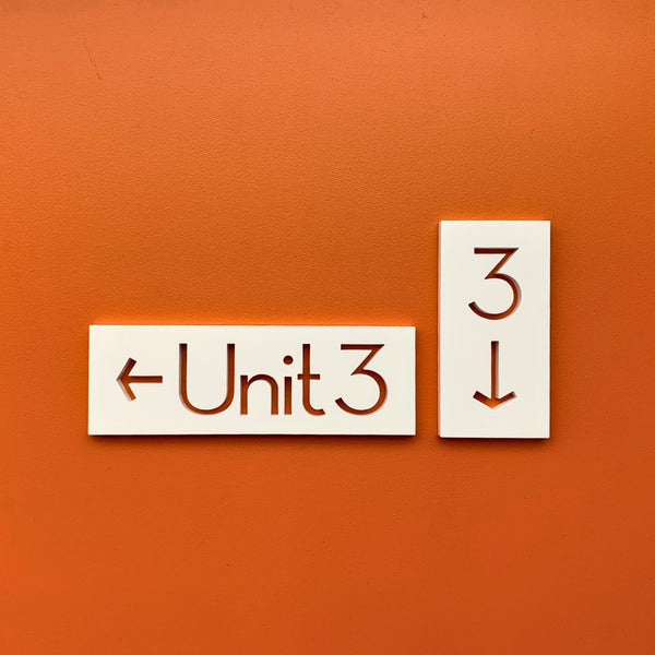
Directional and corridor signs that guide guests to elevators and rooms are arrow-and-text markers placed at hallway junctions, elevator lobbies, and stairwells. Hotel signage overall encompasses a diverse typology built around specific functions, including room identification, directional signage that uses arrows and text through corridors, amenity signage for pools and gyms, safety and emergency signage, and exterior monument or pylon signs.
Within corridors specifically, directional signs should appear at every turn or fork, not just at major intersections. In practice, hotels that skip mid-corridor confirmation signs see guests hesitate or backtrack, even when the destination sign is accurate. Placing a repeat directional cue every 40 to 60 feet reduces this hesitation without cluttering the hallway.
How Do Room Identification Signs and Plaques Support Easy Navigation?
Room identification signs and plaques support easy navigation by confirming a guest has reached the correct door through consistent numbering, floor indicators, and wing labels. Unlike directional signs, which guide movement, room plaques serve as the final confirmation point in the wayfinding sequence, so legibility and placement consistency matter more than decorative flourish.
A strong room identification system uses:
- Sequential, logically grouped room numbers by floor and wing
- Consistent plaque size, font, and mounting height across every corridor
- Clear floor or wing markers at elevator landings to confirm the guest exited on the correct level
Hotels that vary plaque style between renovated and older wings often create confusion, even when numbering itself is correct.
What Regulatory, ADA, and Safety Signs Must Hotels Include?
Regulatory, ADA, and safety signs that hotels must include are tactile room signs, Braille identifiers, and emergency wayfinding markers required under federal accessibility law. Grade 2 (contracted) Braille is mandatory on signs designating permanent spaces, with dots that must be domed or rounded and sized between 0.025 and 0.037 inches in height and 0.059 to 0.063 inches in diameter, positioned below the corresponding text and separated by at least 3/8 inch from other tactile elements.
Placement is equally regulated. At single doors, the U.S. Access Board requires tactile signs to sit alongside the door on the latch side, with an 18-by-18-inch clear floor space centered on the characters, free of protrusions and positioned beyond the door's swing arc.
These specifications are non-negotiable for compliance, but they still leave room for material and finish choices that align with a property's design. Once compliant sign types are identified, sign placement throughout the property becomes the next planning priority.
How Should You Plan a Wayfinding Strategy for Your Hotel Layout?
Planning a hotel wayfinding strategy involves auditing existing signage, mapping sightlines against floor plans, and designing scalable systems for complex layouts. The following steps outline how to build a strategy from assessment to multi-tower execution.
How Do You Audit Existing Hotel Signage and Guest Pain Points?
Auditing existing hotel signage requires checking current signs against technical accessibility benchmarks and identifying where guests repeatedly get confused. This means measuring every tactile sign against ADA specifications: raised characters must sit at least 1/32 inch above their background, appear only in uppercase sans-serif fonts, and stand between 5/8 inch and 2 inches tall. Character spacing must fall between a minimum of 1/8 inch and a maximum of four times the stroke width. An effective audit walks the exact guest path from entrance to guestroom, flagging any sign that fails these measurements or sits where guests hesitate. Pairing this technical check with observed pain points, such as clusters of guests pausing near elevators, reveals which signs need replacement first.
How Can Floor Plans and Sightlines Shape Your Sign Placement?
Floor plans and sightlines shape sign placement by revealing where guests naturally look and where visual obstructions block sign visibility. Reviewing architectural drawings alongside actual walkthroughs helps planners position signs at genuine decision points, such as corridor junctions and elevator lobbies, rather than arbitrary locations. Budgeting for placement should also account for long-term costs, not just installation. A lifecycle cost analysis must factor in routine maintenance, cleaning, repairs, and eventual replacement, since sightline-optimized signs still require upkeep to remain legible over time. In practice, the smartest layouts prioritize sign placement at the first point of hesitation rather than crowding every wall with signage.
How Do You Design Wayfinding for Multi-Wing or Multi-Tower Hotels?
Designing wayfinding for multi-wing or multi-tower hotels requires a hierarchical system that distinguishes buildings, floors, and room clusters before guests ever reach a single corridor. There are several planning priorities for these larger properties, such as color-coded or numbered wings, tower-specific directories near entrances, and consistent directional cues repeated at every major junction. Budget planning matters significantly here: large environments, including resorts and multi-tower hotels, typically invest between $150,000 and $500,000 or more in complete wayfinding systems. Given this investment scale, phasing the rollout by wing or tower often makes the project more manageable without compromising consistency. With a scalable, hierarchical structure in place, hotels can extend wayfinding smoothly as properties expand or renovate.
How Can Design, Typography, and Color Improve Hotel Wayfinding?
Design, typography, and color improve hotel wayfinding by making signs faster to read, easier to interpret, and better aligned with brand identity. Thoughtful hierarchy, contrast, and pictograms reduce hesitation at decision points. The following sections cover font selection, color and contrast strategy, and brand alignment.
Which Fonts, Sizes, and Hierarchies Work Best for Readable Hotel Signs?
The fonts, sizes, and hierarchies that work best for readable hotel signs are simple sans-serif typefaces, distance-scaled lettering, and a clear top-to-bottom hierarchy. Clean sans-serif letterforms, used for room numbers, directional arrows, and amenity labels, stay legible from a distance and in low corridor lighting. Sizing should scale with viewing distance, with larger lettering for lobby signage read across a room and smaller lettering for close-range room plaques. A strong hierarchy places urgent cues, such as exits or elevators, above secondary information like spa or gym directions, letting guests scan a sign quickly instead of reading every word.
How Should You Use Color, Contrast, and Pictograms in Wayfinding?
Color, contrast, and pictograms should be used in wayfinding by pairing high-contrast lettering with universally recognizable symbols so guests can navigate without reading every word. According to the 2025 ICC A117.1 standard, visual characters must reach at least a 65% contrast ratio against their background to stay legible under varied lighting. Pictograms marking permanent rooms, such as restrooms, must sit within a field at least 6 inches high, with text descriptors and Braille placed directly below.
Layered onto this contrast foundation, purposeful color choices turn signage into an intuitive emotional guide rather than a purely functional label.
How Can You Align Wayfinding Signage with Your Hotel's Brand and Interior Design?
Wayfinding signage can be aligned with your hotel's brand and interior design by matching material finishes, color palettes, and typography to the property's existing design language rather than treating signs as an afterthought. Coordinating sign design with professional standards helps ensure both consistency and compliance. According to the Society for Experiential Graphic Design (SEGD), the premier professional organization for wayfinding and placemaking with over 2,200 members globally, the field advances through education, advocacy, and standards such as the ADA White Paper Update and universal healthcare symbols. Hotels that involve interior designers early in the signage process, rather than as a late-stage add-on, achieve signage that reads as an extension of the architecture itself.
With typography and color aligned to brand, material choices become the next design consideration.
How Do Materials and Fabrication Choices Affect Hotel Wayfinding Signage?
Materials and fabrication choices affect hotel wayfinding signage by determining how long signs last, how much upkeep they need, and how premium they feel to guests. Material and finish selection drives durability and cost, while sustainable options reduce environmental impact without compromising quality.
Which Materials Are Best for Durability and a Premium Hotel Look?

The best materials for durability and a premium hotel look are acrylic, aluminum, stainless steel, hardwood, and polycarbonate, each suited to different applications. Material selection significantly impacts the aesthetic, durability, and cost of hotel signage. A whole-life approach weighs material durability and maintenance requirements against purchase price when evaluating true signage investment value.
The following comparison shows typical lifespan, durability rating, best applications, and maintenance needs for common signage materials:
|
Material |
Typical Lifespan |
Durability Rating |
Best Applications |
Maintenance Needs |
|
Acrylic |
5–10 years |
High (Indoor) / Medium (Outdoor) |
Lobby signs, illuminated letters, room numbers |
Occasional cleaning; protect from prolonged UV |
|
Aluminum |
20–50+ years |
High |
Exterior signs, pylon faces, dimensional letters |
Low maintenance; corrosion-resistant |
|
Stainless Steel |
30–100+ years |
Very High |
Corporate branding, luxury retail, monument signs |
Minimal; polish to maintain luster |
|
Wood (Hardwood) |
20–100+ years |
Moderate |
Rustic/themed branding, boutique hotels |
Requires sealing; vulnerable to moisture |
|
Polycarbonate |
10–20 years |
High |
Backlit signs, illuminated awnings |
Clean to prevent clouding; UV coating needed |
For high-traffic guest areas, stainless steel and aluminum typically deliver the strongest return, since low maintenance needs offset higher upfront costs over a decade or more.
How Do Finish, Thickness, and Edge Details Influence Perceived Quality?
Finish, thickness, and edge details influence perceived quality by signaling craftsmanship and structural solidity to guests. Matte and brushed finishes convey a refined, contemporary feel, while thicker substrates and precision-cut, beveled edges reduce visible seams and give dimensional letters a more substantial, architectural presence. Rounded edges also lower injury risk in busy corridors. In practice, guests often judge a hotel's attention to detail by how a sign feels under touch and looks up close, not just by its message, so thicker gauge materials and clean edge work pay off in guest perception even when the price difference between options is modest.
How Can Sustainable and Recycled Materials Be Used in Hotel Signage?

Sustainable and recycled materials can be used in hotel signage through options such as recycled aluminum and High-Density Urethane (HDU) made from recycled plastics. Recycled aluminum matches virgin aluminum's durability with a lower energy footprint, while HDU offers a carvable, moisture-resistant alternative to wood. Extending signage service life through durable materials and proper maintenance also supports sustainability goals by reducing resources needed for manufacturing, transport, and installation of replacement signs. Looking ahead, the industry is converging durable, sustainable materials with intelligent digital navigation layers, keeping wayfinding both environmentally responsible and responsive to guest needs. Hotels that prioritize recycled substrates now are better positioned for tightening sustainability expectations without sacrificing a premium look.
With durable, sustainable materials chosen, accessibility compliance becomes the next essential layer.
How Can You Ensure Hotel Wayfinding Signs Meet Accessibility and ADA Standards?
Hotel wayfinding signs meet accessibility and ADA standards by following precise technical specifications for tactile characters, Braille, mounting heights, and contrast. The requirements below cover directional and room signage, tactile and Braille handling, and balancing compliance with design.
What ADA Requirements Apply to Hotel Directional and Room Signs?
ADA requirements for hotel directional and room signs mandate specific tactile dimensions, non-glare finishes, and contrasting characters for every permanent-space sign. Room number signs, directional signs, and exterior monument signs each carry different compliance and cost considerations depending on placement and function.
Budgeting for these requirements varies by sign type. Exterior signs also require ongoing care to preserve legibility and compliance over time, such as applying carnauba-based wax to protect shine and provide UV protection. Hotels that underestimate this maintenance cost often see compliance and appearance degrade faster than budgeted.
How Should Tactile Letters, Braille, and Mounting Heights Be Handled?
Tactile letters, Braille, and mounting heights should be handled according to fixed ADA specifications that leave little room for design interpretation. Raised characters must sit at least 1/32 inch above their background, appear only in uppercase sans-serif fonts, and range between 5/8 inch and 2 inches in height.
Grade 2 Braille is required on permanent-space signs, with dots between 0.025 and 0.037 inches high and 0.059 to 0.063 inches in diameter, positioned below the corresponding text. Mounting height requirements include:
- Tactile characters located a minimum of 48 inches and a maximum of 60 inches above the floor.
- Signs placed alongside the door on the latch side at single doors.
- An 18-inch by 18-inch clear floor space centered on the tactile characters, free of obstructions.
These dimensions must be followed precisely, since even minor deviations can trigger non-compliance findings during inspection.
How Do You Balance ADA Compliance with High-End Hotel Design?
Balancing ADA compliance with high-end hotel design starts with understanding that the Americans with Disabilities Act (ADA), signed into law in 1990 and updated with the 2010 ADA Standards for Accessible Design, establishes strict requirements for public accommodations, including hotels. Title III regulations prohibit discrimination in guest areas, restaurants, and employee facilities, requiring these spaces to remain readily accessible to individuals with disabilities.
According to L&H Signs, non-glare matte finishes, required for ADA compliance, often support a cleaner, more modern look that blends well with high-end interior design. Modern fabrication techniques now let hotels treat compliance as a design asset rather than a constraint, pairing required tactile elements with premium materials and finishes that match a property's aesthetic. Properties that integrate ADA signage early into interior design plans, rather than retrofitting it later, consistently achieve a more cohesive, upscale look throughout the guest journey.
Where and How Should You Place Wayfinding Signs Throughout a Hotel?
Hotel wayfinding signs work best when placed at key decision points, such as lobbies, corridor intersections, and elevator banks, then mounted at consistent heights with strong lighting and contrast. The sections below cover location strategy, mounting height, and visibility.
How Do You Decide Sign Locations in Lobbies, Corridors, and Elevator Banks?
Sign locations in lobbies, corridors, and elevator banks are decided by mapping the exact points where guests pause to choose a direction. Lobby signage should greet arrivals immediately upon entry, pointing toward the front desk, elevators, and public spaces before confusion sets in. Corridor signs perform best at intersections and turns, confirming room number ranges before a guest commits to a direction. Elevator banks need signage on both the approach wall and inside the cab, listing floor contents and room ranges for each level. Placing signs exactly where doubt occurs, rather than only at final destinations, keeps guests moving confidently without backtracking or flagging down staff.
What Are Best Practices for Sign Mounting Heights and Sightlines?
Best practices for sign mounting heights and sightlines call for consistent placement across the entire property so guests learn where to look without conscious effort. Directional and room identification signs typically sit at standard eye level in corridors, while lobby directories may be mounted higher to stay visible above crowds and furniture. Sightlines should remain unobstructed by plants, artwork, or structural columns, and signs should face perpendicular to the direction of travel whenever possible. Maintaining the same height and placement pattern on every floor reinforces a predictable rhythm that guests recognize instinctively as they move deeper into the building.
How Can Lighting and Contrast Improve Sign Visibility Day and Night?
Lighting and contrast improve sign visibility day and night by keeping characters legible regardless of ambient brightness. Backlit or externally illuminated signs prevent dark corridors and exterior walkways from hiding directional cues after sunset, while non-glare finishes stop daytime glare from washing out text. Contrast between characters and background matters as much as illumination, since light letters on a dark field (or the reverse) read fastest from a distance. According to the 2025 ICC A117.1 standard, visual characters should maintain a 65% contrast ratio against their background to stay reliably readable. Strong contrast paired with even lighting keeps wayfinding effective around the clock. With placement and visibility addressed, digital tools can extend these cues throughout the property.
How Can You Integrate Digital and Static Wayfinding in Hotels?
Digital and static wayfinding integrate by pairing fixed signs with screen-based tools that share the same routes and terminology. Digital directories handle real-time updates, while physical signs anchor permanent decision points. The sections below cover display timing, mobile complements, and sync methods.
When Should You Use Digital Directories and Interactive Displays?
Digital directories and interactive displays should be used at high-traffic decision points where routes are complex or frequently changing, such as conference centers, multi-tower lobbies, and large convention hotels. These displays excel when a route is too complicated to convey on a static sign alone. At the Calgary International Airport, interactive digital maps with QR code mobile handoff allowed White Hat Volunteers to generate complicated routes and share them instantly with travelers, generating highly positive guest feedback on accessibility. This example illustrates why complex, multi-step routes benefit most from interactive tools rather than static signage. For hotels with sprawling layouts, an interactive kiosk near the lobby entrance often outperforms a wall of directional arrows.
How Do Mobile Apps and QR Codes Complement Physical Hotel Signs?
Mobile apps and QR codes complement physical hotel signs by extending fixed directions into personalized, on-screen navigation. Digital wayfinding uses dynamic, screen-based systems, such as interactive kiosks and mobile tools, to help guests navigate spaces in real time, according to Visix. QR codes placed on a physical sign or interactive map generate a mobile-friendly URL that guests can scan for turn-by-turn directions.
- Guests scan a unique QR code posted on a physical sign or lobby map.
- The scan triggers a mobile handoff, delivering turn-by-turn directions to their smartphone.
- Guests follow personalized routes without memorizing corridors or wing names.
This mobile handoff eliminates route memorization and creates a seamless, personalized navigation experience. Static signs remain essential for guests without smartphones, but QR codes add a flexible layer for those who prefer digital guidance.
How Can You Keep Digital and Physical Wayfinding Information in Sync?
Digital and physical wayfinding information stays in sync through cloud-based map management paired with indoor positioning technology. Bluetooth Low Energy (BLE) beacons installed throughout a property broadcast signals to guest smartphones, and when combined with Wi-Fi triangulation, these systems deliver "blue dot" positioning accurate to within a few meters. Cloud-based map management then allows facility managers to update layouts and points of interest instantly, without replacing any physical signs.
In practice, this means a renovated wing or a temporarily closed elevator bank can be reflected in the app immediately, while the physical signage catches up during the next maintenance cycle. Hotels that treat digital maps as the "living" layer and physical signs as the "stable" layer avoid the confusion of mismatched directions. Consistent naming conventions across both formats, such as identical wing and floor labels, are what ultimately keep guests confident regardless of which system they consult.
How Do You Plan, Budget, and Implement a Hotel Wayfinding Signage Project?
Planning a hotel wayfinding signage project involves three phases: concept development, budgeting, and installation coordination. The sections below cover each phase, from initial design to final sign placement and team management.
What Steps Are Involved from Concept to Installation for Hotel Signage?
The steps involved from concept to installation for hotel signage are site audit, design development, ADA review, fabrication, and mounting. Each phase builds on the previous one, moving from concept sketches to a fully installed system.
Installation is the phase where compliance details matter most. ADA installation height is governed by strict spatial requirements: tactile characters must sit a minimum of 48 inches above the floor (measured from the baseline of the lowest character) and a maximum of 60 inches (measured from the baseline of the highest character). Installers must verify these measurements before mounting any permanent room sign.
In practice, projects that skip a formal installation checklist tend to generate costly rework once inspectors flag mounting heights after the fact. Building this verification step into the fabrication timeline, rather than treating it as an afterthought, saves both time and budget later.
How Should You Estimate Costs and Prioritize Sign Types in Your Budget?
You should estimate costs by benchmarking against facility size and then prioritize sign types by legal necessity and guest impact. Wayfinding signage costs vary dramatically based on facility size and complexity.
Within any budget tier, prioritization should follow a clear order:
- ADA-required tactile and room signs, since these are legally mandatory.
- Directional and corridor signage, since these carry the highest guest-navigation impact.
- Amenity and decorative signage, since these enhance brand experience but carry less urgency.
Typography choices also affect cost efficiency. Sans-serif fonts such as Palm Springs or Austin are preferred for hotel signage because they read faster at a distance, while script or decorative fonts should be avoided. Budgeting for durable materials upfront, rather than the lowest bid, typically reduces total spend across a sign system's lifespan.
How Can You Coordinate Designers, Fabricators, and Installers Effectively?
You can coordinate designers, fabricators, and installers effectively by establishing a single shared timeline with clear handoff points between each team. Designers finalize specifications and ADA compliance details first, fabricators then produce signs to those exact tolerances, and installers execute placement according to the approved plan.
Miscommunication between these three groups is the most common source of budget overruns on wayfinding projects. Locking design specifications before fabrication begins, and requiring installer sign-off on mounting locations before production, prevents the rework that otherwise erodes both timeline and budget. Once designers, fabricators, and installers are aligned, custom detailing decisions can further shape how the finished signage reflects the hotel's brand.
How Can Custom Hotel Signage Enhance Brand Identity and Guest Perception?

Custom hotel signage strengthens brand identity by transforming functional wayfinding elements into memorable design touchpoints. Distinctive typography, materials, and finishes signal quality before a guest ever reaches their room. The following covers custom typography and numbering, unique plaques and directional signs, and how premium details shape guest perception.
In What Ways Does Custom Typography and Numbering Elevate Room Signs?
Custom typography and numbering elevate room signs by making them instantly legible while reinforcing a hotel's visual identity at every door. Consistent letterforms, spacing, and sizing across all room signs create a cohesive brand impression as guests move down a corridor. Sans-serif fonts remain the preferred choice for signage clarity, while script or decorative styles are generally avoided because they reduce readability at a distance. According to L&H Signs, typography and color choices work together to guide perception as much as function. Beyond compliance, though, thoughtfully chosen numbering styles, whether sleek and minimal or warmly textured, tell guests something about the property's character before they even open the door. This is where signage stops being purely functional and starts acting as a brand ambassador.
How Can Unique Plaques and Directional Signs Reinforce Your Hotel Story?
Unique plaques and directional signs reinforce a hotel's story by extending its architectural theme into everyday navigation moments. A boutique property leaning into a rustic or heritage narrative, for example, might choose hardwood plaques, which suit rustic or themed branding but require sealing and careful protection from moisture. Directional signs finished in matching tones or materials carry that same narrative from the lobby to the guestroom floor. Custom plaques at suite entrances, meeting rooms, or amenity areas turn ordinary directional cues into small storytelling moments, giving guests a sense that every detail was chosen deliberately rather than mass-produced.
How Do Premium Details Influence Guest Perception of Quality and Care?
Premium details influence guest perception of quality and care by signaling, often subconsciously, that a property pays attention to everything, not just the visible highlights. Crisp edges, quality finishes, and precise mounting suggest the same level of care extends to housekeeping, service, and maintenance throughout the stay. In practice, guests rarely comment directly on signage, but inconsistent or worn signs quietly erode confidence, while cohesive, well-crafted signage builds trust before a single interaction with staff occurs. Investing in refined signage details pays off disproportionately relative to its cost, since it shapes first impressions in spaces every guest passes through. With brand-aligned signage in place, ongoing maintenance keeps that premium impression intact.
How Should You Maintain, Update, and Future-Proof Hotel Wayfinding Signage?
Hotels should maintain wayfinding signage through scheduled reviews, routine cleaning, and modular designs that adapt without full replacement. This section covers refresh timelines, cleaning and material upkeep, and how modular systems reduce the cost of future changes.
How Often Should Hotels Review and Refresh Their Wayfinding Systems?
Hotels should review and refresh their wayfinding systems at least once a year, and immediately after any renovation, rebranding, or change to guest flow patterns. Outdated or confusing signage reintroduces the hardwired fear of getting lost, which raises guest stress and erodes trust in the property. According to L&H Signs' hotel wayfinding research, properties with well-executed wayfinding systems often see higher review ratings and better guest feedback, as guests feel more welcome, confident, and capable of navigating independently. Regular audits catch inconsistencies before they surface in guest complaints or online reviews. Tying a wayfinding review to each property refresh cycle keeps signage aligned with evolving guest expectations without a separate maintenance budget line.
What Maintenance Practices Keep Signs Looking Clean and High-End?
The maintenance practices that keep hotel signage looking clean and high-end include routine washing, material-specific care, and protective treatments. According to Pannier Graphics' sign maintenance guide, hotels should wash signs every six months using a mild detergent and clean water to prevent buildup. Beyond washing, different materials call for different upkeep:
- Aluminum: Low maintenance and corrosion-resistant, giving exterior signs and dimensional letters a 20-50+-year lifespan.
- Polycarbonate: Requires regular cleaning to prevent clouding, and needs UV coating to protect backlit signs and illuminated awnings over a 10-20-year lifespan.
Consistent cleaning schedules protect the premium appearance guests associate with quality hospitality brands.
How Can Modular Systems Make Future Changes Easier and Less Costly?
Modular wayfinding systems let hotels swap individual components, such as insert panels, directories, and room plaques, without replacing the entire sign structure. Instead of commissioning a new sign for every renovation or room renumbering, staff can update just the interchangeable panel. This lowers lifecycle costs by extending the frame and mounting hardware's usable life while keeping messaging current. Modular design also simplifies compliance updates, since ADA tactile and Braille elements can be replaced independently if codes change. For phased renovations, modular systems are often the most cost-effective investment because they separate the sign's structural cost from its content. With maintenance and modularity addressed, choosing the right signage partner becomes the next priority.
How Should You Approach Hotel Wayfinding Signage with Modern House Numbers?

Hotel wayfinding signage benefits from architect-designed room numbers, letters, and plaques that pair clear legibility with a premium look. The sections below show how Modern House Numbers supports this approach and recap the article's core lessons.
How Can Modern House Numbers’ Custom Numbers, Letters, and Plaques Elevate Hotel Wayfinding?
Modern House Numbers elevates hotel wayfinding by offering custom, architect-designed numbers, letters, and plaques crafted from solid, recycled aluminum. Each piece is handcrafted to order, letting hotels choose fonts, sizes, and finishes that match their brand and interior design. Font options such as Palm Springs, SoCal, and Santa Barbara help hotels maintain a consistent, sophisticated look across every room. Every order includes a personalized drilling template and installation instructions, supporting clean results with concealed hardware. Design and construction professionals managing multi-room installations can use the Trade Program for bulk ordering and dedicated support. This craftsmanship gives hotel signage a polished, cohesive feel from lobby to room. Please note, signage from Modern House Numbers is not ADA compliant.
What Are the Key Takeaways About Hotel Wayfinding Signage: Guiding Guests from Lobby to Room We Covered?
The key takeaways about hotel wayfinding signage are that clear, consistent signage guides guests confidently, ADA compliance is mandatory, and thoughtful design pays off in guest satisfaction and staff efficiency. Across a hotel, effective wayfinding includes:
- Intuitive, decision-point signage that guides guests from lobby to room without confusion.
- ADA-compliant tactile letters, Braille, and mounting heights for legal and accessible design.
- Durable, well-maintained materials that protect the signage investment over its lifespan.
- Digital tools, such as QR codes and mobile apps, that complement physical signs.
According to MDM Commercial, effective wayfinding also lets guests self-navigate, so they ask staff fewer questions, freeing teams to deliver more attentive, personalized service.