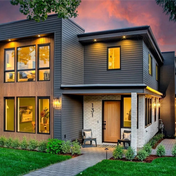
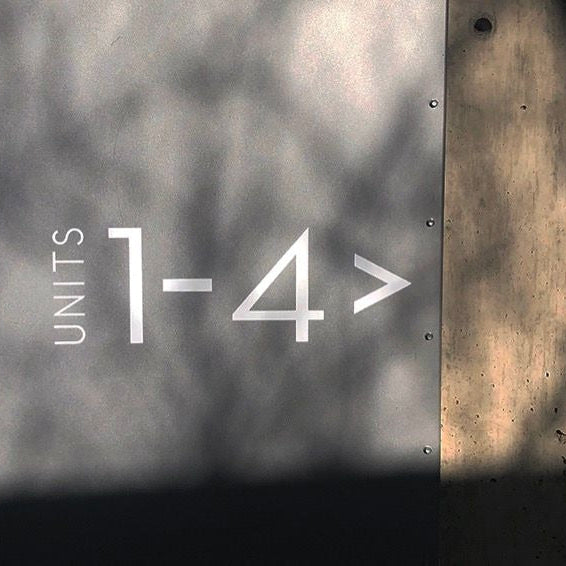
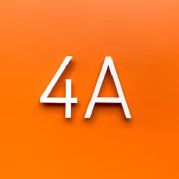
 Numbers + Letters
 QuickShip
 Plaques
 Decals
 Custom
 Trade



Conference room signs are the static nameplates, digital displays, and directional markers that identify meeting spaces, guide visitors through an office, and show real-time room availability.
This guide covers sign types and placement, naming strategies for clarity and brand culture, design and materials that meet ADA standards, digital booking-display integration, and the branding and project-execution steps that complete a signage system.
Static room-ID signs, digital displays, and directional markers each play a distinct role, from identifying a single door to guiding traffic across open floors, and placing signs consistently at every junction speeds up wayfinding.
Naming works best through numbering, thematic, or hybrid systems that pair a room's brand identity with clear, inclusive labels, such as "3A, The Golden Gate," so visitors can navigate while still sensing company culture.
Design and material choices, including sans-serif typography, WCAG contrast ratios, tactile characters, and Braille mounted between 48 and 60 inches, keep signs legible and ADA-compliant while brushed aluminum, acrylic, or glass reinforce brand aesthetics.
Digital booking displays, from e-ink panels to full screens, sync with platforms like Microsoft 365 or Google Workspace to show live availability and prevent double-bookings alongside the permanent static sign.
Creative branding, through thematic iconography, wall graphics, and color-coded neighborhoods, extends room identity beyond the door, while disciplined project planning, ordering, installation, and documentation keep naming and wayfinding accurate as an office grows.
What Are the Main Types of Conference Room Signs and How Do They Work Together?
The main types of conference room signs are static room-ID signs, digital booking displays, and directional wayfinding signs. Together they identify rooms, show real-time availability, and guide visitors through a building. Below: static vs. digital differences, door/wall/overhead roles, and how conference rooms differ from huddle, focus, and training rooms.
How Do static room-ID signs differ from digital conference room displays?
Static room-ID signs differ from digital conference room displays in construction, cost, and function. Static signs are permanent fixtures made of acrylic, metal, or wood that show fixed information such as room names and numbers, while digital displays are dynamic screens that sync with calendar systems to show live availability and booking options. Static signage costs $200 to $1,000 per unit, while digital signage costs $200 to $4,000 per screen.
For most conference rooms, pairing a static ID sign with a digital scheduler delivers the strongest balance of permanence and real-time accuracy.
What roles do door signs, wall signs, and overhead signs each play?
The roles that door signs, wall signs, and overhead signs each play depend on placement and function. Door and wall signs identify specific rooms, while overhead signs support wayfinding across open areas and long corridors by directing traffic from a distance.
Each type serves a distinct purpose, such as:
- Door signs, which mark individual room identity and often carry ADA-compliant Braille.
- Wall signs, which reinforce room identification near entrances or junctions.
- Overhead signs, which guide movement from afar in open floor plans.
Overhead signs require strict clearance; according to the ADA Standards for Accessible Design Title III Regulation 28 CFR Part 36 (1991), they need a minimum clearance of 80 inches. Aluminum and acrylic are common choices for these signs, prized for durability and light weight.
How should conference room signs differ from huddle, focus, and training room signs?
Conference room signs should differ from huddle, focus, and training room signs in scale and complexity. Conference rooms, being larger formal spaces, warrant prominent signage combining static identification with digital scheduling, while huddle, focus, and training rooms typically use smaller, simpler signs suited to casual or specialized use.
Descriptive labels such as "Conference Room 101" rather than just "Room 101" communicate purpose immediately and reduce cognitive load. Larger conference rooms benefit most from digital booking integration, since they see higher usage and more scheduling conflicts than smaller spaces.
With signage types and roles established, effective naming becomes the next priority.
How Should You Name Conference Rooms for Clarity, Culture, and Wayfinding?
Naming conference rooms well means balancing clarity, brand identity, and inclusivity so every room is easy to find and reflects company culture. The following covers naming principles, numbering versus thematic versus hybrid systems, brand alignment, inclusive naming, and rolling out a new system office-wide.
What principles make conference room names easy to understand and navigate?
The principles that make conference room names easy to understand and navigate are clarity, brevity, and consistency. A name should instantly signal a room's location or purpose without extra explanation, since visitors scan signs quickly while walking through a hallway. Short, memorable words outperform long phrases, and once a pattern is set, such as pairing a number with a theme, every room should follow it. According to a 2019 LinkedIn analysis on workplace culture, thoughtfully chosen room names contribute to a positive, navigable office environment. Complicated or inside-joke names slow down wayfinding and frustrate first-time visitors trying to find their way.
Should you use numbers, themes, or hybrid naming for conference rooms?
Numbers, themes, or a hybrid approach can all work for naming conference rooms, depending on company size and culture. Numbering systems suit large campuses that need a scalable, logical structure administrators can expand easily. Thematic names suit smaller or culture-driven offices that want each room to spark conversation or reflect company identity. A hybrid system blends both, pairing a number with a themed label so the room stays easy to locate while still carrying personality. Choosing between them depends less on aesthetics and more on how quickly new employees and visitors need to orient themselves.
How can you align conference room names with your brand, values, or local context?

Conference room names can align with brand, values, or local context by reflecting what a company stands for or where it operates. Thematic naming lets teams build names around company values, such as "Honesty," "Passion," or "Integrity," turning everyday wayfinding into a reminder of culture. According to Alliance Virtual Offices, tech companies often name rooms after famous innovators, while global enterprises choose international city names to bridge cultures and reflect a worldwide presence. Local context works the same way: a business might reference regional landmarks or scenery instead. Numbering can still anchor these themes, since a label like "Room 304, The Innovator" keeps navigation logical while adding brand personality.
How can inclusive, accessible naming improve the employee and visitor experience?
Inclusive, accessible naming can improve the employee and visitor experience by making every room label welcoming and instantly clear to a diverse workforce. Inclusive naming means intentionally choosing words that reflect shared values and respect cultural diversity, avoiding outdated or insensitive conventions. This matters more as office attendance grows: according to the 2025 Workplace Index report, visitor numbers have nearly doubled across all regions over the past three years, and desk bookings of three or more days a week have increased year-over-year. More first-time visitors mean naming can no longer rely on knowledge passed between longtime staff. Inclusive names often do more for how welcome someone feels than for raw navigation speed alone.
How do you roll out a new naming system across an existing office?
Rolling out a new naming system across an existing office requires a phased plan that limits disruption. Steps typically include:
- Audit current names and signage for gaps.
- Choose a framework, numbering, themes, or hybrid, before ordering signs.
- Update directories and booking software to match new names.
- Install signs in phases, starting with the busiest rooms.
- Announce changes via email and temporary signage.
Thematic naming and custom design can boost office culture, turning a rollout into a branding opportunity. With naming settled, sign placement determines how quickly people find each room.
How Can You Plan an Effective Wayfinding Strategy for Conference Room Signs?
An effective wayfinding strategy for conference room signs combines consistent placement, directional cues, color-coding, and scalable numbering. The sections below cover wayfinding basics, sign placement, directional and color-coding systems, floor directories and elevator-lobby signage, and scalable room-numbering design.
What wayfinding basics should guide your conference room sign plan?

The wayfinding basics that should guide your conference room sign plan are consistency, high contrast, and scalability. Wayfinding is the cognitive and corporeal process of locating, following, or discovering a route through a given space. These basics shift by facility type. Healthcare settings require strict ADA adherence, including a recommended minimum 70% contrast between lettering and background, because clear wayfinding reduces patient stress in hospitals. Educational campuses need scalable numbering systems and clear directional signage to manage heavy foot traffic. Office conference room plans should borrow both: strong contrast for legibility and numbering systems that expand as teams grow.
Where should you place conference room signs so people find rooms quickly?
Conference room signs should be placed at every junction, entrance, and decision point along common travel paths, not just on the door itself. According to Gable (2025), the key to effective directional signage is consistency and frequency, with signs appearing at every junction where people might need guidance. Placing repeated cues at hallway intersections, near elevators, and at building entrances prevents visitors from second-guessing their route. Modern wayfinding also layers digital displays, real-time data, and system integrations on top of static placement, helping employees, visitors, and operators navigate complex spaces efficiently. For most offices, a static sign at the door paired with a repeater sign at the nearest junction solves the majority of navigation confusion.
How can directional arrows and color-coding improve navigation to meeting spaces?
Directional arrows and color-coding improve navigation by giving each zone a distinct, recognizable identity visitors process at a glance. Color-coding is a powerful wayfinding tool because assigning each floor or wing a unique color and name helps people identify their location and move intuitively toward the right meeting space. Arrows reinforce this by pointing toward the next decision point, not the final destination, reducing signs needed at any junction. Spatial cues combined with colored floor panels can guide people effectively through large facilities such as hospitals or corporate campuses. For conference rooms, matching a door sign's accent color to its floor's wayfinding scheme lets employees confirm direction before reaching the door.
How can floor directories and elevator-lobby signs support conference room wayfinding?
Floor directories and elevator-lobby signs support conference room wayfinding by giving visitors a single reference point before they commit to a direction. As organizations grow, these directories must scale, accommodating new rooms or floor changes without a full redesign. A hybrid system, combining a numeric location with a theme, such as "3A, The Golden Gate," works well on directories because it shows both the floor and section while adding a memorable identity. Clear wayfinding significantly reduces the time staff spend providing navigation assistance, which is exactly the burden elevator-lobby directories are designed to relieve. Placing a directory at every elevator bank keeps this aid accurate as the office expands.
How can you design a simple room-numbering system that scales as you grow?
You can design a simple room-numbering system that scales as you grow by pairing floor and section codes with sequential numbers, such as 3A-01, 3A-02, and 3A-03. This format lets new rooms slot into any section without renumbering the whole floor. Reserving open number blocks, for example leaving 3A-10 through 3A-20 unused, gives future rooms a logical place instead of forcing a full relabel later. Keeping the numbering format identical across every floor and building matters most, since consistency, not size, is what makes a system truly scalable. Skipping this step often forces costly renumbering later. With a numbering plan set, typography and contrast determine how easily people can actually read it.
What Design Principles Make Conference Room Signs Easy to Read and On-Brand?
Good conference room sign design balances typography, color, materials, layout hierarchy, and lighting to stay legible while reinforcing brand identity. The principles below cover font and contrast choices, color and material selection, layout hierarchy, aesthetic-legibility balance, and lighting considerations.
What font sizes, typefaces, and contrast ratios work best for conference room signs?
The font sizes, typefaces, and contrast ratios that work best for conference room signs depend on viewing distance and accessibility standards. ADA-compliant fonts are sans-serif with a minimum 12-point stroke width, and character height must scale with distance. According to the Web Content Accessibility Guidelines (WCAG) 2.2, contrast ratios must reach at least 4.5:1 for normal text and 3:1 for large text. The proposed 2025 A117.1 standard raises this bar further, requiring a 65% contrast ratio between text and background. Prioritizing sans-serif typography and strong contrast over decorative fonts keeps conference room signs legible at a glance.
How can you use color and materials to reflect your brand in conference room signage?
Color and materials can reflect your brand in conference room signage by aligning finishes, hues, and textures with your company's visual identity. The choice of materials impacts the durability, aesthetics, and sustainability of the signage, so selecting metal, acrylic, or wood finishes should match both brand tone and expected foot traffic. A tech company might choose brushed metal for a sleek, modern feel, while a hospitality brand might lean toward warmer wood tones or glass accents. Color-coding by department or floor also reinforces brand consistency while supporting wayfinding. Beyond color, incorporating logo elements or brand-specific finishes into sign frames creates a cohesive look. Consistency between conference room signage and other branded touchpoints, like lobby directories and exterior signs, strengthens overall corporate identity.
What layout and hierarchy choices make conference room numbers and names stand out?
The layout and hierarchy choices that make conference room numbers and names stand out place the most critical information, the room number, in the most prominent position. Information hierarchy ensures that the most critical information is processed first, so numbers and names should appear larger and higher on the sign than secondary details like booking status. Placing the number above or beside the name helps visitors scan and confirm a room in seconds. Lighting also plays a role in hierarchy: proper placement, adequate light intensity, and energy-efficient fixtures keep key text visible without glare, which can strain low-vision viewers. Clear hierarchy reduces hesitation at doorways and speeds up wayfinding for first-time visitors.
How can you balance aesthetics and legibility in modern conference room signs?
Aesthetics and legibility can be balanced in modern conference room signs by treating accessibility as a design constraint, not an afterthought. Signage design must balance aesthetics with legibility and accessibility, so decorative fonts, low-contrast pairings, and overly minimal layouts should be avoided even when they match a brand's style. Successful signs integrate brand expression within functional design constraints rather than around them. In practice, this means choosing brand colors that still meet contrast requirements and typefaces that remain readable from a distance. The best conference room signs feel intentional because legibility was built in from the start, not added later.
How do lighting conditions affect the design of conference room wayfinding signs?
Lighting conditions affect the design of conference room wayfinding signs by determining material finish, mounting height, and font weight. Bright, glare-prone corridors call for matte, non-reflective finishes, while dim hallways need higher-contrast colors or supplemental illumination to stay visible. Overhead or backlit fixtures can wash out thin fonts, so bolder letterforms often perform better under variable lighting. Rooms near windows or skylights may need signs angled to avoid glare at certain times of day. Walking the space at different times of day before finalizing placement catches lighting issues that a floor plan alone won't reveal, preventing costly reprints after installation. With lighting factored in, material selection becomes the next design decision to address.
How Do You Choose Materials and Finishes for Modern Conference Room Signs?
Material choice shapes how conference room signs perform, look, and hold up over time. Common options include metal, acrylic, glass, and vinyl, each suited to different budgets and traffic levels. The sections below cover material trade-offs, metal finishes, high-traffic durability, brand coordination, and sustainability.
What are the pros and cons of metal, acrylic, glass, and vinyl for room signs?
The pros and cons of metal, acrylic, glass, and vinyl for room signs come down to durability, cost, and appearance.
|
Material |
Pros |
Cons |
|
Metal (aluminum, stainless steel) |
Highly durable, corrosion-resistant, premium look |
Higher cost, heavier to install |
|
Acrylic |
Lightweight, versatile for backlighting, budget-friendly |
Scratches more easily, less premium feel |
|
Glass |
High-end, sophisticated appearance |
Fragile, requires careful maintenance |
|
Vinyl |
Flexible, inexpensive, easy to update |
Less durable, best as an accent layer |
Metal and glass suit executive spaces where longevity and appearance matter most, while acrylic and vinyl work well for budget-conscious or frequently updated signage.
How do brushed aluminum and other metal finishes create a modern conference-room look?

Brushed aluminum and other metal finishes create a modern conference-room look by pairing a matte, low-glare texture with the strength of standard aluminum. This finish offers a modern, premium aesthetic with the durability of standard aluminum, making it a common choice for corporate office signage and lobby directories. Other metal finishes, such as powder-coated aluminum, deliver similar durability while introducing brand-specific colors. Metal resists scratching and fading better than acrylic or vinyl, which matters in high-visibility meeting spaces. Brushed aluminum pairs especially well with minimalist typography and raised or engraved lettering, reinforcing a clean, architectural feel rather than a purely decorative one.
How should you select materials for high-traffic corporate and hospitality settings?
Materials for high-traffic corporate and hospitality settings should be selected for durability first, prioritizing heavy-gauge metal over lighter-weight options like acrylic or vinyl. According to Nicolson Associates, high-traffic areas require durable materials such as heavy-gauge aluminum or stainless steel, often treated with graffiti-resistant coatings to ensure longevity. This coating protects signage in lobbies, hallways, and hospitality corridors where signs face frequent contact, cleaning chemicals, and occasional vandalism. For conference rooms near public entrances or hotel event spaces, this protective layer extends usable life well beyond untreated finishes. Choosing heavier-gauge metal in these zones is a practical trade-off, sacrificing a bit of visual lightness for long-term resilience where foot traffic is constant.
How can you coordinate conference room signs with exterior signs and lobby branding?
Conference room signs can be coordinated with exterior signs and lobby branding by maintaining consistent materials, finishes, and compliance details across every touchpoint. According to the U.S. Access Board, Section 703 of the ADA Standards requires interior and exterior signs identifying permanent rooms to include tactile characters and Braille, with raised characters between 5/8 inch and 2 inches high and Grade 2 Braille dots spaced 3/8 inch apart. Applying the same metal finish, such as brushed aluminum, across lobby directories, exterior signs, and conference room plaques reinforces a unified brand identity while keeping tactile specifications consistent from curb to conference table.
What sustainability considerations matter when specifying conference room signage?
The sustainability considerations that matter when specifying conference room signage are material sourcing and long-term durability. According to Square Signs, eco-friendly options include FSC-certified wood, recycled aluminum, and bamboo, giving designers ways to reduce environmental impact without sacrificing a modern look. Recycled aluminum, for example, delivers the same brushed, premium finish as virgin metal with a smaller environmental footprint. Specifying durable, recyclable materials upfront also reduces replacement frequency, itself a sustainability benefit. Coordinating these sustainable choices with the finishes used at the lobby and exterior keeps branding consistent while lowering the project's overall footprint. With materials and finishes selected, accessibility compliance becomes the next essential layer.
How Can You Make Conference Room Signs Accessible and ADA-Compliant?
Accessible, ADA-compliant conference room signs meet federal rules for tactile characters, Braille, contrast, and mounting location. Compliance also means designing for low-vision and neurodiverse users while keeping a clean, modern aesthetic.
What ADA and accessibility requirements apply to conference room signage in the US?
ADA requirements for conference room signage in the US center on federal rules mandating tactile characters, Braille, sufficient color contrast, and specific mounting locations for permanent room signs. These requirements are not one-size-fits-all, since different industries carry unique signage obligations based on their operational needs and regulatory environments. A law firm and a healthcare facility may share the same core ADA baseline yet face different supplementary codes on top of it. According to Nova Polymers, ADA signage standards specifically address the needs of blind and visually impaired users through tactile and Braille elements built into the sign itself. For conference rooms, this means every permanent sign must satisfy the same core accessibility rules regardless of company size or industry.
How should you use tactile lettering and Braille on conference room signs?
Tactile lettering and Braille on conference room signs must follow Section 703 of the ADA Standards, which requires raised characters and Braille on all permanent interior room signs. According to the U.S. Access Board, raised characters must stand between 5/8 inch and 2 inches tall, measured using the uppercase "I" as the reference height. Braille must use Grade 2 formatting, with rounded or domed dots spaced 3/8 inch apart for consistent readability by touch. This precision matters: slight variations in dot spacing or character height can render a sign unreadable to visually impaired users, even if it appears compliant at a glance.
Where must ADA-compliant conference room signs be mounted for accessibility?
ADA-compliant conference room signs must be mounted beside the door on the latch side, with enough clear floor space for both standing and seated visitors to read them by touch. Positioning is only half the equation, since legibility depends on contrast as much as placement. The Web Content Accessibility Guidelines (WCAG) 2.2 require a minimum contrast ratio of 4.5:1 for normal text and 3:1 for large text, and a similar standard is proposed for the 2025 A117.1 code update at a 65% light-reflectance threshold. A sign mounted at the correct location but printed with poor contrast still fails accessibility standards in practice.
How can you design signs that support low-vision and neurodiverse users?
Signs that support low-vision and neurodiverse users rely on high-contrast lettering, non-glare finishes, and predictable visual patterns repeated throughout the office. For visitors with low vision, high-contrast text and glare-free surfaces reduce visual strain and keep lettering readable under variable lighting conditions. Neurodiverse visitors benefit most from consistency, such as repeated color coding, clear pathways, and intuitive symbol use, all of which lower anxiety and support confident navigation. Inclusive wayfinding for neurodiverse individuals depends on exactly this kind of consistent, predictable design. Conference room signs built around these principles end up serving every visitor, not only those who require accommodation under the ADA.
How can you combine ADA compliance with a clean, modern design aesthetic?
ADA compliance and a modern aesthetic combine best when accessibility features are treated as design elements, not add-ons. Compliance with the ADA is a strict legal requirement in the United States, and failure to comply can result in significant penalties, so accessibility cannot be an afterthought. Tactile characters, Braille, and high-contrast text integrate cleanly into brushed metal or acrylic panels when the layout accounts for these elements from the start. The strongest conference room signage treats ADA requirements as a design constraint to build around, much like an architect designs within a structural grid rather than against it. This approach produces signage that reads as intentional, not merely compliant. Digital booking displays extend these same accessibility principles into real-time scheduling.
How Should You Integrate Digital Booking Displays with Physical Conference Room Signs?
Integrating digital booking displays with physical conference room signs works best when the two share consistent naming, synchronized calendars, and coordinated placement near the door sign. This section covers e-ink displays, panel mounting, information hierarchy, naming sync, and calendar integration best practices.
How do digital room schedulers and e-ink displays complement permanent room signs?
Digital room schedulers and e-ink displays complement permanent room signs by adding live availability data without replacing the static room identity. E-ink technology reflects ambient light rather than emitting it, so the screen mimics paper, avoids glare, and stays readable from a 180-degree viewing angle in any lighting. According to a 2025 ROOMZ report, e-ink displays consume up to 10,000 times less energy than wired screens and run for up to five years on a single battery. This low-power design lets the schedule sit directly beside the permanent sign without extra wiring or maintenance. The static sign still anchors the room's identity while the e-ink panel handles real-time bookings.
Where should you mount digital booking panels relative to the door sign?
Digital booking panels should mount directly beside the door sign, at eye level, so visitors can read room identity and availability in one glance. Positioning the panel next to the static sign, rather than replacing it, keeps tactile and Braille information intact while adding real-time scheduling. This dual-mount approach is becoming more common as demand grows; Grand View Research valued the global digital signage market at $31.1 billion in 2025, projecting growth to $58.4 billion by 2033 at an 8.2% compound annual growth rate. Matching the mounting height of the static sign keeps the visual line consistent and easy to scan for every visitor.
What information belongs on a digital booking display versus the static room ID?
The information that belongs on a digital booking display versus the static room ID differs by how often it changes. The static sign carries permanent, unchanging details, such as the room name, room number, and ADA-compliant tactile characters and Braille. The digital display, by contrast, carries live, time-sensitive information, such as current occupancy status, the name of the ongoing or next meeting, the time the room frees up, and a quick-book button. Keeping permanent identity on the static sign and variable data on the screen prevents confusion if the display glitches or loses power, since the room can still be identified without it.
How can you keep digital and physical naming and numbering perfectly in sync?
Digital and physical naming and numbering can be kept perfectly in sync by treating the room master list in the booking software as the single source of truth. Any change to a room's name or number should update the calendar platform, the digital display, and the static sign at the same time, rather than editing one system and waiting to fix the others. Facilities teams should assign one owner responsible for approving renumbering requests before they reach either vendor. In practice, most naming mismatches happen when a room is renamed informally in conversation long before the physical sign or software catalog is updated, so a quarterly audit against the actual door signs catches drift before visitors notice.
What are best practices for integrating room signage with calendar and booking systems?
Best practices for integrating room signage with calendar and booking systems include choosing software with two-way synchronization, testing conflict handling before rollout, and training staff to book directly from the display. Users can then reserve a room directly from the display or from their own device, keeping the calendar and the door display permanently aligned. Choosing a platform that already supports your existing calendar system avoids costly workarounds later. With booking systems synced, creative branding can turn signage into a memorable brand touchpoint.
What Creative Branding and Décor Ideas Work for Conference Room Signs?
Creative branding for conference room signs blends thematic naming, wall graphics, logos, and photo-ready design into one cohesive identity. The following ideas cover iconography, décor extensions, brand balance, social-media appeal, and neighborhood-specific styling.
How can thematic naming and iconography make conference rooms more memorable?
Thematic naming and iconography make conference rooms more memorable by pairing a room's concept with a matching visual symbol that reinforces the name at a glance. A room called "Everest" gains instant recognition when paired with a small mountain silhouette icon on the door sign, while a room named "Orbit" might use a simple planetary ring graphic. This visual shorthand helps visitors recall room locations faster than text alone, since icons register before words do.
In our experience, the strongest thematic systems pick one icon style, line art, flat color, or embossed metal, and apply it consistently across every room. Mixing icon styles across a floor undermines the cohesive feel that makes thematic naming memorable in the first place.
How can wall graphics, decals, and glass films extend room identity beyond the door sign?
Wall graphics, decals, and glass films extend room identity beyond the door sign by carrying a room's theme, color, or icon onto surrounding walls and glazing. Vinyl is the material most commonly used for this purpose because it is flexible and works as a protective or decorative layer applied directly over aluminum or acrylic surfaces. This makes vinyl a practical choice for window graphics, temporary signage, and custom decals that wrap a theme around an entire glass wall rather than confining it to a single plaque.
Frosted glass film treatments can also trace a room's icon or name across a boardroom's glass partition, reinforcing identity for anyone passing in the corridor, not just those standing directly at the door.
How can you incorporate logos, typography, and brand colors without cluttering signs?
Logos, typography, and brand colors can be incorporated without cluttering signs by limiting each sign to one accent color, one logo mark, and a single supporting typeface. Overloading a small sign face with multiple colors or competing fonts reduces legibility and undercuts the professional look brand guidelines are meant to protect.
Practical ways to keep signs clean include:
- Using the brand's primary color only as an accent stripe, icon fill, or border, not as the full background.
- Placing the logo in one consistent corner or position across every sign in the building.
- Reserving decorative fonts for the room name only, while keeping numbers and directional text in a plain sans-serif.
This restraint keeps signage recognizably on-brand while preserving readability at a glance.
How can you design conference room signs that photograph well for PR and social media?
Conference room signs photograph well for PR and social media when they use high-contrast colors, bold typography, and a distinctive theme that reads clearly even in a quick phone snapshot. Signs with subtle tone-on-tone lettering or busy backgrounds tend to disappear in photos, while a clean icon paired with a punchy accent color stands out in office tours, recruiting content, and press features.
Backlit or dimensional lettering also adds visual depth that flat printed signs lack, giving photographers a more dynamic subject. Rooms with a strong, singular theme, rather than a generic number, generate more organic social shares because they double as a talking point during client visits and employee spotlights.
How can you adapt signage styles for different office neighborhoods or departments?
Signage styles can be adapted for different office neighborhoods or departments by keeping the core material and typography consistent while varying accent colors or icon sets per zone. A sales department might use a warm accent color and client-facing iconography, while an engineering neighborhood could carry cooler tones and technical motifs, all built on the same base sign format.
This zone-based variation helps employees and visitors sense which department they have entered without needing to read every label. Keeping structural design decisions consistent while adapting decorative accents preserves overall brand coherence across a large office.
With branding elements defined, industry-specific customization shapes how these signs perform across different business types.
How Can You Customize Conference Room Signs for Different Industries and Spaces?
Conference room signage requirements vary significantly by industry and space type, covering: (1) tech, legal, healthcare, and education, (2) coworking and flexible offices, (3) client-facing versus back-of-house areas, (4) hotels and event venues, and (5) small offices versus large campuses.
How should conference room signage differ for tech, legal, healthcare, and education?
Conference room signage for tech, legal, healthcare, and education differs based on regulatory needs and user volume. Healthcare facilities require strict adherence to ADA standards, including a minimum 30% luminance contrast between lettering and background. Wayfinding is critical in hospitals, where clear signage reduces patient stress during already difficult visits. Educational campuses require scalable numbering systems paired with clear directional signage to manage high volumes of foot traffic between classes. Legal offices typically prioritize formal, understated signage that reinforces professionalism, while tech companies lean toward innovative designs. In practice, healthcare and education systems need to be the most durable and legible of the four, since first-time visitors navigate them under stress or time pressure.
What special wayfinding needs do coworking spaces and flexible offices have?
Coworking spaces and flexible offices need highly intuitive wayfinding systems that accommodate a constantly changing user base. This includes meeting room signs, open-space identification, phone booth markers, and clear welcome signs. Because members and guests rarely visit the same space twice in a row, coworking signage must communicate function instantly without relying on memorized floor plans. Tech companies operating in these environments often layer seamless digital integration on top of these physical markers, letting new visitors book and locate rooms from a single interface.
How should you adapt conference room signs for client-facing versus back-of-house areas?
Client-facing conference room signs should prioritize brand polish, while back-of-house signage should prioritize speed and clarity over aesthetics. Front-of-house rooms, such as those used for client pitches or executive meetings, benefit from premium materials like brushed aluminum or glass and consistent thematic naming that reflects company identity. Back-of-house spaces, including internal huddle rooms and training rooms, can use simpler, lower-cost signage since employees already know the building layout. This distinction lets budgets concentrate on the areas that shape outside perception, without over-investing in purely internal wayfinding.
How can hotels and event venues handle temporary room names and functions?
Hotels and event venues can handle temporary room names and functions by combining permanent static signs with swappable inserts or digital displays. A ballroom or breakout room often hosts a different event each day, so a fixed nameplate paired with a changeable insert, decal, or e-ink screen lets staff update the room's function without replacing hardware. This approach keeps permanent numbering intact for staff and fire-code wayfinding while giving each event its own identity for guests. Venues that rely solely on printed paper signs risk inconsistent branding and slower turnover between bookings.
What signage strategies work best for small offices versus large corporate campuses?
Signage strategies for small offices favor simple, single-layer naming, while large corporate campuses require layered, color-coded wayfinding systems. Color-coding is a powerful tool in wayfinding: giving each zone a unique name and distinct visual character, using specific colors, helps users identify their location and navigate intuitively. A combination of spatial cues and colored floor panels can guide people effectively, especially in large facilities like hospitals or corporate campuses. Small offices rarely need this complexity, since a handful of clearly labeled rooms is enough for staff to memorize quickly. For campuses spanning multiple buildings, expert wayfinding planners generally recommend committing to a single color-and-zone logic early, since retrofitting a color system across dozens of buildings later is far more disruptive than designing it from the start. Once a space's signage strategy matches its scale, the next step is planning how signs get ordered and installed.
How Do You Plan, Order, and Install Conference Room Signs for a New or Renovated Space?
Planning conference room signage successfully means gathering complete room information, cross-checking floor plans, ordering with enough lead time, coordinating teams, and maintaining records afterward. The sections below cover each of these steps in order.
What information do you need to create a complete conference room signage schedule?
A complete conference room signage schedule requires a master list of every room name, room number, sign type, and mounting location within the building. This schedule should also specify quantities, materials, ADA-compliant tactile and Braille requirements, and whether each room receives a static sign, a digital display, or both. Wayfinding is the cognitive and corporeal process of locating, following, or discovering a route through a given space, and it is essential for minimizing navigation time and reducing frustration. Building this information into a spreadsheet or schedule early prevents costly reorders and mismatched signage once installation begins. Include finish, color, and vendor details so approvals move quickly across teams.
How can floor plans and door schedules guide your sign types and quantities?
Floor plans and door schedules guide sign types and quantities by identifying every door, corridor junction, and open area requiring identification or directional cues. Marking each conference room, huddle room, and shared space directly on the floor plan clarifies where door signs, wall signs, or overhead signs are needed. Door schedules, which list door numbers, hardware, and swing direction, cross-reference cleanly with a signage schedule to confirm mounting side and clearance. Cross-checking both documents catches mismatches, such as a renamed room or relocated door, before fabrication begins. This step also reveals long corridors or open floor plans where overhead or directional signs support wayfinding, keeping the eventual signage count accurate rather than approximate.
When should you order conference room signs within a construction or renovation timeline?
Conference room signs should be ordered as soon as final room names, numbers, and floor plans are locked, ideally during the design or permitting phase of a construction or renovation project. A simple interior signage project may take days to a few weeks, while custom exterior signs or multi-location rollouts can take several weeks or longer, according to a 2026 Econoline Signs guide on commercial signage project timelines. Permits and landlord approvals are often the most variable phase for exterior signage, so building in buffer time avoids delays that push back a grand opening or move-in date. Ordering interior conference room signs at least a few weeks before occupancy keeps installation on schedule without holding up final walkthroughs.
How can you coordinate installers, facilities teams, and IT for smooth implementation?
Coordinating installers, facilities teams, and IT requires a shared installation schedule that confirms site readiness, power access, and network connectivity before signs arrive. Facilities teams should verify wall surfaces, door frames, and electrical outlets are prepared, particularly for digital displays that need power and Wi-Fi or Ethernet connections. IT teams handle network credentials and calendar-system integration so digital booking panels sync correctly with room-booking software on day one. Installers benefit from a single point of contact who can approve final placement and confirm ADA mounting heights before drilling. In practice, projects that skip a joint pre-installation walkthrough lose the most time to rework, since one missed outlet or unconfirmed door swing can delay an entire floor's installation.
How do you document and maintain your conference room naming and signage system over time?
Documenting and maintaining a conference room naming and signage system requires a centralized log of every room name, sign type, install date, and vendor, updated whenever a room changes. Organizations should implement a comprehensive sign management system according to the Federal Highway Administration's sign management guidance. Storing this record with floor plans and door schedules speeds up future renovations, since new signs can match existing specifications without re-measuring. Reviewing the log annually catches damaged or non-compliant signs before they affect wayfinding or ADA compliance. With a documented system in place, choosing durable, well-crafted signage becomes the next priority.
How Can Modern House Numbers Help You Elevate Conference Room and Interior Signage?

Modern House Numbers brings architect-designed, handcrafted quality to interior signage beyond house numbers, including custom metal letters, plaques, and decals suited for conference rooms. The sections below cover how these products enhance meeting-room identification and recap this guide's key naming, wayfinding, and booking-display takeaways.
How can Modern House Numbers' custom metal letters, plaques, and decals enhance conference room signage?
Modern House Numbers' custom metal letters, plaques, and decals enhance conference room signage by bringing architect-designed precision and handcrafted quality to interior wayfinding. Each piece is fabricated from solid, recycled 3/8-inch aluminum, the same durable material used in the company's house numbers, ensuring long-lasting legibility on doors and walls. Because every order is made-to-order, room names and numbers can be customized to match a hybrid naming system, thematic identity, or brand color palette. Concealed hardware, personalized drilling templates, and step-by-step installation instructions, included with every purchase, simplify mounting for facilities teams. This same architectural attention to detail that shapes Modern House Numbers' address plaques translates naturally into clean, on-brand conference room identification. Note, signage from Modern House Numbers is not ADA compliant.
What are the key takeaways about conference room signs, naming, wayfinding, and booking-display ideas we covered?
The key takeaways about conference room signs, naming, wayfinding, and booking-display ideas covered in this guide are that clarity, consistency, and accessibility drive every effective system. Effective programs typically combine:
- Naming rooms descriptively or through a hybrid numbering-and-theme system that reinforces brand identity.
- Placing static and digital signs at consistent points, including doors, walls, and overhead junctions, to support intuitive wayfinding.
- Meeting ADA requirements for tactile characters, Braille, contrast ratios, and mounting height on every permanent room sign.
- Pairing physical signage with digital booking displays that sync to calendar platforms for real-time availability.
Modern House Numbers offers custom metal letters, plaques, and decals to bring that same polish to conference room and interior signage.