 Numbers + Letters
 QuickShip
 Plaques
 Decals
 Custom
 Trade
Trade


Wayfinding signage is the system of signs, symbols, and visual cues that guides people through a physical environment toward a destination, spanning identification, directional, informational, and regulatory functions. It matters for modern spaces because it reduces confusion, supports safety, and shapes first impressions before a visitor ever reaches the front door.
This guide covers the core principles and main categories of wayfinding signage, how each sign type works in practice, design factors like materials and typography, strategic planning and placement, accessibility and digital integration, and how residential wayfinding, starting with house numbers, applies these same principles at a smaller scale.
Effective wayfinding rests on clarity, consistency, visibility, and accessibility, and the main sign types, identification, directional, informational, and regulatory or safety, each answer a different visitor question, from "where am I" to "which way do I go." Identification anchors a location's identity, directional signage guides movement at decision points, informational signs add context like hours and maps, and regulatory signage enforces codes while doubling as emergency guidance.
Design choices determine whether a system actually works. Materials like metal, acrylic, vinyl, and paint trade off durability against cost, while typography, letter height, icons, and color coding govern legibility across viewing distances and language barriers. Environmental graphics, from floor patterns to bold architectural numerals, extend these same cues directly into a building's physical fabric.
Building a system that performs requires upfront strategy: mapping circulation paths, auditing existing signage, and placing signs at genuine decision points rather than fixed intervals. Accessibility standards under ADA and ANSI A117.1 set non-negotiable requirements for tactile characters, Braille, contrast, and mounting height, while digital tools like QR codes and interactive directories extend static signs without replacing them.
At the residential and multifamily scale, this same logic starts at the curb. House numbers, entry markers, and unit identifiers form the first layer of wayfinding that guests, delivery drivers, and emergency responders rely on, a principle Modern House Numbers applies through architect-designed, custom-crafted address signage.
What Is Wayfinding Signage and Why Does It Matter for Modern Spaces?
Wayfinding signage is the system of signs, symbols, and visual cues that guide people through a physical environment toward a destination. It matters for modern spaces because it reduces confusion, supports safety, and shapes first impressions. The sections below define wayfinding, explain its role in visitor experience and safety, and compare its use across homes, multifamily buildings, and commercial spaces.
How Do Experts Define Wayfinding and Wayfinding Signage?
Wayfinding is the process by which people orient themselves and navigate from one point to another within a physical space. Wayfinding signage refers to the specific signs, symbols, and environmental graphics that support this process, including identification, directional, informational, and regulatory signs. Environmental graphic designers often use "orientation systems" or "signage systems" as synonyms for the broader wayfinding concept, since the discipline spans architecture, urban planning, and graphic design rather than signage alone.
Wayfinding differs from simple signage in that it addresses the entire user journey, not just individual markers. A single directional arrow is a sign; the coordinated network of arrows, maps, and identification markers that gets a visitor from the parking lot to a specific office door is a wayfinding system.
Why Is Effective Wayfinding Essential for Visitor Experience and Safety?
Effective wayfinding is essential for visitor experience and safety because it prevents disorientation, reduces stress, and helps people reach exits or destinations quickly during both routine visits and emergencies. Clear identification and directional signage lowers the number of wrong turns and backtracking moments, which shapes how visitors perceive a building's professionalism and organization before they ever interact with staff.
Safety depends on wayfinding just as much as convenience does. In an emergency, poorly marked exits, unclear egress routes, or inconsistent signage can slow evacuation and increase risk. This is why regulatory and life-safety signs, such as exit markers and fire equipment labels, are treated as core wayfinding elements rather than an afterthought.
Spaces that invest in wayfinding at the design stage, rather than retrofitting signage later, consistently deliver a smoother and safer visitor experience.
How Does Wayfinding Differ in Homes, Multifamily Buildings, and Commercial Spaces?
Wayfinding differs in homes, multifamily buildings, and commercial spaces based on scale, audience, and the complexity of decision points. There are three general contexts to consider:
- Homes: Wayfinding is limited primarily to house numbers, entry markers, and mailbox identification that help visitors, delivery drivers, and emergency responders locate a single address.
- Multifamily buildings: Wayfinding must address unit numbering, building identification, parking allocation, and shared entry points across multiple households.
- Commercial spaces: Wayfinding requires layered systems, including directional signage, directories, regulatory signs, and often digital tools, to guide diverse visitors through larger, more complex circulation paths.
As scale increases, so does the number of decision points a system must resolve, which is why commercial wayfinding demands more coordinated planning than a single-family home. Building on these distinctions, the next section outlines the core design principles that make any wayfinding system, at any scale, effective.

What Are the Core Principles of Effective Wayfinding Design?
Effective wayfinding design rests on clarity, consistency, simplicity, visibility, legibility, contrast, and accessibility. Together these principles help visitors find destinations quickly and safely. The following sections break down how each principle shapes a functional wayfinding system.
How Do Clarity, Consistency, and Simplicity Shape Wayfinding Systems?
Clarity, consistency, and simplicity shape wayfinding systems by reducing the mental effort required to navigate a space. Clear signage uses plain language and universal symbols instead of jargon, so a first-time visitor understands a sign as quickly as a regular occupant. Consistency means every sign in a building or campus shares the same fonts, colors, icons, and placement logic, which trains the eye to recognize wayfinding cues instantly. Simplicity strips signs down to essential information only, avoiding clutter that competes for attention at decision points.
In practice, this means:
- Using one typeface family across all signage tiers.
- Repeating the same arrow style for every directional cue.
- Limiting each sign to a single primary message.
Overloaded, inconsistent signage is one of the most common design mistakes, and it directly undermines user confidence in the entire system.

Why Are Visibility, Legibility, and Contrast Critical for Wayfinding Signs?
Visibility, legibility, and contrast are critical for wayfinding signs because a sign that cannot be seen or read from a normal viewing distance fails at its core purpose. Visibility depends on sign placement, lighting, and freedom from visual obstructions such as foliage, furniture, or other signs. Legibility depends on letter height, font choice, and spacing that remain readable as viewing distance increases; sans-serif fonts with generous letter spacing are widely favored for this reason. Contrast, meanwhile, refers to the difference in light reflectance between text and background, which strongly affects readability under varied lighting conditions, including for low-vision users.
Sign designers generally recommend testing legibility at the sign's maximum intended viewing distance, not just up close, since real-world sightlines are often oblique rather than head-on.
How Do Universal Design and Accessibility Standards Influence Wayfinding?
Universal design and accessibility standards influence wayfinding by requiring signage to work for the widest possible range of users, including people with visual, mobility, and cognitive differences. Per the U.S. Access Board, accessible signage must include features such as tactile characters, Braille, and high-contrast lettering, along with mounting heights and character proportions set by the ADA and ANSI A117.1 standards. These requirements are not optional add-ons; they are baseline design constraints that shape sign size, material, and placement from the start of a project.
Universal design principles typically require:
- Tactile and Braille elements on permanent identification signs.
- Non-glare finishes to support low-vision readability.
- Standardized mounting heights so signs are reachable and locatable by touch.
Building accessibility in from the earliest design phase, rather than retrofitting it later, consistently produces cleaner, more cohesive signage systems. This same principle of clean, code-conscious design carries directly into how identification signage, like house numbers, is designed and placed.
What Are the Main Types of Wayfinding Signage You Should Know?
The main types of wayfinding signage are identification, directional, informational, and regulatory or safety signage. Each type serves a distinct function within a navigation system, from naming a location to guiding movement and communicating rules. The sections below explain where and how each type works.
- Identification signage
- Directional signage
- Informational signage
- Regulatory or safety signage
What Is Identification Signage and Where Is It Used?
Identification signage is signage that labels a specific location, such as a room, building, floor, or address, so visitors can confirm they have arrived at their destination. This type of signage answers the question "Where am I?" rather than "Which way do I go?" Identification signs typically appear at building entrances, on office doors, at elevator lobbies, and on house numbers or unit markers. Architects and wayfinding designers treat identification signage as the anchor point of any wayfinding system, since every directional sign ultimately leads a visitor toward one. Without clear identification, even well-placed directional arrows fail to confirm arrival, leaving visitors uncertain and reducing overall confidence in the space.
What Is Directional Signage and How Does It Guide Movement?
Directional signage is signage that guides movement by pointing visitors toward specific destinations at decision points along a route. It typically uses arrows, destination names, and distance indicators to answer the question "Which way do I go?" Directional signs appear at intersections, corridor junctions, and building entrances, where visitors must choose between multiple paths. Common examples include hallway arrows, parking garage markers, and campus wayfinding kiosks. Effective directional signage reduces hesitation by presenting only the information needed at that specific point, rather than overwhelming visitors with the full route at once. Overloading a single sign with too many destinations is one of the most common design mistakes, and it undermines the clarity the whole system depends on.

What Is Informational Signage and What Details Does It Communicate?
Informational signage is signage that communicates details visitors need beyond simple identification or direction, such as hours of operation, building directories, maps, or facility rules. It answers practical questions like "What is available here?" or "When is this open?" Common examples include lobby directories, campus maps, parking rate boards, and facility directories listing tenant names and suite numbers. Informational signage often sits near entrances or central gathering points, where visitors pause to plan their route before moving. Unlike directional signage, it does not point toward a specific path. Instead, it gives visitors the context needed to make informed decisions, such as which elevator bank to use or which department handles a particular request.
What Is Regulatory or Safety Signage and How Does It Support Compliance?
Regulatory or safety signage is signage that communicates rules, warnings, or legally required instructions, such as exit routes, fire equipment locations, and accessibility notices. This signage supports compliance by meeting building, fire, and ADA codes rather than following aesthetic preferences alone. Common examples include exit signs, stairwell identification, occupancy limits, and restroom accessibility symbols. Because these signs affect life safety, jurisdictions typically mandate specific placement, illumination, and lettering standards. Regulatory signage often overlaps with directional signage, since exit signs and stairwell markers double as navigation cues during emergencies. Coordinating regulatory and directional elements, rather than treating them separately, helps visitors move calmly under stress. Together, these four sign types form the foundation for any effective wayfinding system.
How Does Identification Signage Work and When Should You Use It?

Identification signage works by naming or numbering a specific location so visitors instantly know "what is here" rather than "where to go." Use it wherever a location needs a permanent identity, doors, rooms, floors, buildings, and units. The following sections cover numbering systems, placement, and branded design.
How Do Door Numbers, House Numbers, and Unit IDs Support Wayfinding?
Door numbers, house numbers, and unit IDs support wayfinding by giving each location a unique, locatable identity tied to its address or mailing record. First responders, delivery drivers, and guests rely on sequential numbering to confirm they have reached the correct entrance. Consistent numbering, ascending in one direction, reduces backtracking and speeds emergency response. In multifamily buildings, unit IDs extend this logic indoors, pairing a building number with a unit number, such as 204B, so visitors narrow their search floor by floor. This layered system, address, building, unit, forms the foundational tier of any wayfinding system.
Where Should You Place Room, Floor, and Building Identification Signs?
Room, floor, and building identification signs should be placed at consistent, predictable locations so users develop a repeatable scanning pattern. Room signs typically mount beside the door on the latch side, at eye level, so visitors can confirm identity before entering. Floor identification signs belong at elevator lobbies, stairwell landings, and corridor intersections, the exact points where a visitor decides which direction to travel next. Building identification signs work best at primary entrances and along the approach path, visible before a visitor reaches the door. Placing signs at these decision points, rather than mid-corridor, keeps placement height and format consistent so users know where to look next.
How Can Branded Identification Signs Improve Both Wayfinding and Aesthetics?
Branded identification signs can improve both wayfinding and aesthetics by pairing a location's numbering or naming information with a distinct visual identity, such as a signature font, finish, or color palette. This dual function lets a sign confirm identity while simultaneously reinforcing a property's architectural character. A custom house number or building marker crafted from a premium material, brushed or powder-coated aluminum for example, communicates quality before a visitor ever reaches the door. Cohesive branding across every identification sign, from the building entrance to individual unit numbers, creates a unified visual language that feels intentional rather than accidental. For property owners, this consistency often separates a space that merely functions from one that feels genuinely designed. With identification established, directional signage takes over to guide movement toward it.

How Should You Use Directional Wayfinding Signs for Clear Navigation?
Directional wayfinding signs guide movement by marking decision points with arrows and "you are here" markers that orient visitors along a clear path. Using them effectively means placing them at the right decision points, spacing them correctly across corridors and large sites, and minimizing the choices visitors must process at once.
How Do You Decide Where Directional Arrows and "You Are Here" Signs Go?
Directional arrows and "you are here" signs go at every point where a visitor must choose a path, such as intersections, lobby entrances, elevator banks, and building entries. Placement decisions start by mapping circulation routes and identifying the nodes where multiple corridors, exits, or destinations converge. "You are here" signs work best near primary entrances and major junctions, giving visitors an immediate reference point before they commit to a direction. Directional arrows should point unambiguously toward the named destination, avoiding stacked or diagonal arrows that blur which path matches which label. Each sign should confirm the previous decision while previewing the next one, building confidence along the route instead of introducing new doubt.
What Are Best Practices for Placing Directional Signs in Long Corridors and Large Sites?
Best practices for placing directional signs in long corridors and large sites include repeating signage at regular intervals, positioning signs before junctions rather than after them, and holding a consistent mounting height throughout the route. Long corridors benefit from wall-mounted or overhead signs spaced so one sign stays visible before the previous one disappears, preventing gaps in guidance. Large campuses and multi-building properties need a layered approach: a site-wide directory paired with secondary directional signs at each building entrance and pathway fork. Consistent typography, color coding, and arrow styling across the whole property help visitors recognize wayfinding cues instantly, even when transitioning between indoor and outdoor zones.
How Can You Reduce Decision Points and Confusion Using Directional Signage?
Decision points and confusion can be reduced using directional signage by limiting the destinations listed per sign and grouping related locations under single category labels instead of individual names. Signage can compensate for complex layouts by hierarchizing information, showing only the most relevant next step rather than a full directory. Overloading one sign with too many arrows and labels forces visitors to pause and reread, slowing movement and increasing errors. Prioritizing the three or four most common destinations, such as restrooms, exits, elevators, and reception, keeps signs scannable at a glance. In practice, the biggest confusion often starts outside the building entirely: a clearly numbered entry or house number gives guests and delivery drivers their first confident decision point before they ever reach the corridor. With directional signage clarified, informational signs can layer in deeper contextual detail.
How Can Informational Wayfinding Signs Communicate Key Details?
Informational wayfinding signs communicate key details through maps, directories, schedules, and amenity listings placed at natural decision points. This section covers the information visitors need most, how these tools work together, and how to prioritize content on each sign.
What Types of Information Do Visitors Most Often Need at a Glance?
The types of information visitors most often need at a glance are current location, nearby services, hours of operation, and safety instructions. Visitors scan signs for quick orientation rather than reading dense text, so informational signage must answer basic questions instantly.
Common information categories include:
- Current location markers, such as "You Are Here" indicators on a directory map
- Service and amenity locations, such as restrooms, elevators, and information desks
- Operating hours and access times for buildings, offices, or facilities
- Safety and emergency information, such as evacuation routes or first-aid stations
Visitors rely on these categories to make fast decisions, so informational signs work best near lobbies, intersections, and entrances.
How Can Maps, Directories, and Schedules Support a Wayfinding System?
Maps, directories, and schedules support a wayfinding system by translating complex layouts and timing information into scannable visual references that reduce guesswork. A well-designed map orients visitors within the larger site, while a directory lists destinations by name, floor, or category so users can locate a room or department quickly. Schedules add a time dimension, showing arrival, departure, or event timing relevant to transit hubs or venues.
These tools work together, since a map without a directory forces visitors to guess which building or floor they need, and a directory without a map leaves them without spatial context. Pairing all three creates a layered system that supports both quick glances and detailed searches.
How Should You Prioritize and Organize Information on a Wayfinding Sign?
Wayfinding sign information should be prioritized and organized by placing the most time-sensitive details, such as directions and safety instructions, above secondary information like hours or contact numbers. Effective signs follow a clear visual hierarchy so the eye moves from critical to supporting content.
A practical hierarchy looks like this:
- Primary tier: directional cues and current location
- Secondary tier: destination names, room numbers, or department listings
- Tertiary tier: hours, contact details, or supplemental notes
Cluttered signs that treat every detail as equally important are the most common wayfinding failure, since visitors abandon a sign that overloads them. Prioritized layouts keep decisions fast at key junctions.
This hierarchy sets the stage for materials that keep signage legible long-term.
How Do Regulatory and Safety Signs Fit Into a Wayfinding System?
Regulatory and safety signs fit into a wayfinding system by enforcing compliance, warning of hazards, and directing occupants to emergency exits and safety equipment. They work alongside identification, directional, and informational signage to create a complete navigation experience. The following sections cover rule types, emergency sign integration, and code compliance.
What Types of Rules, Warnings, and Instructions Belong on Regulatory Signs?
Regulatory signs communicate mandatory rules, hazard warnings, and required instructions that occupants must follow within a space. Regulatory or safety signage supports compliance by informing visitors of legal obligations and site-specific restrictions, reducing liability for property owners and managers.
There are several categories of content that belong on regulatory signs, such as:
- Occupancy limits and capacity restrictions for rooms or venues.
- Prohibitions, including no smoking, no parking, and no trespassing notices.
- Hazard warnings for wet floors, electrical rooms, or restricted chemical storage.
- Mandatory instructions, such as "wear protective equipment" or "authorized personnel only."
- Accessibility notices marking accessible routes, parking, and restrooms.
Each message must stay short and direct, since regulatory signs are read quickly and often under stress. Property managers who mix regulatory content with directional messaging tend to create confusion; keeping these sign types visually distinct helps occupants recognize authority-driven instructions instantly.
How Do Exit, Fire, and Emergency Signs Integrate With Other Wayfinding Elements?
Exit, fire, and emergency signs integrate with other wayfinding elements by maintaining consistent placement, contrast, and hierarchy so occupants can find safety routes without hesitation during normal use and emergencies alike. These signs typically use standardized colors, such as red or green backgrounds, and universally recognized symbols so meaning transfers instantly regardless of language or literacy level.
Emergency signage works best when it complements, rather than competes with, directional and informational signs already guiding visitors through a building. For example, exit signs placed at consistent heights near directional arrows reinforce a single continuous path rather than introducing conflicting visual cues.
In practice, integration means:
- Placing exit signage at consistent, code-compliant heights along every egress path.
- Aligning emergency signage color and symbol use with fire safety standards for instant recognition.
- Coordinating fire and emergency signs with directional wayfinding so evacuation routes match daily circulation paths.
Buildings that treat emergency signage as a separate system from everyday wayfinding often create redundant or conflicting cues; the strongest systems design both layers together from the start.
How Do You Ensure Regulatory Wayfinding Signs Meet Local Codes and Standards?
Regulatory wayfinding signs meet local codes and standards by following jurisdiction-specific fire, building, and accessibility requirements, including placement, symbol use, and material specifications set by local authorities having jurisdiction. Compliance verification typically requires checking sign content against current fire codes, ADA/ANSI accessibility rules, and any municipal ordinances that apply to the specific property type.
Steps for maintaining compliance include:
- Reviewing local fire marshal and building code requirements before finalizing sign designs.
- Confirming mounting heights, symbol standards, and contrast ratios align with accessibility guidelines.
- Scheduling periodic audits, since codes and standards are updated over time and older signage can fall out of compliance.
Because code requirements vary by city, state, and building type, working with a signage professional familiar with local regulations reduces the risk of costly retrofits after installation. With regulatory signage properly aligned to code, the wayfinding system can extend into environmental and architectural graphics for deeper design integration.
How Can Environmental and Architectural Graphics Enhance Wayfinding?
Environmental and architectural graphics enhance wayfinding by embedding directional and identifying cues directly into a building's physical fabric, such as walls, floors, and ceilings. This approach covers three areas: what environmental graphics are, how color and material serve as intuitive cues, and how to balance bold statements with minimalist restraint.

What Are Environmental Graphics and How Do They Support Navigation?
Environmental graphics are design elements integrated into architecture, such as wall murals, floor patterns, super-graphics, and dimensional lettering, that communicate identity and direction without relying on standalone signs. They support navigation by turning surfaces people already look at, walls, floors, ceilings, into orientation tools.
Unlike traditional signage, environmental graphics work at the scale of the building itself. A color-blocked corridor or a floor-to-ceiling numeral on a lobby wall registers instantly, reducing reliance on small, isolated signs at every junction.
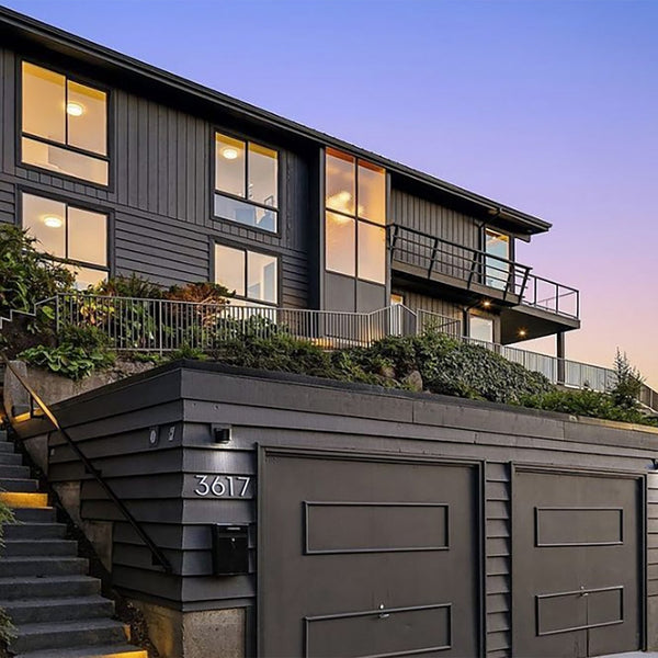
In residential and multifamily settings, this same principle applies at a smaller scale. A well-designed house number or address plaque functions as environmental graphic design for the home, integrating identification into the facade rather than bolting on a separate sign.
This integration matters because graphics that belong to the architecture feel intentional rather than added on, which strengthens both wayfinding clarity and design cohesion.
How Can Colors, Patterns, and Materials Act as Intuitive Wayfinding Cues?
Colors, patterns, and materials act as intuitive wayfinding cues by giving visitors a quick, non-verbal way to recognize zones, floors, or directions without reading text. A distinct color assigned to each floor or wing, for example, lets people navigate by memory and association rather than by decoding words.
Patterns and material changes reinforce this same logic. Transitioning from smooth flooring to a textured or patterned surface can signal an approaching decision point, entrance, or transition zone, while a shift in material, such as warm wood paneling versus cool metal panels, can mark a change from public to private space.
These cues work because human perception processes color and texture faster than text. A visitor catches a color shift in peripheral vision before consciously reading a directional sign.
In practical terms, designers should:
- Assign consistent colors to distinct zones, floors, or functions across the entire site.
- Use pattern changes sparingly, reserved for genuine decision points or transitions.
- Select material contrasts that align with the building's existing architectural palette.
For homeowners, this same intuitive-cue logic scales down effectively. A distinctive material finish, such as brushed aluminum house numbers against a stucco or brick facade, creates an immediate visual anchor that helps guests, delivery drivers, and rideshare services locate the correct entrance at a glance.
How Do You Balance Bold Graphic Moments With Subtle, Minimalist Design?
Balancing bold graphic moments with subtle, minimalist design requires reserving strong visual statements for genuine decision points while keeping the rest of the environment quiet enough that those moments stand out. Overusing bold graphics throughout a space dilutes their impact and creates visual clutter that competes with actual navigation needs.
The most effective approach treats environmental graphics like punctuation: a few well-placed exclamation points amid mostly calm, legible sentences. A single oversized numeral at a main entrance draws the eye precisely because the surrounding facade or lobby stays restrained.
This principle mirrors what makes architect-designed house numbers effective on residential exteriors. A bold, well-proportioned number set against a minimalist facade reads clearly from the street or sidewalk, without competing with landscaping, lighting, or other exterior details. The number becomes the intentional focal point rather than one of many competing elements.
In professional practice, this restraint is often underestimated. Many property owners assume more graphics or bigger signage automatically improves navigation, but a single, well-placed, high-contrast element consistently outperforms clusters of competing visual cues, because it gives the eye one clear place to land at each critical decision point.
How Do Materials and Finishes Affect Wayfinding Sign Performance?
Materials and finishes affect wayfinding sign performance by determining how long a sign lasts, how easily it stays legible, and how much upkeep it demands. The sections below compare common sign materials, explain how lighting and weather stress finishes, and outline how to choose durable, sustainable options.
What Are the Pros and Cons of Metal, Acrylic, Vinyl, and Painted Signs?
The pros and cons of metal, acrylic, vinyl, and painted signs depend on durability, cost, weather resistance, and upkeep. Metal signs offer the longest lifespan and best resistance to impact and corrosion, though they carry a higher upfront cost. Acrylic balances a sleek, modern look with moderate durability but can scratch or yellow with prolonged UV exposure. Vinyl is inexpensive and easy to apply, making it popular for temporary or interior signage, yet it fades and peels faster outdoors. Painted signs are budget-friendly initially but require frequent touch-ups as coatings chip and weather.
|
Material |
Durability |
Relative Cost |
Weather Resistance |
Maintenance Needs |
|
Metal |
High |
Higher |
Excellent |
Low |
|
Acrylic |
Moderate to High |
Moderate |
Good indoors, fair outdoors |
Low to Moderate |
|
Vinyl |
Low to Moderate |
Low |
Fades under UV |
Moderate |
|
Painted |
Moderate |
Low |
Prone to chipping |
High |
How Do Lighting, Glare, and Weather Exposure Influence Material Choices?
Lighting, glare, and weather exposure influence material choices by determining which finishes stay legible under real-world conditions. Glossy acrylic and metallic finishes can reflect sunlight or overhead lighting, creating glare that obscures text at certain viewing angles, while matte finishes reduce reflection and improve readability in bright environments. Prolonged UV exposure fades vinyl and painted surfaces, whereas anodized or powder-coated metal resists color loss over time. Humidity and rain accelerate corrosion on untreated metal and cause vinyl edges to lift.
In practice, choosing a matte or low-glare finish for outdoor, sun-exposed signage almost always outperforms glossy alternatives in long-term legibility, even when the glossy option looks sharper at installation.
How Can You Choose Durable, Low-Maintenance, and Sustainable Signage Materials?
You can choose durable, low-maintenance, and sustainable signage materials by prioritizing corrosion-resistant metals, protective sealants, and recycled content. The key selection criteria include:
- Solid, weather-treated metal such as aluminum, which resists rust, warping, and fading better than plastic or painted alternatives.
- Protective coatings and sealed finishes that shield against UV damage, moisture, and daily wear.
- Recycled or locally sourced materials, which reduce environmental impact without sacrificing structural strength.
- Concealed, corrosion-resistant hardware that prevents streaking and keeps mounting points from degrading over time.
Selecting materials with these qualities upfront reduces long-term replacement costs. With durable materials selected, typography and color choices determine how well signs communicate at a glance.
How Do Typography, Symbols, and Color Choices Improve Legibility?
Typography, symbols, and color choices improve legibility by making signs faster to read, easier to understand across languages, and simpler to navigate by category. Together these three design layers turn a sign from decoration into a functional wayfinding tool. The following sections cover font sizing, icon use, and color coding.

Which Fonts and Letter Heights Work Best for Different Viewing Distances?
The fonts and letter heights that work best for different viewing distances are sans-serif typefaces paired with letter sizes scaled to how far a reader stands from the sign. Sans-serif fonts such as Palm Springs, Austin, and Soho read more clearly at a glance because their simple, uniform strokes reduce visual clutter compared to serif fonts.
Letter height should scale with distance: signs read from 10 feet typically use 1-inch letters, while signs meant to be read from 50 feet or more require letters closer to 5 inches tall. Bold or semi-bold weights improve visibility in low light or from moving vehicles.
In practice, mismatched scale is one of the most common wayfinding mistakes. A beautifully designed sign that's too small for its viewing distance fails at its core job, no matter how well it photographs.
How Can You Use Icons and Pictograms to Support Multilingual Audiences?
Icons and pictograms support multilingual audiences by communicating meaning visually, without relying on any single spoken or written language. A restroom pictogram, an arrow, or a wheelchair accessibility symbol conveys the same message to a visitor regardless of native language or literacy level.
Effective use of icons includes:
- Pairing pictograms with text labels rather than replacing text entirely, so meaning is reinforced for all users.
- Using standardized, widely recognized symbols (such as ISO or ADA-recognized icons) instead of custom graphics that visitors may not understand.
- Keeping icon style consistent across an entire signage system, so shape, line weight, and color always signal the same category of information.
- Sizing icons proportionally to nearby text so neither element dominates the sign.
Consistent, standardized pictograms reduce hesitation at decision points, especially in spaces with international visitors like airports, hospitals, and hotels.
How Should You Use Color Coding to Organize Zones, Floors, or Functions?
Color coding should be used to organize zones, floors, or functions by assigning one distinct, consistent color to each area or category throughout an entire signage system. For example, a parking garage might use blue for Level 1, green for Level 2, and red for Level 3, repeating each color on every sign, elevator, and stairwell within that zone.
Best practices for color coding include:
- Choosing colors with strong contrast against sign backgrounds to support legibility for visitors with low vision.
- Limiting the palette to a manageable number of distinct colors, since too many similar hues become confusing rather than clarifying.
- Applying color consistently across floors, maps, directories, and physical wayfinding elements, not just standalone signs.
- Avoiding color as the sole identifier, pairing it with numbers, letters, or icons for visitors with color blindness.
Well-executed color coding turns navigation into an intuitive, almost subconscious process, letting visitors orient themselves by glancing at a hue rather than reading text. This same design discipline, clear typography, universal symbols, and consistent color, applies at the residential scale, where thoughtfully designed house numbers and address plaques give a home its own legible identity.
How Do You Plan a Wayfinding Strategy Before Designing Any Signs?
A wayfinding strategy is planned by researching user needs, mapping circulation routes, and auditing existing signage before any design work begins. This sequence prevents costly redesigns and ensures signs address real navigation problems rather than guesswork.
What Questions Should You Ask About Users, Routes, and Key Destinations?
The questions you should ask about users, routes, and key destinations include who is navigating the space, where they start, and what they need to reach. There are three core categories worth exploring, such as user profiles, route patterns, and destination priorities.
- User profiles: Who uses the space, including first-time visitors, repeat users, delivery drivers, and people with mobility or vision differences?
- Route patterns: What paths do people take from entry points to their destinations, and where do they typically start?
- Destination priorities: Which locations, such as main entrances, restrooms, elevators, or unit numbers, get searched for most often?
Answering these questions first keeps sign placement focused on actual behavior instead of assumptions. Experienced designers know that skipping this step is the single biggest cause of confusing, oversized signage systems later on.
How Do You Map Circulation Paths and Decision Points in a Building or Site?
Circulation paths and decision points are mapped by walking the actual routes visitors use and marking every intersection, turn, or fork where a choice must be made. This process, often called a wayfinding audit walk, produces a visual map showing where confusion is most likely to occur.
- Trace primary paths from each entry point to the most common destinations.
- Flag every decision point, such as hallway intersections, stairwells, and parking exits.
- Note sightlines and obstructions that block visibility of existing landmarks.
- Identify secondary or emergency routes that also require guidance.
Decision points deserve the most attention because unclear choices at these junctions compound into larger navigation failures downstream. A single missing sign at one fork can derail an otherwise well-marked route.
How Can You Audit Existing Signage to Find Gaps and Pain Points?
Existing signage is audited by cataloging every current sign, checking it against the mapped circulation routes, and identifying where guidance is missing, outdated, or inconsistent. This gap analysis directly informs which sign types need to be added, replaced, or relocated.
- Inventory all current signs by type, location, and condition.
- Compare sign placement against actual decision points identified during route mapping.
- Check for consistency in terminology, color coding, and typography across the property.
- Note signs that are damaged, outdated, or contradict newer wayfinding elements.
This structured planning process, covering user needs, circulation mapping, and signage audits, applies at every scale. Even a single-family home benefits from the same clarity-first thinking, starting with a legible, well-placed house number as the first wayfinding decision point guests encounter.
How Should You Place Wayfinding Signs for Maximum Clarity and Impact?
Wayfinding sign placement depends on mounting height, spacing, and consistency between indoor and outdoor zones. The sections below cover ideal mounting heights and angles, spacing for complex routes, and seamless indoor-outdoor coordination.
What Are the Ideal Mounting Heights and Angles for Different Sign Types?
Ideal mounting heights and angles for different sign types vary by function and viewing distance. Overhead directional signs typically hang 80 inches above the finished floor to clear traffic while staying legible from a distance. Wall-mounted identification and room signs are generally centered 60 inches or over to the baseline of tactile characters. Freestanding exterior signs, such as monument or pylon signs, are angled slightly toward the primary approach path rather than mounted flat, improving visibility for both pedestrians and drivers.
Sign type dictates placement logic more than aesthetics alone. Overhead signs prioritize distance legibility, wall signs prioritize accessibility compliance, and freestanding signs prioritize approach-angle visibility. Getting height wrong is one of the most common wayfinding mistakes; a sign mounted too low gets blocked by crowds, while one mounted too high loses legibility for close-range readers.
How Close Together Should Wayfinding Signs Be for Complex Routes?
Wayfinding signs should be spaced close enough that a visitor never loses sight of the next decision point, but not so close that redundant signage creates visual clutter. On complex routes with multiple turns, signs generally belong at every decision point, such as intersections, lobby entries, elevator banks, and stairwell landings, rather than at fixed intervals.
For long, straight corridors without branching paths, spacing can extend further because there is no decision to reinforce. In dense environments like hospitals or campuses, tighter spacing at each branch reduces hesitation and backtracking. The guiding principle is decision-based placement, not distance-based placement: add a sign wherever a visitor must choose a direction, and skip signage where the path is unambiguous.
How Can You Coordinate Indoor and Outdoor Sign Placement Seamlessly?
Indoor and outdoor sign placement can be coordinated seamlessly by maintaining consistent terminology, color coding, and iconography as visitors move between environments. A parking garage sign, exterior monument sign, and interior lobby directory should reference the same building names, unit numbers, and directional language so the visitor's mental map carries through without interruption.
Material and lighting choices should also transition logically: exterior signage needs weather-resistant materials and higher-contrast lighting for dusk visibility, while interior signage can rely on ambient lighting and lighter-weight materials. Property owners often overlook this handoff point, yet it is where visitors are most likely to hesitate. Extending that same clarity to the first sign a visitor sees, the home's address itself, sets the tone for everything that follows.
How Can Homes and Multifamily Properties Use Wayfinding Signage Effectively?
Homes and multifamily properties can use wayfinding signage effectively by layering house numbers, unit and parking identifiers, and guest-access cues into one cohesive system. The following sections cover entry markers, unit numbering, and delivery or rideshare navigation.
How Do House Numbers and Entry Markers Act as the First Layer of Wayfinding?
House numbers and entry markers act as the first layer of wayfinding by giving visitors, emergency responders, and delivery drivers the initial visual cue needed to locate a property. This first touchpoint sets the tone for every wayfinding decision that follows, since a driver scanning a street cannot use interior signage until the address itself is confirmed. Entry markers work best when placed at a consistent height, illuminated for nighttime visibility, and sized for the viewing distance from the street or driveway.
Beyond function, entry markers double as a design statement. Modern House Numbers designs its address numbers, letters, and plaques with this dual purpose in mind, using solid recycled aluminum construction so the first wayfinding cue a visitor sees also reflects the home's architectural character.
How Should You Number Units, Buildings, and Parking Spaces for Clarity?
You should number units, buildings, and parking spaces for clarity by applying a single, logical sequencing pattern across the entire property and repeating it at every decision point. Multifamily properties benefit from numbering systems that are consistent, such as grouping units by floor and building letter, so residents and visitors can predict a unit's location before reaching it.
Clear numbering for multifamily wayfinding includes:
- Building identifiers placed at each entrance and repeated on directional signs leading to it.
- Unit numbers displayed at eye level near each door, matching the format used on directories.
- Parking space numbers aligned with unit or building numbers to reduce guest confusion.
- Floor indicators in stairwells and elevator lobbies that match the numbering logic used outdoors.
Consistency across these layers prevents the mismatched numbering schemes that often frustrate visitors at larger properties.

How Can Thoughtful Wayfinding Improve Deliveries, Rideshare Pickups, and Guest Access?
Thoughtful wayfinding improves deliveries, rideshare pickups, and guest access by removing the guesswork that delivery drivers and rideshare passengers face when searching for a specific address or unit within a larger property. Clear, well-placed identification signage lets drivers confirm they've reached the correct building without circling a block or calling for directions, which directly reduces missed deliveries and pickup delays.
For multifamily properties, this means marking building entrances, package rooms, and guest parking with visible, legible signage that matches the numbering used elsewhere on-site. For single-family homes, a well-lit, clearly sized house number does the same job at a smaller scale.
In practice, properties that invest in this first-impression signage tend to see fewer guest complaints and smoother delivery experiences, since the confusion typically happens before anyone reaches the front door. This makes entry-level wayfinding one of the highest-value, lowest-cost upgrades a property owner can make.
How Does Wayfinding Signage Differ for Commercial and Public Spaces?
Wayfinding signage differs for commercial and public spaces because these environments involve higher visitor volume, more complex circulation paths, and stricter regulatory oversight than residential settings. Offices, retail centers, and campuses need layered directional systems, while parking structures and events require specialized, often temporary solutions.
What Extra Wayfinding Needs Do Offices, Retail, and Campuses Have?
Offices, retail, and campuses have extra wayfinding needs that include multi-tenant directories, department-level identification, and cross-building navigation systems. Unlike single-family residences, these spaces host visitors unfamiliar with the layout, requiring redundant signage at every major decision point.
Offices typically need lobby directories, suite numbering, and conference room identification that update as tenants change. Retail environments depend on category signage, promotional zone markers, and anchor-store directionals that guide shoppers efficiently between departments. Campuses face the most layered demands, combining building identification, pathway signage, and outdoor kiosks across sprawling, multi-structure sites.
Key differentiators for these environments include:
- Multi-tenant or multi-department directories that require frequent updates
- Cross-building directional signage for sprawling or multi-structure sites
- Zone-based color coding to distinguish departments, wings, or campus quadrants
- Entry-point signage that orients first-time visitors immediately upon arrival
Because these spaces serve constantly changing populations of first-time visitors, the signage system must communicate instantly, without relying on prior familiarity with the property.

How Do You Plan Wayfinding for Large Parking Areas and Garages?
Planning wayfinding for large parking areas and garages requires level identification, color-coded zones, and clear directional signage guiding drivers from entry to exit and back to their vehicle. Parking structures present a unique wayfinding challenge because drivers navigate at speed, often distracted, and must later recall their parking location on foot.
Effective parking wayfinding typically combines several elements working together:
- Level and zone identifiers posted at every entry point and stairwell
- Color-coded or numbered sections that are easy to memorize
- Directional arrows guiding traffic flow toward exits and elevators
- Pedestrian-specific signage separate from vehicle directional signs
- High-contrast, well-lit signage for visibility in low-light garage conditions
The biggest parking wayfinding failure is inconsistent signage between the vehicle level and the pedestrian level; garages that use the same zone names and colors on both driving and walking signage see far fewer "lost car" complaints than those treating the two systems separately.
How Can Temporary and Event Signage Complement Permanent Wayfinding?
Temporary and event signage can complement permanent wayfinding by filling gaps for short-term needs such as conferences, construction detours, or seasonal promotions without altering the building's core signage system. This approach lets facility managers address unique, time-limited navigation needs while preserving the architectural integrity of permanent signage.
Common applications include:
- Event-specific directional signs guiding attendees to registration, sessions, or exhibits
- Construction detour signage rerouting traffic around closed pathways
- Seasonal or promotional signage for retail campaigns and pop-up installations
- A-frame or banner signage supplementing fixed directories during high-traffic periods
Temporary signage should visually align with the permanent system's typography and color palette, reinforcing familiarity rather than creating confusion. Well-planned properties, whether commercial campuses or residential communities, benefit from this same layered thinking: permanent identification establishes the foundation, while temporary elements adapt to changing needs. Modern House Numbers applies this same principle at the residential scale, offering architect-designed house numbers and plaques that serve as permanent, foundational identification for homes and multifamily properties.
How Can You Make Your Wayfinding System Accessible and Inclusive?
You can make your wayfinding system accessible and inclusive by following ADA-mandated tactile and visual standards, choosing sign types that serve varied sensory needs, and testing designs with real users. The sections below cover ADA requirements, tactile/Braille/contrast features, and user testing methods.
What Do ADA and Accessibility Guidelines Require for Wayfinding Signs?
ADA and accessibility guidelines require wayfinding signs to meet specific tactile character, Braille, contrast, and mounting-height standards under ADA and ANSI A117.1 codes. Permanent room signs identifying spaces such as restrooms, stairwells, and exits must include raised characters and Grade 2 Braille, mounted between 48 and 60 inches above the finished floor, measured to the baseline of the tactile text.
Character proportions matter too: letters must maintain a defined width-to-height ratio and stroke thickness so raised text remains legible to touch. Finish requirements call for non-glare backgrounds with characters contrasting sharply against their background.
Compliance is not optional for public and multifamily buildings; overlooking one measurement, such as mounting height, can trigger costly retrofits. Building teams that treat ADA compliance as a design constraint from day one, rather than a late-stage fix, consistently avoid rework and legal exposure.
How Do Tactile, Braille, and High-Contrast Signs Support All Users?
Tactile, Braille, and high-contrast signs support all users by giving people with visual impairments, low vision, or limited literacy multiple ways to read the same message. Raised lettering allows fingertip reading for individuals who are blind, Braille serves those trained in it, and high-contrast color pairings, such as dark text on a light background, help users with low vision or aging eyesight read signs from a distance.
These features benefit more than one user group at once, which is why accessible design is often described as universal design rather than a niche accommodation. Common approaches include:
- Raised, sans-serif tactile characters paired with Grade 2 Braille below the text.
- Contrast ratios strong enough for text to stand out clearly under varied lighting.
- Non-reflective sign materials that reduce glare for users with light sensitivity.
Designing for the widest range of users from the start typically costs less than adding accessibility features later.
How Can You Test Your Wayfinding System With Diverse User Groups?
You can test your wayfinding system with diverse user groups by observing real navigation attempts from people with different abilities, ages, and language backgrounds before finalizing signage. Effective testing methods include:
- Recruiting participants who use wheelchairs, canes, or guide dogs to walk key routes and flag confusing or inaccessible sign placements.
- Asking low-vision participants to read signs at typical viewing distances and lighting conditions.
- Including non-native speakers or children to check whether icons and color coding communicate without relying on text alone.
- Timing how long it takes each group to reach a destination and noting hesitation points or wrong turns.
Direct observation reveals problems that design reviews miss, since real users interact with signage in ways designers rarely anticipate. Building this feedback loop into every project keeps wayfinding systems genuinely inclusive rather than only technically compliant.
How Can You Integrate Digital and Static Wayfinding Signage?
Digital and static wayfinding signage integrate by pairing fixed signs with real-time digital tools that update instantly. The following sections cover when to add digital directories, how QR codes extend physical signs, and how to keep both formats consistent.
When Should You Use Digital Directories or Interactive Maps?
Digital directories or interactive maps should be used when a facility has frequent changes, multiple destinations, or heavy foot traffic that static signage cannot keep up with. There are several scenarios where this applies, such as:
- Multi-tenant office buildings with recurring lease turnover
- Hospitals with departments that relocate or expand
- University campuses with event-driven schedules
- Retail centers with seasonal or rotating store lineups
In these environments, a printed directory becomes outdated the moment a tenant list changes, while a digital screen can be updated in minutes. Interactive maps work best as a complement to static signs rather than a replacement, since some visitors will always prefer a fixed reference point.
How Do QR Codes and Mobile Wayfinding Tools Support Physical Signs?
QR codes and mobile wayfinding tools support physical signs by linking a fixed sign to live digital content, such as searchable maps, translated directions, or turn-by-turn navigation on a smartphone. Common applications include:
- QR codes on directory boards that open a searchable building map
- Mobile apps providing indoor turn-by-turn navigation
- NFC tags delivering audio descriptions for accessibility
- Scannable codes on parking signage showing real-time space availability
Pairing a static sign with a scannable code closes the gap between fixed information and personalized navigation, which matters most in facilities too complex for a single map to cover.
How Can You Keep Digital and Physical Wayfinding Information in Sync?
Digital and physical wayfinding information can be kept in sync by assigning one owner to manage updates across both formats and scheduling regular audits whenever a space changes. Practical steps include:
- Updating static signs and digital directories at the same time after any renovation or tenant change
- Using a centralized content system that pushes updates to kiosks, apps, and printed signage simultaneously
- Setting a recurring audit schedule to catch outdated listings
- Training on-site staff to report mismatches between digital and physical signs
Mismatched information erodes trust in a wayfinding system faster than any single missing sign, so synchronization should be treated as an ongoing operational task, not a one-time setup. Keeping both formats accurate sets the stage for measuring wayfinding performance next.
How Do You Measure and Improve the Effectiveness of Wayfinding Signage?
Wayfinding effectiveness is measured through navigation metrics, user feedback, and observation, then improved through scheduled reviews and updates. The sections below cover key performance indicators, feedback methods, and review frequency.
What Metrics Indicate That a Wayfinding System Is Working Well?
Metrics that indicate a wayfinding system is working well include reduced decision-point confusion, fewer wrong turns, faster time-to-destination, and lower staff time spent giving directions. A well-performing system also shows fewer help-desk or front-desk inquiries about locations, since visitors find destinations independently.
Facilities teams often track these indicators through direct observation logs, staff-reported inquiry counts, and simple time-to-arrival comparisons before and after signage changes. Consistent wayfinding, clear directional cues, and legible identification signs typically correlate with smoother circulation and fewer repeated questions at any given decision point.
In practice, the most reliable signal is behavioral, not anecdotal: watching where people pause, backtrack, or ask for help reveals more than a satisfaction survey alone. Facilities that combine both data types get the clearest picture of system performance.
How Can User Feedback and Observation Reveal Navigation Problems?
User feedback and observation reveal navigation problems by identifying exactly where visitors hesitate, backtrack, or seek assistance. Surveys, comment cards, and direct interviews capture qualitative frustration points, such as confusing intersections or unclear signage wording, that raw traffic data cannot explain on its own.
Observation-based methods include the following:
- Tracking foot traffic patterns to spot repeated backtracking at specific junctions.
- Timing how long visitors take to locate a destination after passing key decision points.
- Recording front-desk or staff inquiries by location to flag recurring confusion zones.
- Conducting brief post-visit surveys asking where wayfinding felt unclear.
Combining these methods with direct observation of real users navigating a space, rather than relying solely on self-reported feedback, consistently uncovers the specific sign or intersection causing the breakdown.
How Often Should You Review and Update Your Wayfinding Signage?
Wayfinding signage should be reviewed at least annually, with additional updates triggered by any renovation, tenant change, rebranding, or shift in traffic patterns. Regular review keeps directional information accurate and prevents outdated signs from misdirecting visitors.
A practical review schedule includes:
- An annual full-system walkthrough to check accuracy, legibility, and physical condition.
- Immediate updates after any layout change, new construction, or department relocation.
- Periodic spot-checks after major events or seasonal changes in traffic flow.
- A responsive review whenever feedback or observation data flags a recurring problem area.
Skipping scheduled reviews is one of the most common mistakes property managers make, since even small changes, like a relocated entrance or renumbered unit, can undermine an otherwise well-designed system. Consistent review cycles protect the investment already made in clear signage.
How Can Modern House Numbers and Custom Architectural Signage Support Better Wayfinding?
Modern house numbers and custom architectural signage support better wayfinding by giving homes a clear, consistent identification point that guides visitors and deliveries to the right entrance. The following sections cover architect-designed products and key wayfinding takeaways.
How Can Architect-Designed House Numbers, Plaques, and Custom Signage From Modern House Numbers Improve Wayfinding and Curb Appeal?
Architect-designed house numbers, plaques, and custom signage from Modern House Numbers improve wayfinding and curb appeal by making a home's address legible from the street, sidewalk, or driveway. Modern House Numbers designs every number, letter, and plaque in-house, drawing on the founders' architecture and urban planning backgrounds to balance legibility with style. Each piece is handcrafted to order from solid, recycled 3/8-inch aluminum in Tucson, Arizona, and ships with a free drilling template plus concealed hardware for a clean install. Custom plaques, decals, and curb stencils extend identification to mailboxes and curbs, reinforcing the address at multiple points along a guest's approach.
Consistent, well-placed identification is the foundation of good wayfinding, and thoughtfully designed numbers turn a functional requirement into a genuine curb-appeal feature.
What Are the Key Takeaways About the Different Types of Wayfinding Signage and How to Use Them Effectively?
The key takeaways about the different types of wayfinding signage and how to use them effectively are that identification, directional, informational, and regulatory signs perform best when designed as one coordinated system rather than isolated pieces. Clarity, consistency, and accessibility should guide every decision, from letter height to mounting position, so users at every decision point can navigate with confidence.
For homes and multifamily properties, that same logic starts at the curb: legible house numbers, unit markers, and entry signage set the tone for every visitor, delivery, and guest who follows. Modern House Numbers applies this architect-led approach to every custom number, plaque, and sign it crafts, treating address identification as the first and most important layer of any wayfinding strategy.