 Numbers + Letters
 QuickShip
 Plaques
 Decals
 Custom
 Trade
Trade


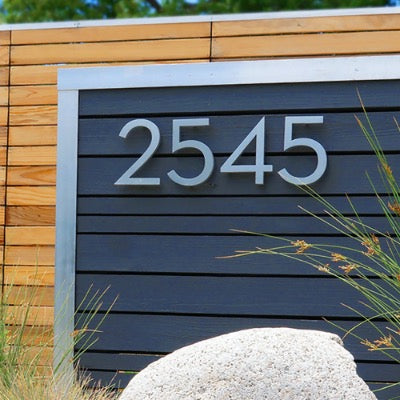
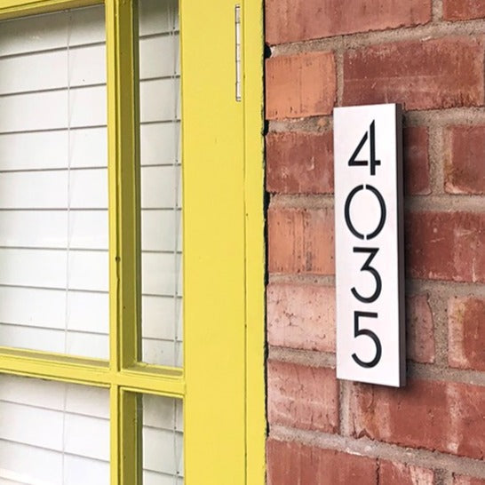
Address plaque and house number font style is the typographic design applied to residential numerals, governing how quickly and accurately a viewer identifies your address from the street. The right choice balances legibility, architectural compatibility, code compliance, and material durability.
This guide covers font selection fundamentals, the most popular modern and classic styles, readability principles, material and finish pairings, local regulations, and customization options available through Modern House Numbers.
Font style directly determines street-level visibility. Stroke width, aperture size, and character spacing each affect how cleanly digits register from a moving vehicle, and lighting conditions introduce an additional layer of complexity for nighttime readability.
The modern versus classic divide shapes most purchasing decisions. Clean geometric sans-serif typefaces are gaining ground in new construction, while serif styles still dominate established neighborhoods by a wide margin, reflecting the architectural character of the homes they identify.
Readability from the street depends on more than typeface alone. Character height, stroke weight, and spacing work together, and municipal codes such as the 2024 International Fire Code set enforceable minimums that effectively eliminate narrow scripts and decorative fonts from consideration.
Material and finish choices amplify or undermine a font's visual impact. Aluminum, acrylic, and wood each pair best with specific type styles, and surface finishes from brushed to matte affect contrast, glare, and long-term durability.
Custom font selection through Modern House Numbers gives homeowners precise control over architectural compatibility and personalization, combining handcrafted production with named styles designed to match distinct regional aesthetics.
Why Does the Font Style Matter for Address Plaques and House Numbers?
Font style matters for address plaques and house numbers because it directly affects legibility, safety, and curb appeal. The following sections cover how font choice influences daytime and nighttime visibility from the street.
How Does Font Style Impact Visibility and Readability?
Font style impacts visibility and readability by determining how quickly and accurately a viewer can identify individual characters from a distance. Key factors include stroke width, aperture size, character spacing, and contrast ratio. According to data from the Houston Sign Company, three-inch letters are readable up to 100 feet away, while ten-inch letters extend readability to 450 feet. High-contrast combinations, such as black on yellow or white on black, perform best for distance reading. Fonts with wide apertures, the open negative spaces within letters like "C" or "S," consistently outperform tight-aperture designs in legibility. For address plaques specifically, character spacing between 10% and 35% of letter height ensures digits read cleanly from a moving vehicle.
Are Different Fonts Better for Daytime Versus Nighttime Visibility?
Different fonts perform differently for daytime versus nighttime visibility, with lighting conditions being the decisive variable. During the day, high-contrast font and background combinations maximize legibility regardless of font style. At night, however, font style alone is insufficient. Backlit house numbers, which use LED lighting to illuminate through or around digits, provide a clear advantage in poorly lit locations compared to standard non-illuminated numbers. A study published in Lighting Research & Technology confirmed that visibility percentages improve significantly by optimizing color temperature and luminance to meet minimum visibility level requirements. Bold, open-stroke fonts amplify these lighting benefits by allowing more light to pass around each character cleanly.
What Are the Most Popular Font Styles Used for House Numbers?
The most popular font styles for house numbers fall into two broad categories: modern sans-serif designs and classic serif styles. The sections below explore what's trending in contemporary construction and which traditional choices remain timeless favorites.
What Modern Font Styles Are Trending for Address Numbers?
The modern font styles trending for address numbers are clean, geometric sans-serif typefaces that prioritize legibility over ornamentation. These designs favor bold strokes, open letterforms, and uniform character spacing, all of which read clearly from the street at a distance.
A survey of over 1,000 blocks in a Northern Virginia ZIP code, published by Slate, found that serif addresses outnumbered sans-serif addresses by nearly 4 to 1, though sans-serif fonts are increasingly chosen for new modern constructions. This shift reflects broader architectural trends favoring minimalism and clean exterior lines.
Popular trending styles include:
- Geometric sans-serif fonts with uniform stroke widths for contemporary homes.
- Mid-century modern numerals with slightly tapered strokes suited to ranch-style architecture.
- Industrial block styles that pair well with mixed-material facades using metal and concrete.

What Classic or Traditional Font Styles Are Common Choices?
The classic and traditional font styles commonly chosen for house numbers are serif typefaces, which dominate existing residential neighborhoods by a wide margin. Their small finishing strokes lend each numeral a sense of formality and permanence that suits Colonial, Victorian, Tudor, and Craftsman architecture particularly well.
Traditional options include:
- Old-style serif numerals with bracketed serifs and slight stroke contrast, evoking a timeless handcrafted quality.
- Transitional serif styles, which balance classic weight contrast with slightly more upright letterforms.
- Art Deco-influenced designs featuring geometric details, popular on early 20th-century bungalows and prairie-style homes.
Serif styles have held their ground because they signal permanence and heritage, values that align naturally with established neighborhood aesthetics.
How Do You Choose the Right Font Style for Your Home's Architecture?
Choosing the right font style for your home's architecture means matching the visual character of the typeface to your exterior design language. The subsections below cover whether font should echo your home's exterior and which styles suit contemporary versus historic properties.
Should Font Style Match the Exterior Design of the House?
Yes, font style should match the exterior design of the house. The typography on your address plaque reads as part of your home's overall composition, not as a separate decorative element. A mismatch between a sleek, minimalist facade and an ornate script font creates visual tension that undermines curb appeal.
Clean sans-serif fonts with geometric precision suit modern or contemporary homes, while Art Deco or handcrafted looks work better for early 20th-century prairie-style and Craftsman bungalows. Finish choices matter alongside font selection; matte brass, for example, pairs naturally with traditional styles.
Are Certain Fonts Better for Contemporary Versus Historic Homes?
Certain fonts are better suited to contemporary homes, while others complement historic properties more naturally. Contemporary homes benefit from geometric sans-serif typefaces, which reflect the clean lines and angular profiles typical of modern construction. Historic homes, including Craftsman bungalows and Victorian properties, read more cohesively with serif styles that echo the ornamental detailing already present in the architecture.
Matching font weight and finish to the home's dominant material palette reinforces this alignment. A brushed aluminum sans-serif suits a mid-century modern exterior; a dark bronze serif pairs well with a brick Colonial. Font selection is one of the most underestimated contributors to architectural coherence at the street level.

Which Font Styles Are Easiest to Read from the Street?
The font styles easiest to read from the street share three qualities: bold stroke weight, generous letter spacing, and simple, open letterforms. Sans-serif fonts with clean geometry consistently outperform decorative or script styles at distance. The sections below explain how thickness, spacing, and size each drive street-level legibility.
How Does Font Thickness and Spacing Affect Readability?
Font thickness and spacing affect readability by determining how clearly individual characters separate and register at a distance. Thick strokes give each digit visual mass, preventing letters from disappearing against a background. Open letterforms with large apertures, the negative spaces inside characters like "C" or "S", also reduce misreading under real-world conditions.
Spacing matters equally. According to the Nielsen Norman Group, proper character spacing should fall between 10% and 35% of letter height to ensure legibility from the street. Tight spacing causes numerals to blur together; excessive spacing breaks the visual grouping. For address plaques, a medium-weight sans-serif with deliberate letter spacing consistently delivers the clearest result.
What Font Size Works Best for Maximum Legibility?
The best font size for maximum legibility depends on the viewing distance from the street to your front door. A Houston Sign Company visibility chart shows that three-inch letters read clearly up to 100 feet away, while ten-inch letters remain legible up to 450 feet. The 2024 International Fire Code sets a minimum character height of 4 inches with a stroke width of at least 0.5 inches, which satisfies most residential setbacks.
For most homes, 4 to 6 inches is the practical sweet spot, large enough to meet code and visible to both emergency responders and delivery drivers without overwhelming the facade.

What Materials and Finishes Best Complement Popular Font Styles?
The right material and finish can elevate or undermine a font's visual impact. The subsections below cover how metal, acrylic, and wood pair with different type styles, and how surface finishes shape the final appearance.
Do Certain Fonts Look Better in Metal, Acrylic, or Wood?
Certain fonts do look better in specific materials, and the pairing depends on stroke complexity and architectural context. Aluminum house numbers typically last 7 to 15 years with high outdoor durability, while acrylic typically lasts 5 to 10 years and may fade or discolor in direct sun.
The material-font pairings that work best are:
- Metal (aluminum, stainless steel): Clean geometric sans-serif fonts, such as modern condensed or rounded styles, photograph sharply in metal and hold fine stroke details over time.
- Acrylic: Bold, high-stroke-weight fonts work well in acrylic because thicker letterforms are less vulnerable to edge chipping.
- Wood: Rustic serif typefaces complement natural wood grain, reinforcing a Craftsman or cottage aesthetic.
For coastal installations, 316-grade stainless steel is the safest metal choice, as chloride-containing salt particles significantly accelerate atmospheric corrosivity in those environments.
How Do Finishes Like Brushed and Matte Affect the Appearance?
Finishes like brushed and matte each affect the appearance of house number fonts in distinct ways, influencing contrast, legibility, and architectural cohesion.
- Brushed finish: Adds linear texture that softens reflective glare while preserving crisp letterform edges, making it ideal for geometric sans-serif fonts.
- Matte finish: Absorbs light evenly, reducing glare and creating a flat, contemporary look that suits minimalist typefaces well.
A high-contrast color relationship between the lettering and background is critical regardless of finish type. Brushed and matte finishes are the most forgiving across font styles, making them a practical default for most modern homes.

Are There Any Local Regulations About Font Styles for House Numbers?
Local regulations about font styles for house numbers vary by jurisdiction, but most focus on character height, stroke width, and contrast rather than specific typeface. The subsections below cover what municipal codes typically mandate and how to verify your plaque meets those standards.
What Size or Style Requirements Do Municipal Codes Usually Specify?
Municipal codes usually specify minimum character height, stroke width, and background contrast for house numbers. The 2024 International Fire Code (IFC) Section 505.1, published by the International Code Council, requires address characters to be at least 4 inches (102 mm) high with a minimum stroke width of 0.5 inches (12.7 mm) and must contrast with their background. Requirements vary at the local level: the Los Angeles Fire Department sizes numerals by setback distance, while Montgomery County, Maryland requires at least 5 inches for new residential installations. Some jurisdictions go further on font choice; the Anna, Texas Fire Department mandates Handel Gothic BT Capital with additional kerning for fire-related signage. Most codes do not ban specific typefaces but effectively rule out narrow scripts and decorative fonts that cannot meet stroke-width or legibility thresholds.
How Can You Make Sure Your Address Plaque Is Code-Compliant?
Your address plaque is code-compliant when it meets your local jurisdiction's character height, stroke width, contrast, and placement requirements. HOA governing documents add another layer, as they often include specific Architectural Guidelines regulating house number size, font, shape, and mounting location to ensure community-wide aesthetic consistency. Before purchasing, check your city or county fire code, your HOA's architectural guidelines, and confirm your chosen font has a stroke width of at least 0.5 inches at the required display size. Bold sans-serif and geometric fonts typically satisfy these requirements more reliably than decorative scripts. Confirming compliance before installation is far easier than replacing a non-conforming plaque after the fact.
How Can Custom Font Styles Enhance Curb Appeal and Personalization?
Custom font styles enhance curb appeal and personalization by giving homeowners direct control over how their address reads within the broader visual context of their home's exterior. The following headings cover the customization options available and whether homeowners can request truly unique or personalized fonts.
What Customization Options Are Available for Font Selection?
The customization options available for font selection include typeface category, finish, and material combination. Clean sans-serif fonts with geometric precision suit modern or contemporary homes, while Art Deco or handcrafted looks complement early 20th-century prairie-style and Craftsman bungalows. Proper character spacing, typically between 10% and 35% of letter height, ensures legibility from the street while reinforcing the architectural lines of the home.
Key dimensions homeowners can customize include:
- Typeface style: Sans-serif, serif, or Art Deco designs
- Material and finish: Brushed aluminum or matte to match exterior palettes
- Size and stroke weight: Scaled to complement facade proportions
Can Homeowners Request Unique or Personalized Fonts?
Yes, homeowners can request custom fonts, and Modern House Numbers makes this accessible through its made-to-order production model. Every product is handcrafted to order in Tucson, Arizona, meaning no two sets need to look alike. Modern House Numbers offers multiple named font options, including Palm Springs, SoCal, Austin, SoHo, Backbay, South Beach, and Santa Barbara, each reflecting a distinct architectural personality. This range allows homeowners to match their address plaque to a specific regional or stylistic identity rather than settling for a generic off-the-shelf option. Custom font selection is among the most impactful and underutilized tools for exterior personalization, since the address is one of the first details a visitor encounters.
How Should You Select and Install the Right Font Style With Modern House Numbers?
Selecting and installing the right font style requires balancing architectural compatibility, code compliance, and visibility. The sub-sections below cover custom address plaque options and key takeaways to guide your final decision.
Can Custom-Made Address Plaques from Modern House Numbers Help You Achieve Your Desired Look?
Yes, custom-made address plaques from Modern House Numbers can help you achieve your desired look while meeting practical safety requirements. Clear and legible house numbers can reduce emergency response times by up to 60%, according to the City of Mobile, Alabama, making font selection far more than a cosmetic choice.
Modern House Numbers offers architect-designed plaques in multiple font styles suited to different home exteriors. House numbers should be placed free from obstructions such as overgrown foliage or seasonal decorations, and positioned adjacent to an exterior light fixture for reliable nighttime visibility. Every Modern House Numbers plaque ships with a personalized drilling template and concealed hardware for a clean, professional installation result.

What Are the Key Takeaways About Best Address Plaque & House Number Font Styles We Covered?
The key takeaways about best address plaque and house number font styles are:
- Match font to architecture: Clean sans-serif fonts suit modern homes; Art Deco and handcrafted styles suit Craftsman bungalows and prairie-style homes.
- Prioritize legibility for safety: Visible, unobstructed house numbers directly support faster emergency response.
- Check local and HOA rules: HOA Architectural Guidelines commonly regulate font, size, and mounting location for community-wide consistency.
- Choose durable materials: Coastal environments demand corrosion-resistant materials; inland installations have broader options.
- Address market context: The global house address plaque market was valued at approximately USD 389 million in 2024, reflecting strong homeowner investment in this detail.
- Install for maximum visibility: Mount numbers free from obstructions, adjacent to exterior lighting, at an accessible eye-level height.
Font style is often underestimated, but it directly shapes how quickly your address is found, whether by a delivery driver or a first responder.
Modern House Numbers combines architect-designed precision with handcrafted quality to make selecting the right address plaque straightforward and visually rewarding.